Blue-green is almost everywhere in this painting. It spreads across the back wall, turns around the shoulder of the glass carafe, enters the folds of the white cloth and covers the patterned fabric in the foreground. Recognizing wall, bottle and cloth is easy enough. The harder task is to keep looking at a small patch of color: why does the warm shape inside the carafe resemble fruit, yet remain part of the glass? Is a dark curve on the blue textile a pattern, or a place where the cloth folds down?
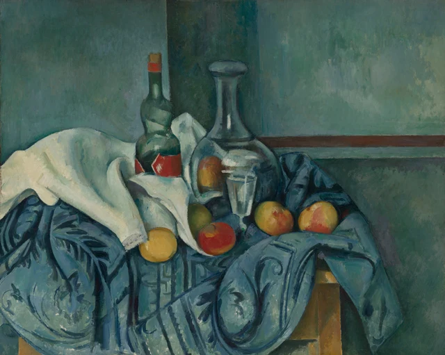
For this reading, what makes the still life worth sustained attention is that color keeps changing its role after we have identified the objects. A small red area can suggest fruit or become color seen through glass; a dark blue line can mark a pattern and also help a fold turn downward. Cézanne does not assign each material a fixed set of signs. We have to follow edges, colored areas and neighboring shapes to discover what a particular mark is doing here.
The painting dates from the 1890s. Cézanne had already exhibited with the Impressionists and, encouraged by Camille Pissarro, had adopted a brighter palette and worked outdoors. In his still lifes he repeatedly explored how adjacent tones could build volume, returning to familiar household objects in different arrangements. The useful historical point here is modest: these ordinary things gave him a sustained field of work on color, shape and position. Before following his influence into later art, we can look at how this particular bottle stands up. Cézanne’s practice; his still lifes
1 From the blue of a wall to the blue of a bottle
The upper part of the painting gives blue-green a large area to occupy. The wall is lighter on the left, darker in a vertical zone behind the carafe, then lighter again across the broad area to the right. Visible marks vary its color without giving it the billowing volume of the cloth below. A brown horizontal band on the right brings a measure of definition to these spreading color areas. The museum cautiously identifies it as possibly a chair rail. We do not need a complete architectural plan to sense a plane behind the objects.
Move your eyes sideways to the carafe. Its neck is made of gray-green, blue and dark tones too, but here the colors occupy a long, narrow shape. The sides draw inward below the flared mouth, then gradually open again toward the body. Pale vertical bands extend along the neck, with a small, nearly white stroke shining between them. Color has acquired boundaries and a direction. The cool tones dispersed across the wall gather into an upright vessel.
The mouth deserves attention. A pale horizontal oval sits above a dark rim. Its sideways extension checks the upward reach of the neck. Farther down, the two outside edges curve outward at the shoulders, and a dark band passes around the junction of neck and body. Narrowness, roundness and swelling each emerge at a particular meeting of colored areas. They are not supplied by an outline alone, with blue merely filling the space inside it.
The wall is doing active work in this process. If it were uniformly pale behind the carafe, the vessel’s light edges would not stand out as clearly. A uniformly black background would weaken its color relationship with the room. The uneven wall we actually see helps the outline emerge in some places and lets it approach the surrounding tones in others. The carafe remains distinct without being cut free from the cool-colored space around it.
2 Painting transparency in color
The body of the carafe has not been left blank. On its left is an oval of yellow-orange and reddish brown, as though the color of nearby fruit has entered the glass. Milky white and gray-blue bands cross the middle; the right side comes close to the blue cloth behind it. These are cues for things seen through glass and for reflections on it. The reproduction does not allow us to assign every mark a single, certain optical source.
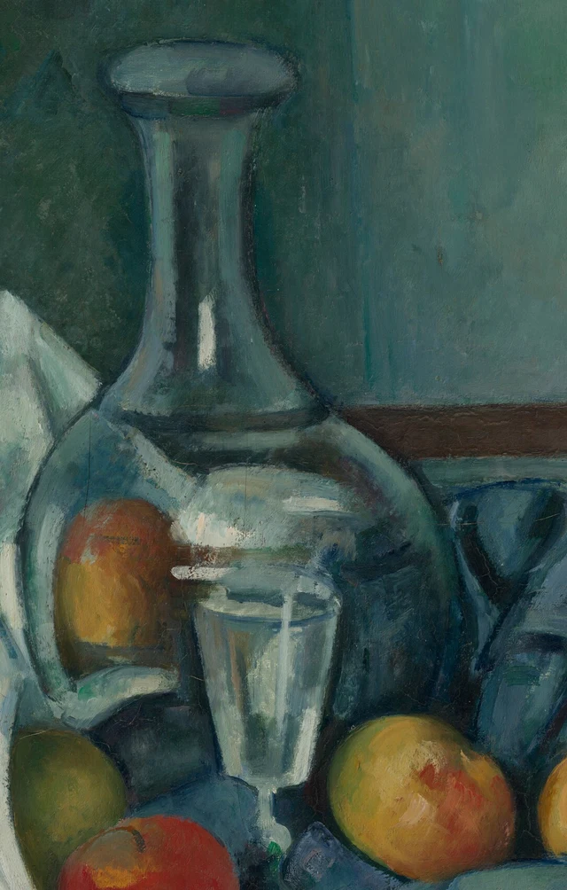
Transparency arises through these differences. We can follow the outside edges and assemble the carafe into a container, while continuing to recognize colors belonging to its surroundings within that container. It has a surface, yet seems to let our sight pass through. The pale curve at the lower left is especially useful: it contains the warm oval and joins a dark blue area. What might otherwise look like an independent piece of fruit is held within the glass’s curvature.
The stemmed glass in front uses fewer means. Its rim is a pale ellipse; its sides narrow downward; near-white vertical strokes pass through gray-green. The tones within it are uneven, and the bright outline does not continue unbroken all the way around. Below, a short stretch of the slender stem appears against dark blue, with green near its junction. These limited signs are enough to give us a thin-walled, upright glass.
The carafe opens out through broad curves and horizontal bands; the drinking glass comes forward through narrow bright edges. Several pale marks crowd together near the rim. Taken alone, a single stroke is hard to assign to either vessel; the narrowing sides help us find the glass again. Transparency is therefore not a property of each patch of color in isolation. Areas that look solid, or even resemble fruit, contribute to the appearance of glass through their relations with the carafe’s edges and neighboring bands of light.
3 Folding those colors into white cloth
The white cloth forms the broadest light area in the picture, although little of it approaches pure white. The expansive rise on the left has a creamy warmth; as it turns inward, it becomes gray-blue. Beside the peppermint bottle, a curled fold has a light outside and a dark interior. As the cloth drops, blue-gray marks run along its slope. We read it as white through its relative brightness and through the direction in which its connected light areas lead us.
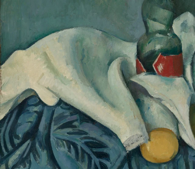
Compare two kinds of pale brushwork here. Bright bands in the glass are often interrupted by dark areas and compressed into relatively small spaces. In the white cloth, lighter paint spreads more broadly and connects into a slope the eye can follow. Near the yellow fruit, little gray marks break up the cloth’s edge. They differ from the longer vertical light along the carafe’s neck. Neither passage needs a minute inventory of surface texture. The scale and continuity of its marks, together with the dark colors nearby, establish a material distinction.
The white cloth also connects the different groups of objects. Its wide left-hand area bends toward the middle, changes direction below the bottle and then approaches the red fruit in a narrow light edge. It builds an irregular bright route through the cool, dark surroundings. The eye follows it for more reasons than its whiteness. Changes of width, turning diagonals and the red and yellow fruits interrupting its edge all contribute to the movement.
The green peppermint bottle beside it feels denser and more solid. There are pale green reflections on its shoulder and body, but dark color encloses most of its form. The tilted pale patch above and the red label below introduce flat-looking pieces absent from the carafe. The red label has defined corners, though pale strokes still cross its face. Within one object we encounter the curved bottle, the relatively flat label and shifting reflections. Differences of material do not simply correspond one-to-one with the names of things.
4 Pattern and folds share the blue
The blue textile occupies a substantial part of the foreground. It hangs from the tabletop and continues beyond the bottom of the canvas. Dark blue leaves, scrolls and stripes cover it: some turn down with the cloth, while others cross a lighter area. Two kinds of work need separating here. Some dark paint describes a pattern; some helps us read a hollow or a fold. The two can come very close and sometimes borrow one another’s shapes.
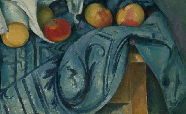
Just right of center, a scroll begins in a small curl, extends downward and closes within a larger arc. Outside it, a broader curved stretch of cloth drops toward the lower edge. The curve of the pattern and the curve of the fabric lie side by side. They can reinforce one another but can also make it temporarily difficult to tell which line belongs to decoration. Clarifying the distinction does not exhaust the passage. We then see cloth presenting a design while carrying that design through a bend.
Straighter stripes at the lower left set a different rhythm. A diagonal fold interrupts them, and their darkness and width vary as they descend. The exposed brown wood on the right supplies a simpler shape within the surrounding blue. Its straight edge looks hard and steady beside the large returning sweep of the cloth. Softness becomes more definite because it has a firmer neighbor with which to be compared.
Most of the tabletop is hidden. What is visible is sufficient for a spatial reading: vessels cluster above, textiles spread downward, and small areas of wood emerge between them to suggest support. Contact, overlap and changes in color do much of the work of making these objects occupy space.
The density of the lower half also gives the wall a compositional role. Two long-necked vessels rise out of the crowded patterning, with broader color areas around them in which to extend. Calling the lower passage merely “busy” would miss this distribution. Complexity gathers where things rest and cloth falls; the upright forms have room around them. The contrast is between kinds of visual activity as much as between objects.
5 What a little warm color can do
Yellow and red are not scattered evenly across the painting. A yellow fruit lies at the white cloth’s edge; a red one sits near the glass’s stem; two larger fruits to the right contain patches of yellow, orange and red. Higher up, the bottle’s lower red label and the touch of red near its top carry warmth into another register. They make a sequence of unevenly spaced pauses across the large blue-green field.
Each pause works differently. The yellow fruit at the lower left is a relatively concentrated area of warm light, made prominent by dark blue around it. The green fruit near the glass is closer in color to its setting. Its outline can be seen, but its color does not spring forward in the same way. On the right, red does not fill an entire round shape. It sits within yellow, beside darker lower areas and a few pale marks. Color changes position over the curved fruit; the uneven distribution helps us read its volume.
The label gives us a different red again. Its outline has corners and its color area is comparatively compact, answering the curves of the red fruit below. A phrase such as “warm–cool contrast” would file all these passages under one heading. Follow the reds and the same color changes jobs: the label’s corners hold it against a surface; changing color across fruit skin carries it around a volume; the carafe’s pale edge contains warmth within glass. The color’s name stays the same, while the relationships through which we recognize materials have changed several times.
This also changes the pace of looking at a still life. In the whole picture, bottle, glass and fruit quickly acquire names. Closer to a passage, those names no longer explain the marks before us. One bottle contains a curved surface, a label and reflections; one stretch of blue cloth contains pattern and hollows. We need to move from the detail to the object and back again. The things on the table have not moved, but recognizing them did not end with the first glance.
Ordinary objects thus offer something that sustains looking. Cézanne makes them definite enough to be recognized and felt as having weight, while leaving passages that become legible only through their surroundings. This is especially true of the blue cloth. Even after distinguishing dark pattern from dark fold, we can keep returning along the same curve, watching how the design rests on the fabric and how the fabric carries it downward. The painting’s richness lies in this repeated work of discrimination.
Optional reading Is pattern merely added decoration
Han Qin’s SAE, or Self-as-an-End, aesthetics distinguishes personal preference from the grounds an aesthetic judgment needs to explain. Borrowing that contemporary approach, we can ask a further question: if we like the blue scroll on the cloth, are we admiring only a design that could be moved elsewhere? How much does it have to do with the way this particular cloth hangs? SAE Judgment and Aesthetics
Start with the small curl at the top of the central scroll in Figure 4. It has its own beginning and end, completing a turn on a broader area of cloth. We need not treat every bend as a hollow to recognize this ornament. Look farther outward: the larger arc below the scroll lies beside a broader fold. As the eye turns with the pattern, it can also pick up the downward fall of the fabric. One passage gives the design an independent rhythm; another makes it part of our reading of volume.
The straighter stripes on the left offer another comparison. A diagonal fold interrupts them, changing their widths and directions. Here the cloth’s bend alters the pattern, while the breaks in the pattern help us read the bend. Return to the exposed wood on the right. The large fold beside it also draws support from the straight wooden edge and the light and dark planes; its volume does not depend entirely on the scroll. How much work each passage does needs looking at separately.
We can now question the claim that decoration is something added to form. In some parts of this painting the pattern does have a shape we can identify on its own. Elsewhere, an account of the fabric that omitted the design would miss cues through which the eye reads its folds. How far pattern can be separated from the cloth’s volume changes from place to place. The name “decoration” cannot settle it.
You may like the scroll’s turns, or prefer a plain textile. Beyond that preference, we can check how a particular patterned passage meets the cloth’s slopes, hollows and supports. Borrowing SAE here takes “I like this design” a step further into the relationships it inhabits. The question arises from our viewing today and is not used to infer Cézanne’s intentions.
Images and sources
The visual reading was made from the National Gallery of Art’s 4096 × 3271-pixel image, including inspection of the complete composition and its details. The full JPEG is preserved as downloaded. Three PNG details retain the decoded source pixels and embedded ICC color profile; they have not been resized, recolored, restored or generated. Screen viewing still differs from seeing the original.
Object information and image rights are documented in the collection record and CC0 Open Access policy. Open image rights do not grant unrestricted republication of museum essays. The interpretation here is independent and does not imply museum endorsement. See also References, Image credits.
