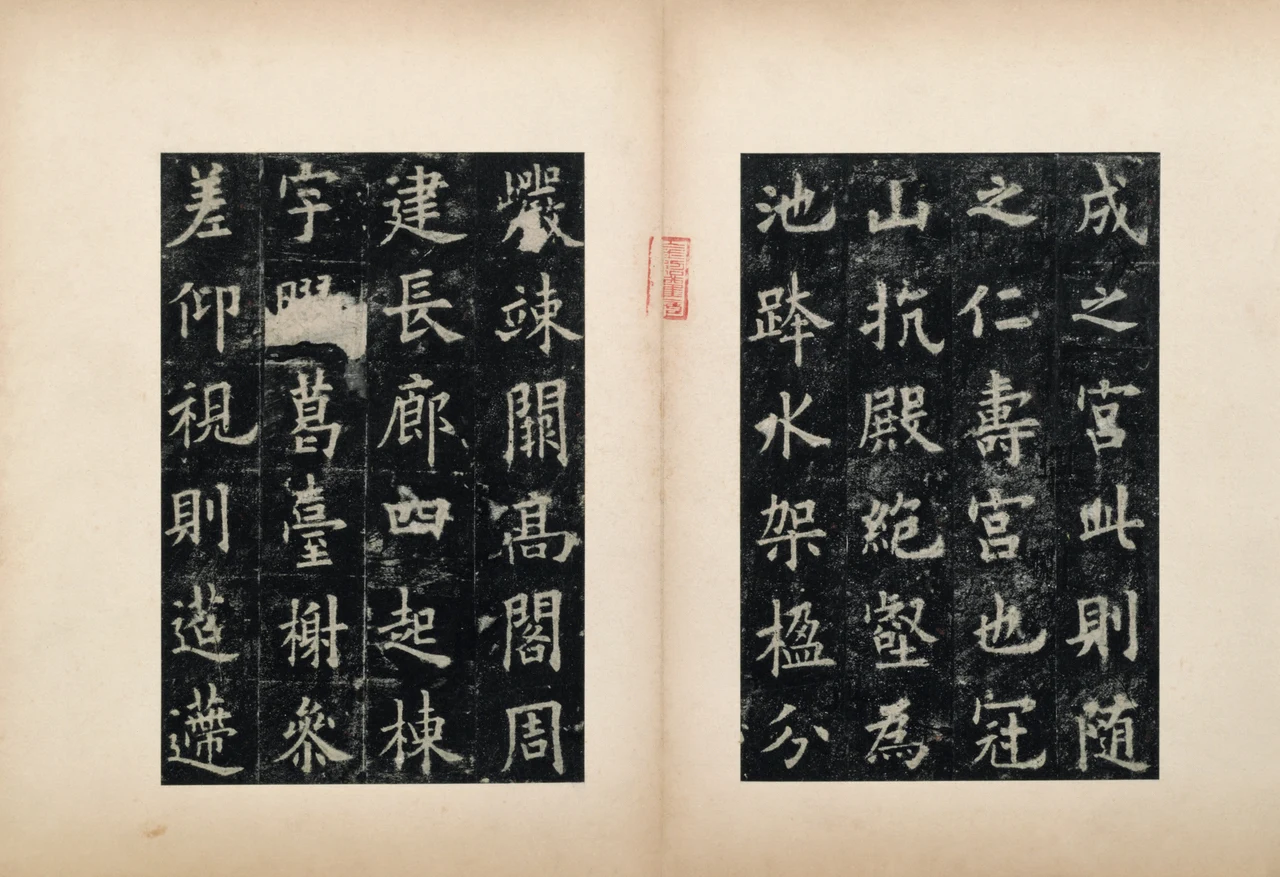
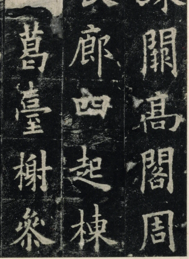
In 長廊四起, “long corridors extend in all four directions,” 四, “four,” spreads sideways without becoming tall. Find it in the middle column of Figure 1, below 廊, “corridor,” and above 起, “rise.” Within its white enclosure, short strokes divide the black into smaller areas: narrower on the left, more horizontally extended on the right. Once the eye rests on those dark shapes, 四 becomes more than an outline bounded by four sides.
Its neighbour to the right, 高, “high,” also contains enclosures, but stacks several small spaces vertically. To the left, 臺, “terrace,” stacks still more short strokes. The three characters meet at approximately the same level without dividing their interiors in the same way. The low, wide shape of 四 becomes clearer beside their height and density.
Here the strokes are white and the spaces inside the characters are black. We are looking at a Song-dynasty rubbing of the Inscription on the Sweet Spring at Jiucheng Palace, formerly in the collection of Li Qi in the Ming dynasty and now in the Palace Museum, Beijing. This is not ink that Ouyang Xun personally put on this sheet. The white characters correspond to grooves cut into stone. Ink applied to paper pressed against the stone leaves the recessed parts uninked, showing the colour of the paper. Stone left uncut between the strokes acquires a black shape in the rubbing.
Those dark shapes seem to me the best place to begin. They show that the compactness of Ouyang’s regular script does not depend on filling every character completely. Strokes of different lengths enclose, divide and make room for areas of different sizes. The characters hold together through these unequal relationships.
Ink falls around the writing
First clarify this change in how we look. To make an ink rubbing of a recessed inscription, paper is generally dampened, laid on the stone and tamped or brushed into contact with its relief. Ink is then applied to the paper corresponding to the higher surface. When lifted, the writing reads the right way round: the incised strokes are light, their surroundings dark. The process differs from filling grooves with ink and printing from them; it does not reverse the characters left to right. Palace Museum, “Rubbing”; Musée Cernuschi, the rubbing technique
The black inside 四 in Figure 1 is therefore not a blob that Ouyang painted in. It makes the distance between strokes visible. The widths of light and dark need to be seen together. Following only the white contours, stroke by stroke, can turn each stroke into an isolated component. Looking back at the black shows how those components approach one another without closing everything up.
In 廊, “corridor,” immediately above 四, a line descends obliquely at the left, while a long vertical stands on the right; white strokes alternate with narrow dark intervals between them. At 四, the height contracts and the surrounding black widens. Below it, the final part of 起, “rise,” extends to the right. Then the central vertical and oblique strokes of 棟, “roof beam,” spread the character again. Their centres broadly follow the same column, while their margins keep changing. We can continue reading downward without requiring every character to become an identically sized white block.
This rubbing has been cut and mounted, distributing sections of the inscription across album pages. Ruling and joins in the image also need to be distinguished. We can still compare interiors and close neighbours, but the outer edges and page turns are not the original column endings on the Tang stone. At page scale, the calligraphy now carries the dimensions of carving, rubbing and album mounting together.
Wei Zheng composed the inscription, Ouyang Xun wrote it, and the stele was erected in 632. The text describes the palace, Emperor Taizong’s summer retreat and the discovery of a sweet spring, ending in praise together with admonition. This essay examines passages visible in the album’s public photographs; it does not supplement them with another rubbing to suggest a complete view of the original stone. Palace Museum catalogue entry
From “water” to “erect”: openings have shapes too
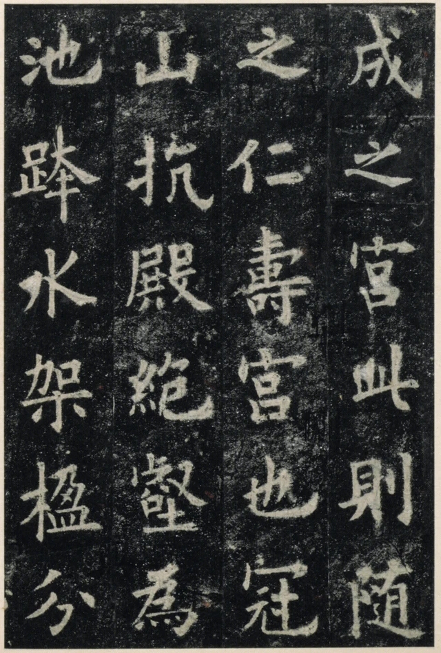
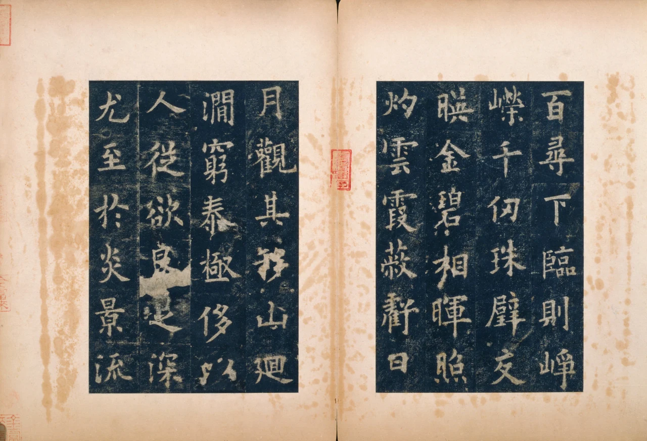
Find 水, “water,” below 跨, “span,” in the leftmost column. A central stroke descends while oblique strokes extend out from its middle. There is no enclosing frame, so black enters between the white strokes from outside, forming intervals with different widths and points. Above and below the white stroke extending down to the right, the dark openings face different directions.
In the next character, 架, “erect,” the short strokes of the upper component 加 gather together. Below them, 木, “wood,” sends a vertical downward and oblique strokes out to either side. 架 adds a horizontal tier absent from 水, yet does not fill its entire area. The eye moves from the black centre of the little 口, “mouth,” at upper right, to the dark areas beside the lower vertical: from a relatively enclosed space to an open one.
In the neighbouring 殿, “hall,” and the 絕, “cut off,” and 壑, “ravine,” below it, several components occupy their own places. The black between white lines becomes more finely divided. 水 has few strokes, allowing dark areas to enter broadly from outside. 壑 has many, dividing the black into narrow gaps and small patches. They still occupy comparable positions in the column; character size does not expand in direct proportion to stroke count. Sparse forms avoid looking stranded, while dense ones remain open to the eye.
“Draw the centre tight and extend on all sides” is quickly read as a calligraphic maxim. On this page it has particular things to answer to: where the strokes of 水 meet, how the upper part of 架 sits on 木, how the bottom of 壑 closes with a horizontal. Each gathers and opens differently. One identical centre and four identical corners cannot be drawn for all of them.
The text here describes palace buildings. The complete passage relevant to Figures 1–3 follows, transcribed in standard simplified characters with modern punctuation. Its printed divisions do not imitate the album’s columns:
此则隋之仁寿宫也。冠山抗殿,绝壑为池,跨水架楹,分岩耸阙,高阁周建,长廊四起,栋宇胶葛,台榭参差。仰视则迢递百寻,下临则峥嵘千仞,珠璧交映,金碧相晖,照灼云霞,蔽亏日月。观其移山回涧,穷泰极侈,以人从欲,良足深尤。
This was the Sui dynasty’s Renshou Palace. High halls crown the mountains; deep ravines are dammed to make pools. Pillars span the waters, and rocks are divided to raise lofty gate towers. High pavilions encircle the site; long corridors extend in all four directions. Buildings interlace, and terraces and pavilions rise at different levels. Looking up, one sees structures soaring a hundred xun; looking down, precipices descend a thousand ren. Pearls and jade reflect one another; gold and green shine together, their brilliance illuminating clouds and rosy vapours, the buildings eclipsing sun and moon. When one considers how mountains were moved and streams diverted, extravagance taken to its limit and human labour made to serve desire, there is indeed much to condemn. Xun and ren are ancient measures of length, used here to express extraordinary height and depth.
The passage first makes the buildings appear magnificently sumptuous, then turns to what they have cost. 四 in 長廊四起 denotes the four directions; the low, broad 四 in Figure 1 remains a particular visible form. “Four directions” is the orientation supplied by meaning; the broad shape is what this character presents on the rubbing. The language supplies objects and judgements, while close looking lets its sentences acquire visible weight character by character.
Several kinds of density before “eclipsing sun and moon”
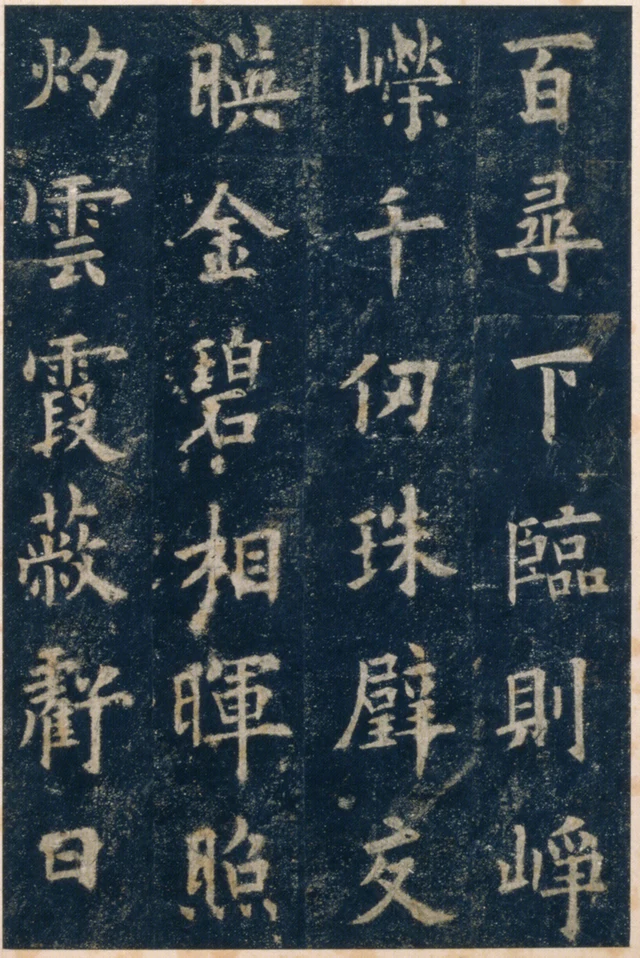
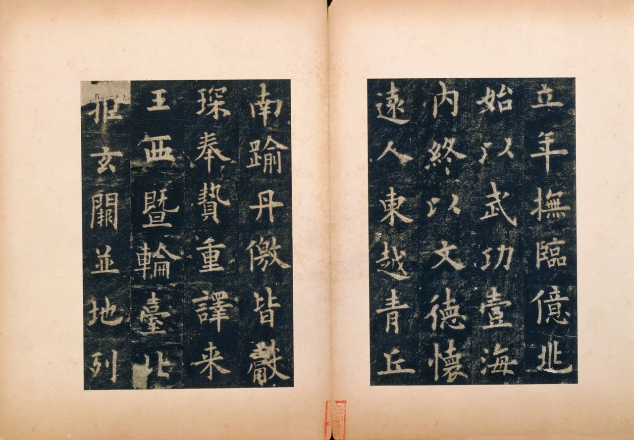
Read down the leftmost column from 灼, “shine,” through 雲, “clouds,” 霞, “rosy clouds,” 蔽, “cover,” 虧, “obscure,” and 日, “sun.” 雲 and 霞 share the rain component at the top, but differ markedly below it. The lower part of 雲 spreads sideways. The lower part of 霞 has more turns, with small dark spaces on both sides. A similar covering at the top has not made the spaces below it identical.
蔽, “cover,” changes the organisation again. Its grass component occupies the top horizontally; beneath, left and right parts stand side by side, with white strokes extending obliquely outward. In the following 虧, “obscure,” the left is complex, the right has fewer strokes, and a long turning stroke descends. A dense side and a relatively open side share a narrow, elongated form, giving it a distinctly uneven distribution of weight.
At 日, “sun,” at the foot of the column, the change becomes abrupt. Its white frame is smaller, with only one horizontal dividing the black inside. The preceding layers of turns resolve into a few edges. The surrounding dark does not swallow the little character; it makes its compactness and coherence more distinct.
What matters in this column is more than the arrival of a simple character after complex ones. We need to see how 雲, 霞, 蔽 and 虧 are each complex: stacked vertically, arranged side by side, dense on one side and sparse on the other. Returning to them after 日, the thin dark intervals become more than background left over among “many strokes.”
The museum points to the preservation of 蔽虧 and the earlier 四 in identifying this old rubbing’s importance. Here many dark boundaries between white strokes remain clearly visible. If the grooves in the stone wear or are recut, the boundaries transferred to paper change too. An early rubbing has value partly because it preserves the stone’s shape at a particular stage. The stone’s survival today does not make every newly taken character closer to its initial carving than the old sheet is.
The grey-white specks, pale horizontal traces and breaks at character edges are not all the same kind of thing either. Stone, paper, inking and later preservation all participate in the image. Here we can directly compare contours and intervals; assigning a cause to one particular speck would require further evidence. That limit does not prevent us from seeing the low breadth of 四, the uneven weighting of 虧, or the dark interior of 日.
The changing density of 文德懷
The following part praises Taizong. The sentences relevant to Figure 4 read:
皇帝爰在弱冠,经营四方,逮乎立年,抚临亿兆,始以武功壹海内,终以文德怀远人。
From the age of about twenty, the emperor ordered affairs throughout the realm. By about thirty he ruled over the multitude. First, through military achievement, he unified all within the seas; thereafter, through civil culture and virtuous government, he won over distant peoples. 弱冠 and 立年 invoke the conventional life stages of twenty and thirty; 亿兆 means the vast population. These are the inscription’s terms of praise.
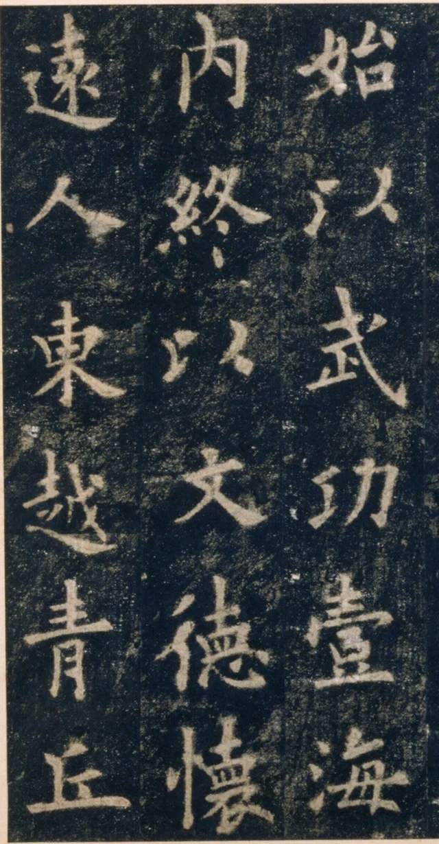
Find 文, “civil culture,” in the middle column. Its top dot and horizontal are relatively short; below, two oblique strokes separate to left and right, with the broadest part in the lower half. Black enters between the obliques from beneath like a wedge. Outside them, distance remains from the neighbouring characters. The expansion has definite directions rather than spreading evenly on every side.
德, “virtue,” directly below, becomes dense immediately. On the left, the 彳 component stands through short obliques and a descending stroke; on the right, several components are stacked. In 懷, “win over,” below that, the left is narrower and the right longer, with fine interior strokes concentrated together before the bottom opens outward. Within one column, 文德懷 moves from openness towards density, while the proportions of its left and right parts also change.
功, “achievement,” on the right and 越, “go beyond,” on the left have long lines and turns of their own. Only with all three columns together can we see that the long obliques of 文 are not an isolated display: their ends stop within dark areas left by the surrounding forms. The area a character occupies and the area it leaves to its neighbours are established together.
To me, this measured relationship is among the most persuasive qualities of Ouyang’s regular script in this album. Uprightness has not become an inert grid. The characters’ centres can continue along a column while their interiors remain asymmetrical; the direction of the column is clear while its contours widen and narrow. Once these differences are visible, “strict order” becomes more than praise. It names something established jointly by sizes, directions and spaces.
Return to 四. Its black interior now does more than sit behind white strokes: it shows how the strokes coexist. Carving and rubbing still stand between us and the original act of writing. This old sheet has carried those relationships into the present, allowing us, after reading about palaces and emperors, to keep looking at a small dark shape left within a character.
Optional further reading: which step can we trace between black and white?
Look first at 水, “water,” in Figure 2, then at 霞, “rosy clouds,” in Figure 3. This time, hold back the labels light, heavy, quick and slow. Point to one place in each: where white strokes meet, where black enters, and where it is enclosed.
In “The Wood Still Holds That Dry Year”, I wrote that reading tree rings requires checking materials and sequences; a narrow ring alone does not warrant supplying it with a drought. The “beauty of causation” in SAE, Self-as-an-End, asks here: which identifiable processes has the shape before us passed through?
For this album, the first step we can clearly describe is how lines incised in stone become light on rubbing paper, and how the stone between those lines becomes dark. Knowing that, we return to the black inside 四 and see more than a number. We also see something of how rubbing has transmitted the character’s form.
There is no obligation to explain every trace. Describe one checkable step accurately, and what remains can stay open to further looking and research. The old paper’s history makes its black and white more particular. Their beauty still has to occur in the different arrangements of individual characters.
The chosen rubbing, text and images
- The object is the Palace Museum, Beijing’s Northern Song rubbing formerly owned by Li Qi, accession 新00044517. It is cut and mounted with white paper borders, in twenty-six openings; each half-opening measures 20.9 × 13.9 cm. The date 632 belongs to the Tang stele, not to this paper rubbing. Wei Zheng, the text’s author, and Ouyang Xun, its calligrapher, have separate roles.
- All four close-reading details and three whole-opening views come from three museum photographs of this same album. The digital catalogue’s five image entries include duplicate openings. This essay does not claim to have inspected all twenty-six openings.
- Processing comprises assembly of the official display tiles in their original coordinates, rectangular cropping, proportional reduction and JPEG encoding. No strokes, damage, seals or colours were retouched; no sharpening or tonal inversion was applied. Neighbouring characters retain their positions. Joins, paper colour and collectors’ seals are not treated as Ouyang’s brushwork.
- The Chinese excerpts use standard modern forms, retain 壹, and use 璧 for a jade disc. The photograph’s 暎 corresponds to 映, “reflect”; 雲, 虧, 臺, 棟 and 懷 correspond to simplified 云, 亏, 台, 栋 and 怀, meaning “cloud,” “obscure,” “terrace,” “roof beam” and “win over.” Both excerpts are translated in full. Printed punctuation does not reproduce the stele’s or album’s columns.
- Wording was checked against the catalogue transcription of another Song rubbing in the National Palace Museum, Taipei. Its photographs, dimensions and version identification were not transferred to this object. The Beijing catalogue page 234546 mentions “the seventh Zhenguan year” when retelling the discovery of the spring, conflicting with its own erection date and the inscription’s opening “sixth year.” This essay uses 632 without constructing another chronology from that phrase.
- This is close reading of digital images, not a record of examining the physical object. No separate written museum permission has been obtained for public publication or commercial reuse of these images. Attribution, crop coordinates and permissions are documented in the accompanying image notes.
Whole palace opening; whole clouds opening; whole civil-virtue opening. Each shows a separately photographed album opening, not a reconstructed view of the entire stele. Read the right page before the left, columns from right to left, and characters downward.