On the same album opening, 孝, “filial devotion,” and 季, “youngest,” both carry the component 子, “child.” At the top of the middle column on the left-hand leaf, the upper part of 孝 spreads horizontally while its 子 is kept very short. In 季, the fourth character down the far-left column, the lower part descends and turns left in a long curve. The shared lower component, not a shared meaning, is what we are comparing. Related structures have not been made into identical shapes: one is low and broad; the other turns breadth into a downward journey.
Now look beside them. Below 孝 is 之, a grammatical connective, extending diagonally down to the right; below that, the verticals in 性, “disposition,” narrow the form. Above 季 is 養, “to care for,” with its stacked horizontals; below it comes 祖, “ancestor.” These related components are not presenting their two gestures in isolation. They also make the distances between neighboring characters perceptibly different.
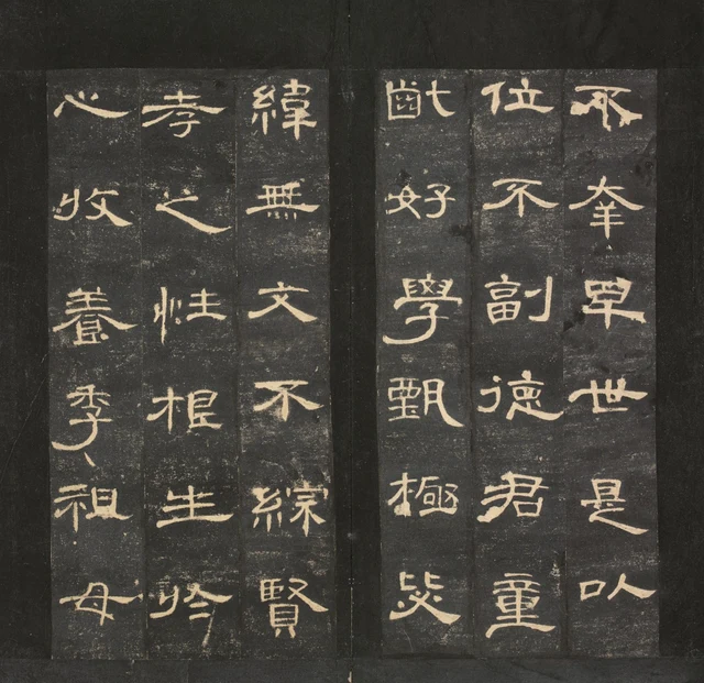
The passage 孝之性,根生于心,收养季祖母 says that filial devotion sprang from Cao Quan’s heart and records his care for the elderly family member described as 季祖母. Both 孝 and 季 are organized around 子 below. Against the dark rubbing ink, their pale incised forms first make their related upper-and-lower organization conspicuous. The extended curve belongs to this particular writing of 季.
Look at the two columns together. 之 sends its long stroke towards the lower right, while the curve at the bottom of 季 turns back to the left. The long strokes do not all fly in the same direction: one moves diagonally outwards, another descends and returns. On the same album opening, related components and their neighboring characters offer different paths. The Cao Quan Stele’s expansiveness lies in these differences of direction, extension and return.
First distinguish the Han stone from the Ming album
The original stele was erected in the tenth month of 185, the second Zhongping year of the Eastern Han. It records the ancestry and official achievements of Cao Quan, magistrate of Heyang (郃陽). The stone is now in Xi’an’s Beilin Museum. Our object is the Palace Museum’s rubbing, accession 新00045355: an early impression taken after the stone’s excavation in the Ming dynasty, before the stone broke. The rubbing was cut and mounted as an album and later belonged to Wang Hongzhuan. The dates of carving, rubbing, mounting, and photography must not be collapsed into one. Palace Museum collection record
The writing is pale and the ground black. This is not a manuscript that Cao Quan or a calligrapher wrote in white ink on black paper. Rubbing translates the recessed characters and the surrounding stone surface into this relationship of light and dark. Paper, ink, stone, and carving all mediate our approach to the earlier writing. When discussing thickness, turns, and opening or closing forms, we should not treat every broken patch as the brush’s original dry-brush texture.
Each illustration shows a complete album opening: two leaves with three columns each, read down each column and from right to left. The visible joins, edges of narrow strips, and gap between the leaves belong to the cut-and-mounted object. Characters now placed side by side can be compared, but they were not necessarily neighboring long columns on the stone. Nor can a turn after six characters be attributed to a deliberate pause by the Han calligrapher. We begin with the actual rubbing before us, while keeping this distinction when discussing the stone’s original layout.
Four instances of 或, without becoming a stamped pattern
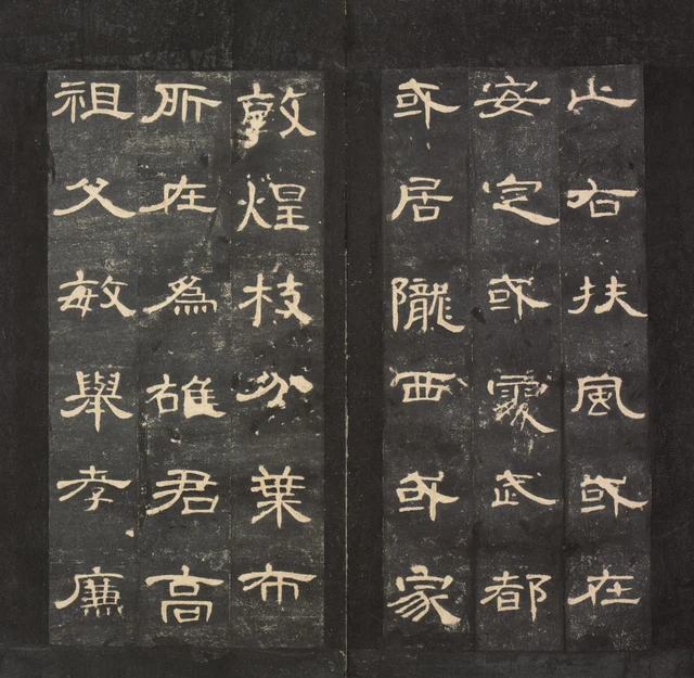
The passage reads: 或在安定,或处武都,或居陇西,或家敦煌。枝分叶布,所在为雄. “Some were in Anding, some settled in Wudu, some lived in Longxi, and some made their homes in Dunhuang. They spread like branches and leaves, becoming prominent wherever they were.” This is a celebration of the Cao clan’s ancestry. It explains the repeated 或, “some,” while reminding us that the characters carry a purposeful public narrative.
All four 或 extend horizontally, yet none simply fills a ready-made frame. In the topmost example in the right leaf’s left column, the small central 口, “mouth” or enclosure, is clear; the diagonal reaching right establishes another layer above and beside it. Lower down that same column, the balance between these parts has shifted slightly. In the rightmost column, 或 follows 風, “wind”: its upper horizontal and diagonal spread outward while 口 stays within a tighter center. The same identifying features recur, but the dark spaces between them are different.
Look first only at 口, then at its distance from the far-right tip. That small space is not waste ground left over after the character was completed. The compact 口 makes the outward-reaching stroke seem longer. If the interior were stretched just as far, the character might grow larger without retaining this sensation of release from a tight center.
The left leaf presents another contrast. 葉, “leaves,” has many strokes, its horizontals crossing and gathering around a central vertical. The following 布, “to spread,” has fewer strokes: its top extends to either side, while the lower part exposes larger dark intervals. The two have not been given the same density.
Two instances of 于 give the horizontal stroke different room
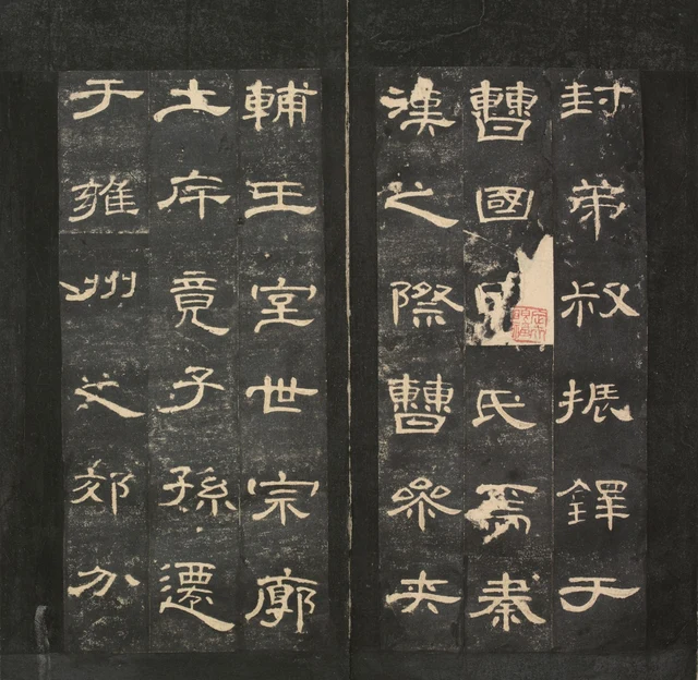
These two 于, a preposition meaning “in,” “at,” or “to,” use fewer strokes than 或. In the example at the lower right, a shorter upper horizontal and an extended lower horizontal create distinct levels; the vertical bends toward the lower left. In the second 于, at the upper left, the balance between horizontal extension and the returning curve changes again. Both establish a definite space with very few lines.
Set beside them is 曹, the clan name, at the top of the right leaf’s middle column. Its upper and lower parts stack in layers, enclosing several small spaces. The following 國 gathers its interior within an outer frame. The breadth of sparse characters and the compactness of complex ones coexist on this opening. To describe the Cao Quan Stele merely as “flattened” would miss these different ways of organizing a character.
The traditional clerical-script term 波磔, bōzhé, refers here to a stroke’s movement from a narrower section toward a wider one and its lifted ending. Look at the bottom horizontal of 王, “king,” on the left leaf: it is not a uniform ruler-straight line. In the lower part of 土, “earth,” one can also find differences between the middle and the ends. Stability does not require every section to be level. Local rises and falls belong to a character that remains settled as a whole.
The familiar phrase 蚕头燕尾, “silkworm head and swallow tail,” can help a beginner find differences between a stroke’s beginning and end. But an eye busy searching for a swallow tail in every character may notice only its most conspicuous extremity. Here we also need to see how much dark ground remains beneath the horizontal, where a vertical crosses it, and how shorter strokes avoid competing with the principal stroke for the same space. Expansion means not only that one stroke is long, but that the others have not all filled the surrounding area.
A very small 七 does not look empty
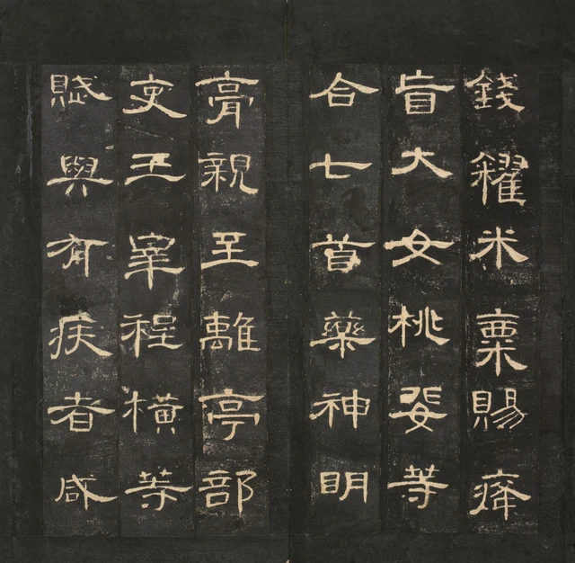
七 uses very few lines. Its horizontal reaches far to the right, while the other stroke turns to define a low corner. Above it, 合, “combine,” gathers a covering shape over a small 口; beneath it, 首 places several horizontals within a more vertical structure. Although 七 has so many fewer strokes, it does not leave a hole demanding to be filled. Its endings, turn, and surrounding space already form a sufficiently distinct relationship.
This passage concerns assistance to the population and the preparation of medicines. 神明 continues across the column break into 膏, forming the name Shenming ointment; it is not a separate phrase praising efficacy. 七首 is retained from the museum transcription without settling its numerical interpretation or alternative readings. The rubbing lets us see how 七, 首, and 藥, “medicine,” hold their places at different levels of complexity.
親 on the left leaf carries a different visual weight. Its numerous strokes have not squeezed it into a pale lump; dark intervals remain between its left and right sections. In the neighboring column, 王 is defined by several horizontals and a central vertical, contrasting with 親’s lateral division. A sparse character need not be filled up to become complete, and a dense one need not be compressed into a mass to become compact. The traditional impression of refined, supple grace becomes concrete when lines can turn and spaces remain distinguishable, rather than merely when a photograph looks soft.
Sun Chengze praised the stele as 字法遒秀,逸致翩翩: “Its character forms are vigorous and refined, its untrammeled grace lightly poised.” To understand 秀, “refined,” simply as prettiness would be too quick. 遒, “vigorous,” reminds us that rounded and extended lines still have an organizing framework. The old judgment remains useful because it puts together two sensations that can seem opposed. The tight centers and outward release of the four 或, and the few but cohering lines of 七, offer concrete occasions to reconsider it. Sun Chengze’s appraisal quoted by the Palace Museum
Return to the first two characters
Return to Figure 1 and look separately at the upper and lower parts of 孝 and 季. After identifying them, comparison can continue: how does each upper part cover the lower, how does 子 contract or extend downward, and what distances do these choices establish beside 之, 養, and 祖? Recognizing meaning has not canceled formal discovery. It gives that discovery a firmer footing.
The Cao Quan Stele is often used as an introduction to clerical script. Becoming familiar with it need not begin by memorizing a set of stylistic adjectives. Start with something smaller: identify one character, keep its neighbors in view, then find another related structure. Breadth does not mean lengthening every stroke; order does not mean copying identical forms. The stele gives each character its own sense of scale while allowing these differences to inhabit the same luminous, restrained order.
Optional reading: After recognizing a name, can the eye stay a little longer?
In As the Light Fades, the Garden Appears Differently, I wrote that knowing a name can help us look, but can also bring looking to a premature end. Figure 3 offers a concrete exercise. First find the long horizontal in 于; then look at the small spaces inside 曹. Having just returned from breadth, does the compact area seem tighter? Reverse the journey, from 曹 to 于: do the sparse character’s open areas acquire more weight?
The characters have not changed; the order in which we compare them has. In discussing perception, the SAE framework distinguishes beauty, pleasure, and understanding. Here it is useful simply as a way to let looking continue its own work after recognition. 于 does not acquire its long horizontal because we judge it refined, and 曹 does not lose its internal intervals when we know it is a surname. By letting the eye move back and forth, we can bring the extending lines and contained spaces into one judgment. SAE Judgment and Aesthetics
Edition, reading, and image notes
This essay is based on official high-resolution photographs, not an examination of the original in person. The four illustrations are proportionately reduced photographs of complete album openings, preserving mounting joins, paper damage, and collectors’ seals. No characters were repaired, seals removed, colors changed, or strokes generated. The high-resolution images were reconstructed from the museum’s public Deep Zoom tiles at their original coordinates; see IMAGE_NOTES for the processing record. The embedded images cannot support precise measurement of the original stone.
The Palace Museum page is headed 明初拓东汉曹全碑, but its descriptive text says the stone was excavated early in the Wanli reign and calls this a 明代出土初拓未断本, an early post-excavation Ming rubbing taken before the stone broke. This essay follows the chronology in that description and does not translate the title as a rubbing made in the early Ming dynasty. The stone dates to 185; the paper before us is not Han-period paper.
Quoted passages are set in familiar modern character forms, with editorial punctuation. The photographs remain the reference for the actual glyphs. 孝 and 季 are similar in structure, and their positions are specified beneath Figure 1; resemblance does not replace textual identification. Graphic differences such as 于/於 are retained where relevant. The damage, patching, and red seal in Figure 3 belong to the object’s material and collecting history; their sequence cannot be established from color alone.
Image rights remain with the Palace Museum and other relevant rights holders. No republication permission has been obtained for this package, and no open license is claimed. Rights must be checked separately before public redistribution or commercial publication.
In Figure 4, 七首 follows the museum transcription and is not expanded into “seven prescriptions.” The character below 親 is 至; 王 is in the next column. 神明膏 is read across the column break as a medicinal name.