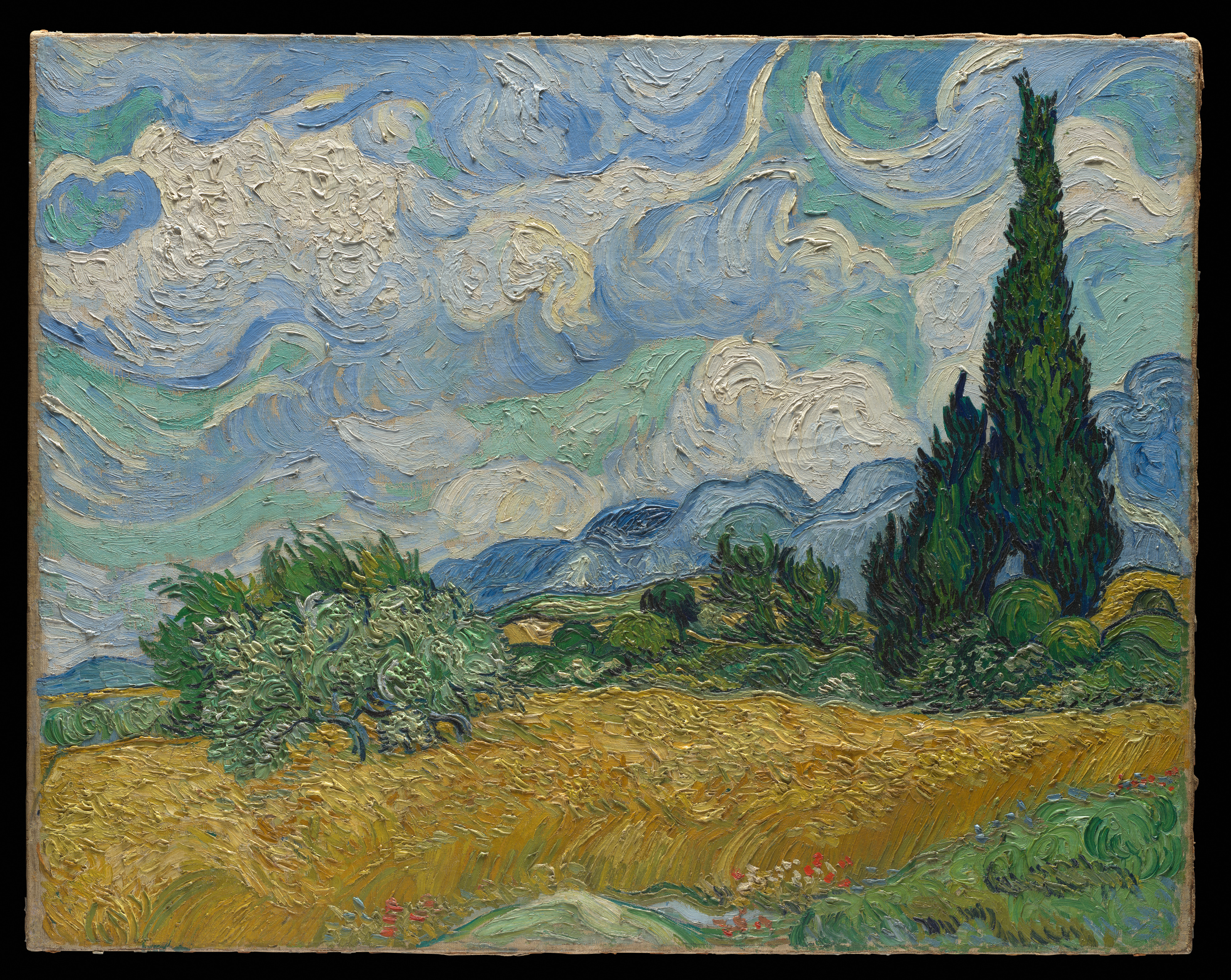
Start with the white clouds above the blue ridge. They belong to the distant sky, yet the white paint has clear grooves and crests that seem closer to the eye than the hills. Look down again: the golden wheat, silvery-green olive tree and dark cypresses still arrange the landscape in depth. One of its farthest regions is also one of the most conspicuous parts of the painted surface.
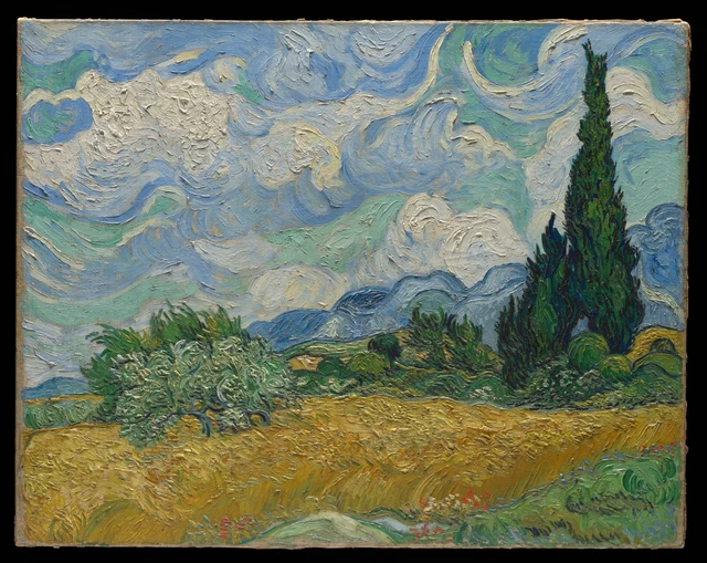
This reading follows two kinds of distance that do not quite coincide. The landscape leads our eyes past the wheat and shrubs toward hills and sky; raised paint keeps returning them to the surface. The strength of Van Gogh’s painting lies in both routes remaining open. Thick paint does not bring the clouds down in front of the field, and the sky’s vastness does not make that substantial white disappear from view.
Van Gogh painted this work at Saint-Rémy in southern France in 1889. The Met’s canvas is the initial oil study made before the motif. In September he produced two further painted versions in the studio, one of which is now in London’s National Gallery. Our subject throughout is the New York painting, cataloged as F717. Technical research connects it with a reed-pen drawing sent to Theo on July 2, establishing that this canvas had been completed before that date. This history matters because a similar composition can offer a different experience when the handling of paint changes. Charlotte Hale, Technical Notes, 2016
1 The sky is distant and the white is close
White in the sky rewards sustained attention. Some cloud formations consist of short, crowded ridges; others spread into long, broad arcs. They are not repetitions of one curling pattern. Denser white on the left opens toward the center, while the large bend at upper right encloses conspicuous blue-green spaces. Follow a white edge and its turns and pace keep changing.
Blue helps make these forms. It is more than a passive backdrop. Sometimes it turns alongside white; sometimes a turquoise passage cuts between two cloud groups. The sky’s movement occurs within the colored bands as well as along cloud outlines. Blue, green and white work through their changing widths and adjacent directions.
These colored bands depict clouds while showing the shapes of the paint itself. In the landscape, clouds are far away, beyond the hills. As paint, their thick white ridges seem unusually close. Grooves, crests and edges make them appear almost more tangible than the blue mountains. We can follow the white into an imagined expanse of sky, or stop on a crest and begin looking at how the paint rises.
The Met’s technical study identifies the white clouds among the most heavily impastoed areas and describes broad, curved handling in the sky. This evidence supports attention to the paint’s relief. A photograph cannot, however, replace moving in front of the original, and it cannot establish the surface’s actual gloss.
This closeness of the surface has not yet explained distance within the picture. On the right, dark cypresses stand in front of the clouds; below them, the narrow blue ridge sets the sky farther away. Although the white is brighter and more prominent, the clouds remain behind. Looking next at the ridge and olive tree reveals cues that sustain this distance.
2 How the hills remain behind the tree
The silvery-green olive tree on the left helps us see how near and far connect. Its crown spreads sideways, with bright, twisting marks clustered among the branches. Only sections of the dark trunk show as it enters the yellow field. Beside the narrow cypresses, its shape is low and broad, with a more broken edge. Above and on either side of the canopy, we can still find the blue ridge passing behind it.
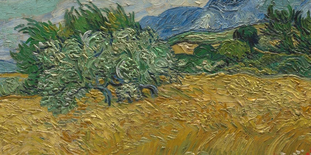
The olive foliage is dense, but abundant pale paint and small gaps disperse its dark areas. It lacks the concentrated weight of the cypresses. Where tree and field meet, branches and leaves reach outward individually, with yellow appearing between them. Their irregular boundary does not erase depth: foliage overlaps the yellow, while glimpses of yellow help us imagine the field continuing behind the tree.
Behind the tree, the blue ridge rises and falls across the landscape. Its long contour answers the curves above, while its narrow, extended shape leads the eye sideways. It gives us a legible distance: beyond the olive tree, shrubs and field lies cooler blue, and above that, the more open sky. Forceful paint marks throughout the surface do not prevent these spatial relationships from taking hold.
Depth therefore does not depend entirely on making distant things smooth or indistinct. The ridge retains clear marks; beyond that narrower, cooler blue, the clouds carry thicker paint still. Overlap, position, color relationships and the sizes of forms maintain distance together. Paint can remain visibly present while placing one part of the landscape behind another.
3 The wheat brings the eye back toward us
Move down from the olive tree into the broad gold area at the bottom. At a distance, the field resembles a single wave lifting to the right. Closer looking breaks that wave into many passages. Near the lower edge, long, slanting strokes run side by side through relatively even ochre. Toward the field’s upper boundary, the marks become more closely packed hooks, folds and small knots. We read stalks and ears in them, and feel their different weights: stems extend, while heads of grain cluster.
The field does not obey a single directional arrow. Lines in the lower left bend one way; bunches of diagonal strokes in the middle take another course; those farther right develop a more pronounced lean. Their neighboring directions make the long yellow band undulate. Wind passing through wheat is a natural association. Treating every mark as an exact record of the same gust would ask more of the image than it can tell us.
Green and gray-blue appear within the yellow. Sometimes a cool color is a narrow slit; elsewhere a green stroke emerges more distinctly. These interruptions vary the field’s density, keeping the bright area from becoming a solid, unbroken plane. Its gold is the overall effect of many warm colors beside a smaller number of cool ones, rather than the name of one uniform paint color.
At the bottom, wheat meets foreground grass. In the lower right, green strokes loop and double back; they are broader and rounder than the stems. A few red flowers punctuate the meeting of grass and wheat. They occupy little space but draw the eye toward the near edge. Just as the yellow field carries us into the distance, these small, distinguishable red marks bring another scale into view.
Here, too, the idea that nearer things must be painted more thickly meets resistance. Several bunches of stalks near the lower edge cross relatively even ochre, while dense raised marks gather along the field’s more distant upper edge. We still read land extending away from us: foreground grass overlaps it, the olive tree enters its upper boundary, and long stalks and crowded ears supply different scales. Within the field, spatial distance and paint thickness do not follow a single sequence either.
4 The cypresses connect two kinds of distance
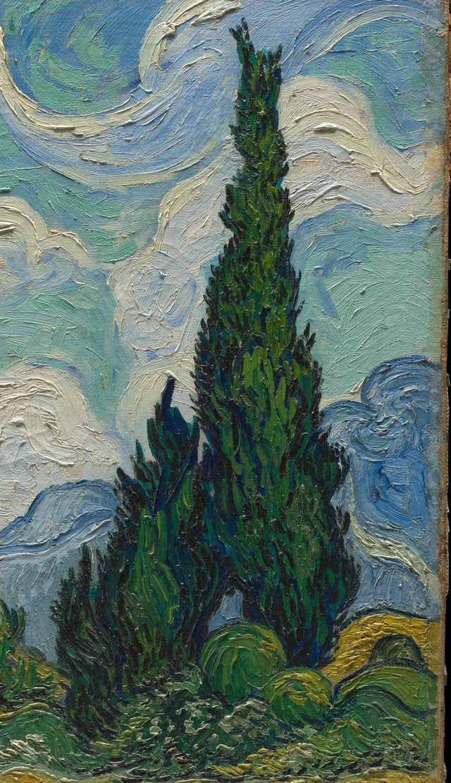
On the right, the cypresses abruptly change the direction of looking. Wheat crosses the canvas, and the blue ridge is largely horizontal; the trees rise out of dense shrubs, carrying the lower dark green into the sky. Their off-center position keeps them from dividing the picture into symmetrical halves. Following them upward takes the eye from the ground to the height of the clouds. Yet the trees remain in front of those clouds, and their bases stay among the low shrubs.
The dark area is far from uniform. Brighter green lies between deep blue and near-black, and narrow marks point upward or flick outward. The crown narrows as a whole while containing many smaller directions. This combination gives the tree solidity and animation: it is a mass of densely assembled foliage, not a silhouette filled with black.
Compare the boundary between tree and cloud. Inside the tree, green changes direction over very short distances. Outside it, pale paint can sweep through a long arc. Both bend, but one is compressed and the other open; one crowds together small changes of light and dark, while the other unfolds in broad bands. The tree’s outline blocks the cloud color behind it, establishing depth. Beside it, raised white returns attention to the paint. Along this same edge, the landscape’s depth and the painting’s surface appear in turn.
A flame is an easy first comparison. It captures the narrowing upward form, but can make us overlook how broad and heavy the lower part is. The base joins neighboring shrubs in a low dark mass and reconnects horizontally with the land. Looking only at the tip, we might feel the tree about to leave the picture. Its full shape gives that upward force a substantial footing.
The museum’s technical notes record damage on both sides of the taller cypress’s tip. The outline has been retouched and may differ from its original profile. The group’s position, dark mass and relationship with the clouds remain available for discussion, but the retouched tip cannot be attributed stroke by stroke to Van Gogh’s original painting. Hale on condition
5 Entering the landscape and returning to the surface
Back in the whole picture, two routes are now available. Looking past grass, wheat, olive tree and blue hills opens successive distances. Following white paint crests, knots of foliage and long stalk marks moves the eye across the surface of a single canvas. These two routes do not always make the same place seem nearest to us.
The museum’s technical notes describe different paint handling in the clouds, cypresses, olive tree, wheat and foreground grass, and record that much of the picture was painted wet into wet. This helps explain colors intermingling where they meet; the order of individual strokes still cannot be reconstructed from a photograph alone. At about ninety-three centimeters wide, this object has a specific size and a raised surface within which the landscape’s vastness takes place. Hale on technique
What I value especially is that the painting does not make us choose just one of these routes. The white clouds remain distant, and the white paint remains close. Cypresses stand before clouds without necessarily overpowering the white’s material presence; the field extends away without smoothing everything at its far edge. We repeatedly enter the landscape and are brought back by a raised mark. That movement gives spaciousness a texture we can examine closely.
“Everything is moving” can express the excitement of a first look, but does not exhaust this experience. Interpreting brushwork directly as mental illness also bypasses its concrete work of establishing distance and making paint visible. Return to the white cloud where we began: the eye has passed beyond the hills, yet comes to rest on a white crest close at hand on the surface. Distant landscape and material surface are both present here, and neither replaces the other.
Optional reading When noticing brushwork changes distance
Han Qin’s SAE, or Self-as-an-End, aesthetics distinguishes how something appears from whether we like it. Borrowing this approach from The Beauty of Perception, we can compare two ways of looking: seeing paint as landscape and seeing paint as surface. The exercise concerns our experience of looking and is not used to infer Van Gogh’s intentions. The Beauty of Perception, sections 2–3
First, fit the whole image on the screen and trace the depth relationships between field, shrubs and ridge. Then enlarge a passage of white cloud above the ridge within the original image, attending to the paint’s crests and grooves. Does this make you more aware of a layer of paint before you? Return to the whole image and see whether the marks you have just noticed change your sense of the sky’s distance.
There need not be one result. Thick white may make the sky feel closer without removing its position in the distance. Or, while attending to brushwork, you may find the space briefly shallower, recovering its depth when you return to the trees overlapping the hills. Identifying where a change occurs is more useful than requiring yourself in advance to “see both at once.” If enlargement and reduction leave your sense of distance unchanged, that result is worth keeping too.
Now separate two judgments: “I prefer landscapes without visible brushwork” and “Visible brushwork necessarily destroys depth.” The first is a personal preference. The second faces a question from this painting: what overlaps and color relationships still keep hills behind trees and clouds behind hills? The distinction SAE makes between personal aesthetic response and the grounds of judgment lets us keep our preference while reconsidering that “necessarily.” SAE Judgment and Aesthetics
Images and sources
The observations are based on the Met’s official 4000 × 3184-pixel image. The full image is unchanged, including the canvas edges and narrow black surround. The two details are crops retaining original pixels and the ICC profile. No color adjustment, sharpening, retouching or generated content has been added. Screen color, photographic lighting and enlargement affect viewing.
The image is CC0 under the museum’s Open Access policy; that does not make its research prose freely reusable on the same terms. Visual interpretations here are independent, while historical and material statements follow the linked sources. The philosophical exercise does not represent the museum’s interpretation. See References and Image credits for the source and image records.