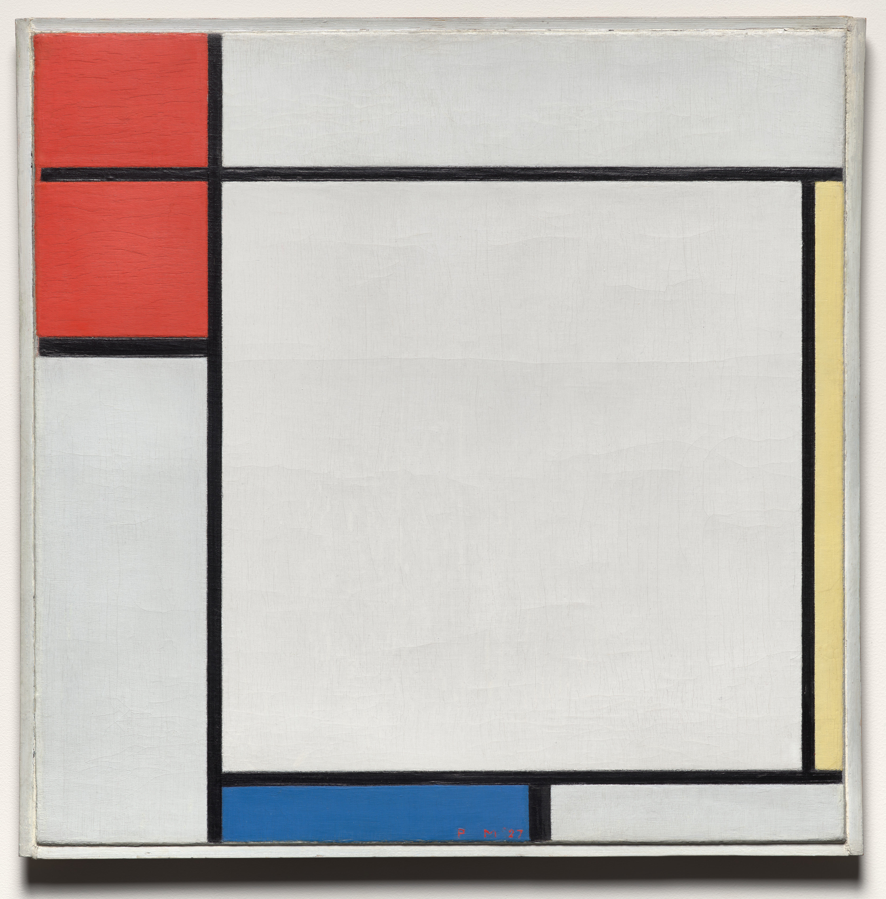
Before reducing this painting to “primary colors and black lines,” let your eye travel between its three concentrations of color. Red gathers at the upper left. Yellow stays close to the right edge. Blue lies along the bottom. The red has breadth, the yellow is almost a slit, and the blue stretches sideways. They do not share the painting equally. Most of what we see belongs to the large, nearly white area just right of center.
With so little color and so much apparent emptiness, why does our attention keep moving?
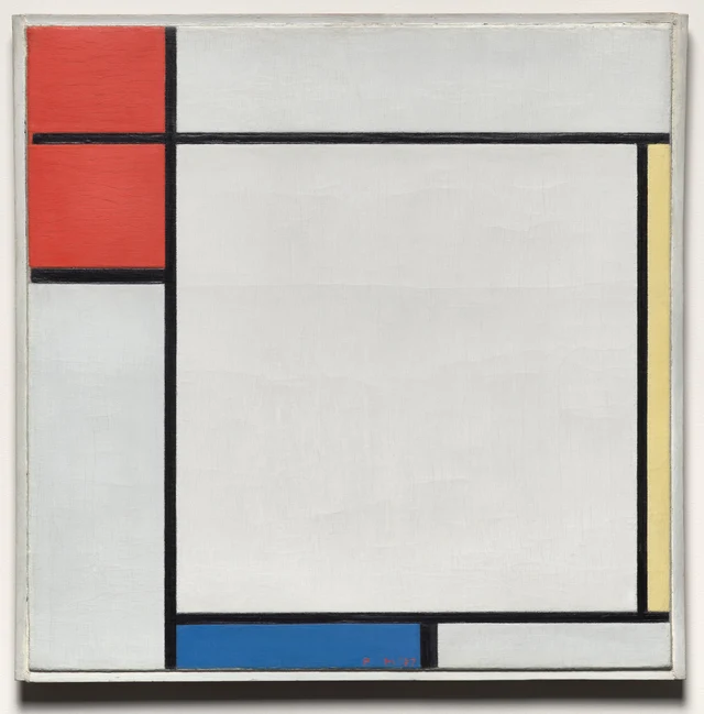
This essay proposes that the painting’s balance emerges from unequal areas, contrasting directions of extension, and decisions about where lines connect or stop. The large white field is an active participant. The colors at its edges make its breadth perceptible; in return, that breadth gives the smaller colors their particular force.
During the 1910s, Mondrian moved from Cubism toward increasingly abstract painting. Associated with De Stijl, which emerged in 1917, he made horizontal and vertical directions, primary colors, black, and white important conditions of his work. He developed these ideas under the name Neo-Plasticism. Cleveland’s account places his ambition for a universal visual language against the desire for social harmony after the First World War. This helps explain the hopes invested in such painting. How this particular work holds together is something we still need to see for ourselves. Museum account; MoMA educational resource
How the red is divided
At first the upper left may register as one substantial red shape. A closer look separates it into two areas. The black horizontal passing through them crosses the main vertical and continues to the right. There it becomes both the lower edge of the pale strip at the top and the upper edge of the large white field below. The same line divides red from red on one side and separates two differently shaped pale areas on the other.
It therefore does two things at once. The neighboring reds, similar in color and stacked together, readily form a group. Yet the black division keeps that group from becoming a single uninterrupted surface. Our eye can gather the red together, then follow the line out toward the right. The color attracts attention; the line carries that attention beyond its corner.
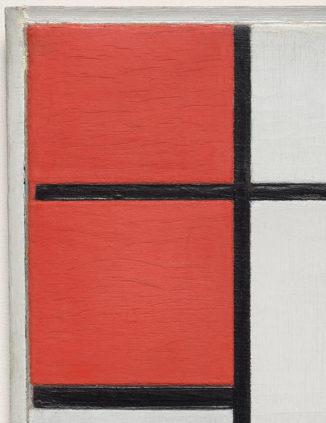
At the bottom of the red group, a shorter horizontal black band meets the main vertical and stops. It does not cross the large white field. If extended to the right, it would divide that field into two tiers. The field’s present continuity depends in part on this stop. An area takes its shape not only from the lines around it, but also from where neighboring lines do not go.
There is another small decision at the left end of the longer horizontal. It does not quite reach the gray frame. A narrow connection of red slips around its endpoint. At a reduced scale that gap is easy to miss. Enlarged, it gives the supposedly regular grid a definite, visible termination. We can inspect the meeting of line and color without claiming that the photograph tells us which paint was laid down first.
The main vertical runs from top to bottom well to the left of center. It gathers the reds and the pale lower-left rectangle on one side, while defining the boundary of the much wider area on the right. These are unequal columns. On the left, two red areas and a change from red to pale paint are closely packed. On the right, a large continuous expanse belongs to the pale field. Concentration of attention and size of area have begun to pull in different directions.
Giving white a shape
For a moment, set the primary colors aside and compare the pale areas. The one at the top stretches horizontally. The lower-left area extends downward. The lower-right strip is long and low. The largest field is approximately square, but it sits to the right within the painting’s overall square. Their proportions, neighboring colors, and black boundaries differ.
Calling all of them “background” would overlook much of the painting’s work. The top strip makes a horizontal distance explicit. The tall area at the lower left emphasizes the reach of the main vertical. The strip along the bottom allows the eye to continue rightward after the blue has ended. The central field gives looking room to spread and linger, without immediately encountering another colored shape. Closely related colors establish several distinct rhythms.
The four edges of the central field are also unequal in effect. Beyond the left black band lie red above and pale paint below. Beyond the upper band lies a relatively shallow white strip. On the right, black separates the field from a very narrow yellow. Below, blue and white follow one another across the width. Black defines all four sides, yet each side meets something different. Each carries a different pressure and direction.
The field can consequently seem enclosed and expansive at the same time. It is easy to pass over because there is no figure or object there to name. Stay with it, however, and its role becomes more definite. The more concentrated the red at the upper left appears, the more open this pale expanse becomes. The slender yellow to its right makes its horizontal breadth more apparent. “Empty” here means a delimited plane of color with a particular size.
The pale paint also varies subtly in the photograph. Some parts appear grayer, others slightly warmer. Fine vertical and horizontal marks coexist with broader traces across the surface. We cannot attribute every difference on a screen to a deliberately mixed shade of white: lighting, the work’s present material condition, and digital display also matter. But the image does establish something useful. We are not looking at rectangles filled with an identical numerical white. Even this extensive quiet color has a surface.
Why the yellow and blue are enough
Yellow occupies a narrow strip at the extreme right. It runs from the long upper horizontal to the horizontal below the central field, making its length much greater than its width. A black vertical separates it from the white, while the gray original frame lies just beyond its outer edge. Held between a dark boundary and a pale one, this small quantity of color has a sharply defined place.
The yellow needs to be seen within the whole. If we isolated it and enlarged it to the width of the red, we would lose its essential relationship: a small area of color extending along an entire side of the large pale field. Red offers concentration; yellow offers extension. Their different ways of being present allow them to counter one another without being equal in area.
Blue takes a third approach. It lies low along the bottom, beginning beside the main vertical and ending at a short black vertical partway across. Pale paint continues to the right. That short division occurs only in the bottom strip; it does not rise into the large white field. The blue therefore has a firm endpoint while the expanse above remains whole.
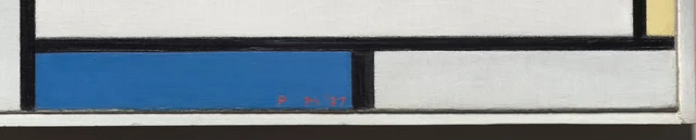
Read the lower edge from left to right: the tall pale area, the main vertical, blue, the short vertical, pale paint, and the right frame. Read the right edge from top to bottom: the upper pale strip, a horizontal black band, yellow, another horizontal, and the pale bottom strip. Both routes begin and end in pale areas, but the colored intervals differ in length and direction. The painting connects its adjacent edges without turning them into matching decorative borders.
“Cool blue” and “warm red” may describe familiar responses to color. Here, temperature alone cannot account for what happens. The blue’s low shape, the yellow’s slenderness, and the reds’ stacked concentration all affect how those colors appear. Remove position and proportion, leaving only three swatches, and it becomes difficult to explain the sense of horizontal support below or vertical containment at the right.
Balance is therefore not simply a total to calculate in advance. The greater area of red does not demand a blue area of the same size at the opposite corner. What we compare is the combined effect of area, shape, position, and surrounding space. Each relationship we notice gives the broad statement “this painting is balanced” another precise basis for discussion.
Black also takes up space
The word “line” can suggest a geometric boundary without width. In the painting, the blacks are bands. Where a horizontal crosses a vertical, they join in a continuous area of black. Where one ends against another, a different junction appears. The eye can follow them, but they also occupy space and interrupt the colored surfaces beside them.
Figure 2 makes their uneven edges particularly visible. Within the black there are small changes of light and dark and traces of paint handling. Neither the apparent widths nor the darknesses of every segment are identical. The bands remain assertive enough to sustain clear divisions at a distance. Up close, that firmness includes the small variations of an oil-painted surface.
At a distance, the black bands clearly link the boundaries of the color planes; up close, slight undulations along their edges make the eye move more slowly. Both scales of looking coexist. The causes of cracks, wear, and reflections require material research specific to this work; these features cannot all be treated as intentional brushwork.
The more consequential difference is the reach of each band. The main vertical spans the height, the upper horizontal spans most of the width, the short horizontal closes the red group, and the short vertical divides blue from pale paint below. They make different cuts. Instead of filling the canvas with an indefinitely repeating checkerboard, their lengths determine which areas remain continuous and which separate here. Clear constraints still leave many choices. This painting has the appearance produced by those particular choices.
A final boundary in gray
At the outside, the eye meets a gray strip much lighter than the internal black bands. The Cleveland Museum of Art identifies this narrow wooden surround as the painting’s original frame. It supplies an actual boundary between the painted object and the wall. Museum note on the frame
Gray does not divide the colors with the force of black. It instead gathers the different edges of red, pale paint, yellow, and blue into a single object. The upper pale strip seems to extend laterally until it finally reaches this outer limit. The red approaches the left edge but remains separated from the surrounding wall by gray. Internal division and external enclosure do different jobs.
Below, the photograph shows the frame casting a shadow on the wall. That darkness belongs to the way the object is hung, not to the painting’s system of black lines. Keeping the frame and shadow in view helps us see an oil painting about half a meter across, with a surface, an edge, and physical depth. The photograph’s slightly rectangular proportions do not mean that the canvas itself is anything other than square.
The painting’s restraint now becomes more specific. Mondrian has removed images we might recognize as trees, houses, or people, but painting’s decisions remain: how much area a color receives, how far a line extends, where it stops, and how the whole object ends. Those decisions are exposed to view. They also give us something definite to disagree about.
This work changes the task of looking. Instead of letting a story organize our attention, we examine relationships among areas directly. The clearer these relationships become, the more the narrow passage of red around the line’s endpoint and the stop at the end of the blue invite another look. What we can carry away is a more exact habit: even when a form seems familiar, ask what this particular arrangement achieves.
Optional reading A change to test with SAE
The following contemporary exercise draws on Han Qin’s SAE, or Self-as-an-End, aesthetics without using it to infer Mondrian’s intentions. SAE treats the beauty of perception as a direction of judgment concerned with how things appear. Its general framework also distinguishes what moves an individual from grounds that viewers can identify together. SAE Judgment and Aesthetics; The Beauty of Perception
Keep the horizontal and vertical directions, the primary colors, black, and white. Then make one change in your imagination: move the yellow strip to the middle of the large pale field. It would still be yellow and still a vertical rectangle, yet it would interrupt a previously continuous area. A color once located at the outer edge would become a conspicuous internal marker. The constraints would remain; the organization of looking would change.
Now imagine enlarging the blue strip into an area as substantial as the red group above. It would have to take space from the white above and alter the lengths of blue and pale paint along the lower edge. The question is not whether the result would still be recognizably “Mondrian-like.” Which specific relationships would disappear, and which new ones would appear?
This exercise tests the reading proposed here. If you think the painting’s balance comes mainly from its three colors, explain how that balance survives a change of location. If proportions and endpoints seem decisive, identify the change that matters most. Geometry supplies conditions for comparison, not a mathematical proof that the original must be the best possible arrangement. You may prefer an imagined alternative. Bring that preference back to identifiable features of the same painting, and there is room for an exact discussion.
Images and sources
This reading uses the museum’s official 3352 × 3400-pixel image. The complete downloaded file is unchanged and retains the original frame. The two details are rectangular crops only, preserving decoded source pixels and the embedded ICC color profile, without resizing, color adjustment, retouching, or generated content. A screen cannot reproduce the original viewing scale or color conditions. No object-specific X-ray or pigment analysis was obtained for this essay; research on other Mondrian paintings is not used to reconstruct this work’s tools, layers, or revisions.
The image is available under the museum’s CC0 open-access policy. That license does not make all museum research text free to reproduce in full. Historical claims are linked above; the close reading is this essay’s interpretation. See the accompanying references and image credits.