Look first at her face, then at what presses close around it. Her forehead is a broad area of light; across her cheeks, light and shade merge gradually. On either side, curls keep turning back on themselves, fine bright lines tracing one loop after another. Farther out, needles of foliage point in every direction. Some details seem precise enough to count individually; elsewhere, a definite edge is almost impossible to find. These three different ways of painting meet in a small space, making the motionless face unusually arresting.
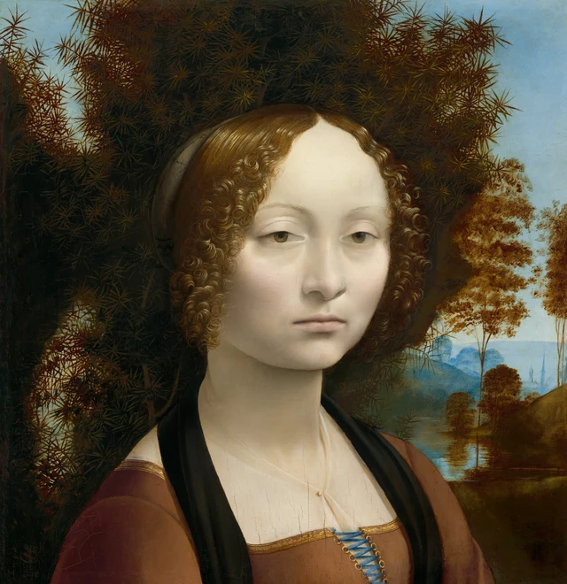
Keep the juniper behind her in mind. On the other side of the same wooden panel, it appears again, with a different scale, position and role. This essay follows that change to ask how a portrait can bring a person’s appearance before us while also making her name and the praise addressed to her into readable images. Appearance, name and praise are connected, but none can take the place of the others. That is the reading proposed here, rather than a settled account of Leonardo’s intentions.
The painting dates to about 1474–1478, during the young Leonardo’s years in Florence. Fifteenth-century portraits of women there often showed the sitter in profile; this face turns back toward us. The move from profile to a three-quarter view changes more than the pose. It also changes how a face is given volume and presence. NGA’s guide to the painting
How the face emerges among the needles
The painting is less than forty centimeters high. An enlarged image on a screen can make us imagine her at life size. At the scale of the original, her eyelashes, the corners of her mouth and the curls occupy very small areas. Leonardo does not draw us in with a sweeping gesture. He concentrates attention on these minute differences.
Her body turns toward the right of the picture while her face turns back. The face is not fully frontal: the eyes and cheeks appear at different angles on either side, the nose turns a little, and the shadow beneath the jaw gives the head volume above the neck. A profile organizes a likeness around a clear outer contour. Here, the three-quarter view brings the changing surfaces within the face to our attention. The forehead recedes toward the temple; the bridge of the nose darkens toward the eye socket. Light and shade, rather than the outer outline, have to explain those turns. NGA’s guide to the painting
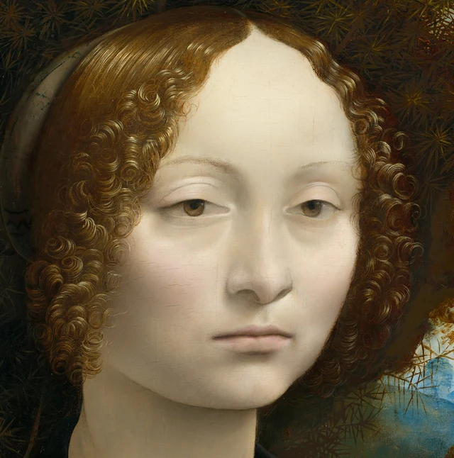
Look at the gray beside the bridge of her nose. It is not a separate strip of shadow laid against the skin: it deepens gradually and joins the eye socket. A relatively distinct dark line separates her lips, but the shadow beneath the lower lip is much softer. Nor are her eyes enclosed by lines of uniform strength. The upper lids are more clearly defined; the lower boundaries are far lighter. Even within a single feature, the degree of definition changes. Delicacy here involves knowing which edges to soften.
The curls do something else. Bright lines move through dark brown, gathering and loosening; individual strands escape the larger curls and extend lightly beside the face. The background needles are just as dense, but repeatedly send the eye outward. The adjacent coiling and radiating shapes make the relatively unmarked, light surface of the cheek seem quieter. If we cropped the image down to the facial features alone, the person would remain recognizable, but this stillness produced by the surrounding forms would diminish.
Her mouth is closed, without a noticeable upward turn at its corners. The lids partly cover her pupils. Her gaze comes in our direction, though it is difficult to say whose eyes she is meeting. Some viewers may sense distance, others composure. Such responses have identifiable starting points, but the painting offers no inner monologue against which to check them. We can see the structure of a face clearly and still not know what its owner is thinking. Precision of appearance and uncertainty about a person’s thoughts can exist together.
The clothing also deserves a second look. Narrow gold edging follows the square neckline, and blue lacing passes through a row of small gold rings. Across her chest, sheer fabric becomes visible through diagonal fine lines, slight changes of tone and a small gold fastening. These details lack the display of piled-up jewels, yet the clothing is far from unadorned. What seems restrained at a glance reveals distinctions of material and workmanship on closer inspection. They, too, give the figure her particularity.
A world remains open on the right
Juniper occupies most of the space around her head, its darkness almost enclosing the face. Yet it does not seal off the whole picture. Let the eye travel beyond the curls on the right, and it encounters tree trunks, water, then increasingly pale blue forms.
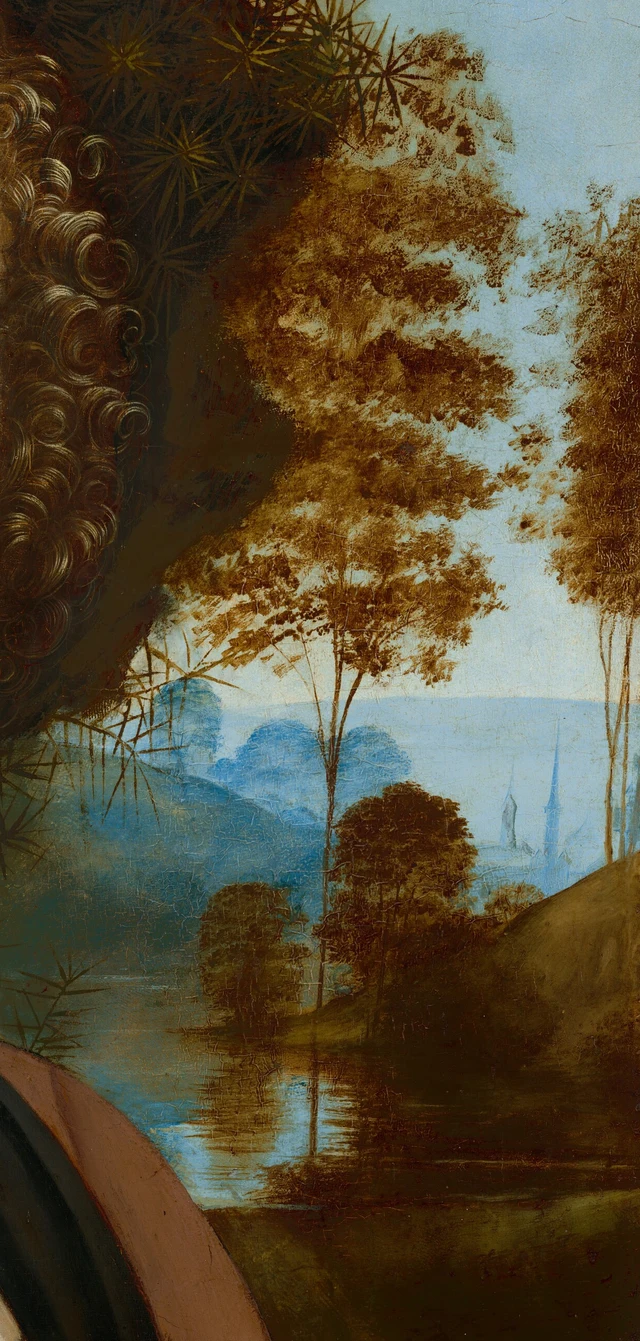
The slender trunks of nearby trees continue downward in the water, where horizontal strokes of light interrupt their reflections. The bank rises at an angle. Farther away, a few pointed buildings emerge from blue-gray surroundings. Small as they are, they carry space beyond the trees. Our eyes pass through successive obstructions, moving from a foreground where separate needles can be distinguished to a distance where only general shapes remain legible.
No figure is traveling through this landscape, and no story continues its action there. Its contribution is closer to a breathing space. Darkness brings the face near, while the world can still unfold behind it. Person and surroundings acquire different distances and degrees of clarity. We need not identify every tower to feel that she occupies space, rather than floating against a flat field of color.
The brown foliage we see today readily suggests autumn, just as the pale face invites guesses about ill health or melancholy. But these colors have a history of their own. Technical research has found that copper-based greens used for the middle-distance trees and slopes have browned, while red lake pigment in the face has faded. Today’s colors are the real starting point for our looking. They cannot, however, be equated directly with the painting’s initial fifteenth-century appearance, much less used on their own to diagnose a person’s health or mood. Research on pigments and underlayers; research on color change
The same technical investigation also shows adjustments where the juniper meets the sky. Some branches were narrowed by sky painted over them; others were extended over the sky. The apparently natural growth of the bush was worked out through painting. Looking again at the front, we can see it both as a plant with needles and layers, and as a shape that determines how the face appears and where the distant landscape opens.
Turn the panel over and the juniper changes place
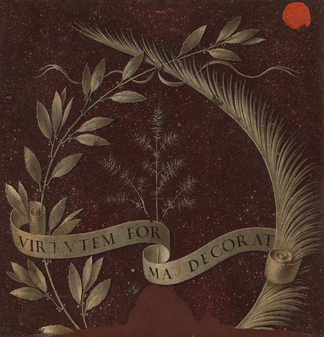
The person has disappeared. The continuous light area on the front gives way to a dark red, speckled ground, and the plants separate into individual branches. Broader leaves spread along the branch on the left; long, narrow leaves crowd together on the right. The two branches cross above, seeming to enclose a place. At the center, the juniper is comparatively slender, its needles almost readable cluster by cluster.
The ground is generally understood as an imitation of red porphyry. There is no sky or water here, and no invitation to keep moving into the distance. Branches spread before a surface that imitates stone; the arrangement approaches an emblem. Even before we know what the plants symbolize, we can see that the way of looking has changed. On the front, plants surround a person. On the back, they themselves become the central things to recognize. 2001 exhibition catalogue
The Italian word for juniper, ginepro, echoes Ginevra’s name. This botanical clue, together with early written sources, supports the identification of the sitter; her full name is not written on the painting. Born in Florence in 1457, she married Luigi Niccolini in 1474, at sixteen. A commemoration of the marriage is therefore an important interpretation, but it is not an established account of the commission that excludes other possibilities. NGA’s collection account; entry 16 in the 2001 catalogue
Once we know the connection with her name, the juniper on the front is no longer simply an attractive background. Its other work in the picture does not disappear. It still obscures, darkens the area behind the face and sends needles into the blue sky. The front allows a reference to her name to inhabit an environment; the reverse draws it out and places it at the center of the enclosing branches. The same plant can belong to the space a person occupies and serve as a way of naming her.
This is not a passage from pure nature to pure symbolism. The environment on the front already contains the name, while the emblem on the back still consists of carefully painted plants. The difference lies in their arrangement. One side lets us encounter the face before recognizing the allusion. The other gathers the allusions together, preparing to make a judgment about her.
How a phrase of praise becomes an image
The scroll reads VIRTVTEM FOR / MA DECORAT. Joined up in the usual spelling, VIRTUTEM FORMA DECORAT can be translated as “Beauty adorns virtue.” Beauty is the subject of the sentence, and virtue is what it adorns. The words do not say that a beautiful appearance is sufficient proof of virtue. They do, however, place outward beauty and praiseworthy inner qualities within the same statement.
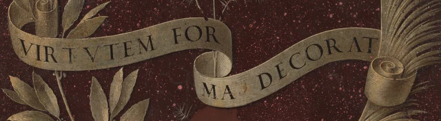
The sentence is not placed flat alongside the image like a modern museum label. The scroll extends from the left, folds back in the middle, then rises toward the right; the letters move with its curves. To finish reading FORMA, we have to carry the end of one section over to the beginning of the next. Our eyes are reading meaning while following the turns of an object. The inner surface darkens and the rolled ends reveal thin layers. Flat letters are thus caught up in a small movement through three-dimensional space.
In the museum’s interpretation, the laurel and palm on either side relate to intellectual and moral virtue. They also appear in the personal emblem of the Venetian diplomat Bernardo Bembo. A more specific clue lies beneath the visible inscription: infrared examination has revealed the motto “Virtue and Honor,” associated with Bembo. He therefore very likely commissioned the painting of the reverse. Whether he also commissioned the portrait on the front remains unproven. Research on the reverse
Bembo’s relationship with Ginevra is usually discussed in the context of humanist literary praise and spiritual admiration. This makes the reverse a tribute rooted in social exchange, rather than an abstract botanical decoration. A marriage commemoration and a friend’s tribute need not be mutually exclusive: scholars have proposed that the two sides were completed in stages. That remains an interpretation, however, and cannot supply a missing commission contract. Nor does their literary association establish a particular sexual relationship. Discussion in the 2001 catalogue
Read “Beauty adorns virtue” again, and a social voice becomes audible. It is a way of praising her and of placing her beauty within an approved account of character. We can ask what such praise emphasizes and what it leaves out. We cannot simply treat it as her own self-description, or use this sentence alone to establish whether she endorsed its values.
The reading offered here keeps some distance between the two sides. The reverse supplies an allusion to a name, signs of virtue and an orderly expression of praise. The front remains a particular face, slightly turned, with closed lips and soft shadows. The tribute tells us how someone at the time could speak about her; the face keeps us looking at a person whom the sentence cannot wholly replace. Both sides are carefully constructed images, preserving her in different ways.
Return to the interrupted lower edge
Now look at the bottom of both full images. On the front, the edge cuts through the clothing and lacing. On the reverse, branches are interrupted below, and an irregular brown area occupies the center. The lower part of this work has been cut away. Its present, almost square composition, close around the face, includes the consequences of that physical change. We cannot take all of this closeness as Leonardo’s original choice.
The missing portion may have included her hands. A familiar reconstruction connects the portrait with a Leonardo study of hands. Yet the Royal Collection, which holds the drawing, currently dates it to about 1490, considers its style later than this portrait and suggests a possible connection with an early conception of Lady with an Ermine. The sheet contains two explorations of crossed hands, rather than a complete pair with their relative positions settled. There is evidence that the painting was cut down. Whether a particular reconstruction has recovered the exact position of the hands and what they held is a separate question. Royal Collection, RCIN 912558
Knowing this gives the imagination firmer limits. If the original included hands, there would have been a relationship between face and gesture that we can no longer see. We cannot choose a flower at will and finish the meaning of the lost gesture for her. The museum’s other measurement, 42.7 × 37 cm, includes a later strip of wood along the bottom; it is not the panel’s original height before it was cut. The red wax seal at the upper right of the reverse belongs to the work’s later collecting history and is associated with the Liechtenstein collection record of 1733. It was not part of Leonardo’s design of plants and inscription. Dimensions and provenance
These changes do not invalidate our experience of the work today. They help us understand what we are looking at: an object with a pictorial arrangement that has also undergone cutting, color changes and movement through collections. The closeness it offers is real, but what we encounter has not come down to us unchanged from the fifteenth century.
Finally, alternate once more between the two sides. A screen lets us place them next to each other; the wooden panel itself must be turned to reveal its other face. When the portrait leaves our sight, we hold it in memory while reading the praise. When we return, the plant has acquired the meaning of a name, yet the mouth and gaze have become no easier to explain.
This is what makes the small painting worth returning to. Juniper connects appearance, name and praise without collapsing them into a single answer. We know more, and still need to look again at that face. Her particularity comes not only from a likeness to someone, but also from painted relationships that continue to offer differences worth noticing each time we return.
Optional reading Moving between the two sides with SAE
The close reading can end here. What follows draws on SAE (Self-as-an-End) aesthetics to take the experience a little further. SAE distinguishes what moves us personally from the grounds that can be acknowledged together in making a judgment. Its “rays” are directions of inquiry, not categories or ranks assigned to artworks. Here, it is most useful to begin by distinguishing what is present to our eyes, then consider how memory enters the next act of looking. SAE’s general account of aesthetics
Set aside, for a moment, the names “juniper,” “virtue” and “Ginevra,” and look only at Figure 2. How do light and shade join across the cheek? How do bright lines coil into curls, and how do the needles extend outward? We can still experience three different kinds of form before using them to identify a person or guess at her character. SAE’s approach through perception reminds us that what appears before us has a character of its own. It need not first prove useful or pleasurable to deserve attention. This also lets us test our descriptions. If the face seems “cold,” are we referring to color, edges and expression, or have we already brought an idea of her personality into the picture? The beauty of perception
Next, look only at the reverse, then return after a while to the front. Does the connection we have learned between ginepro and Ginevra lead our eyes to the bush sooner? If so, something learned previously is acting within the next encounter. Yet the expectation it brings may also fail: we might think that understanding the emblem will let us understand her expression, only to find, on returning to the face, that we still cannot be sure. What we remember reaches toward what is before us, and the visible details prompt us to revise our expectations. This is the relationship to pursue here through cognition. Memorizing one more allusion is not, by itself, the conclusion. The beauty of cognition
Likewise, once we know about the altered pigments and the missing lower portion, the present image brings its past before us. SAE’s approach through causation asks how what has happened remains in what comes later. It does not require us to like damage, or automatically count age as beauty. We can ask quite specific questions: which interruption makes us aware of a missing part? Which present color requires research to explain it, rather than an attempt to guess history with our eyes alone? The beauty of causation
These questions return to the same work but attend to different relationships: how the face appears before us, how the remembered emblem changes our next look, and how the painting’s past remains in its present image. Theory helps by distinguishing these relationships. We can then say more precisely what we are looking at and what grounds our judgment, before returning to the painting with a more specific question.
Images and sources
The independent visual descriptions in this essay are based on the National Gallery of Art’s official images: 3971 × 4096 pixels for the obverse and 3942 × 4096 pixels for the reverse. Both full images are unchanged from the downloaded files. The three details were cropped by pixel coordinates only, with no color adjustment, sharpening, restoration, overpainting or generated content. The display conditions of digital reproductions differ from those of viewing the original.
Both collection images fall under the museum’s CC0 open-access policy. Open image licensing does not mean that research articles, technical illustrations or modern reconstructions carry the same license. This package contains no source-publication PDFs or reconstruction images. Historical facts and disputed interpretations draw on the linked sources; the readings proposed here do not imply museum endorsement. See the references and image credits and licensing.

