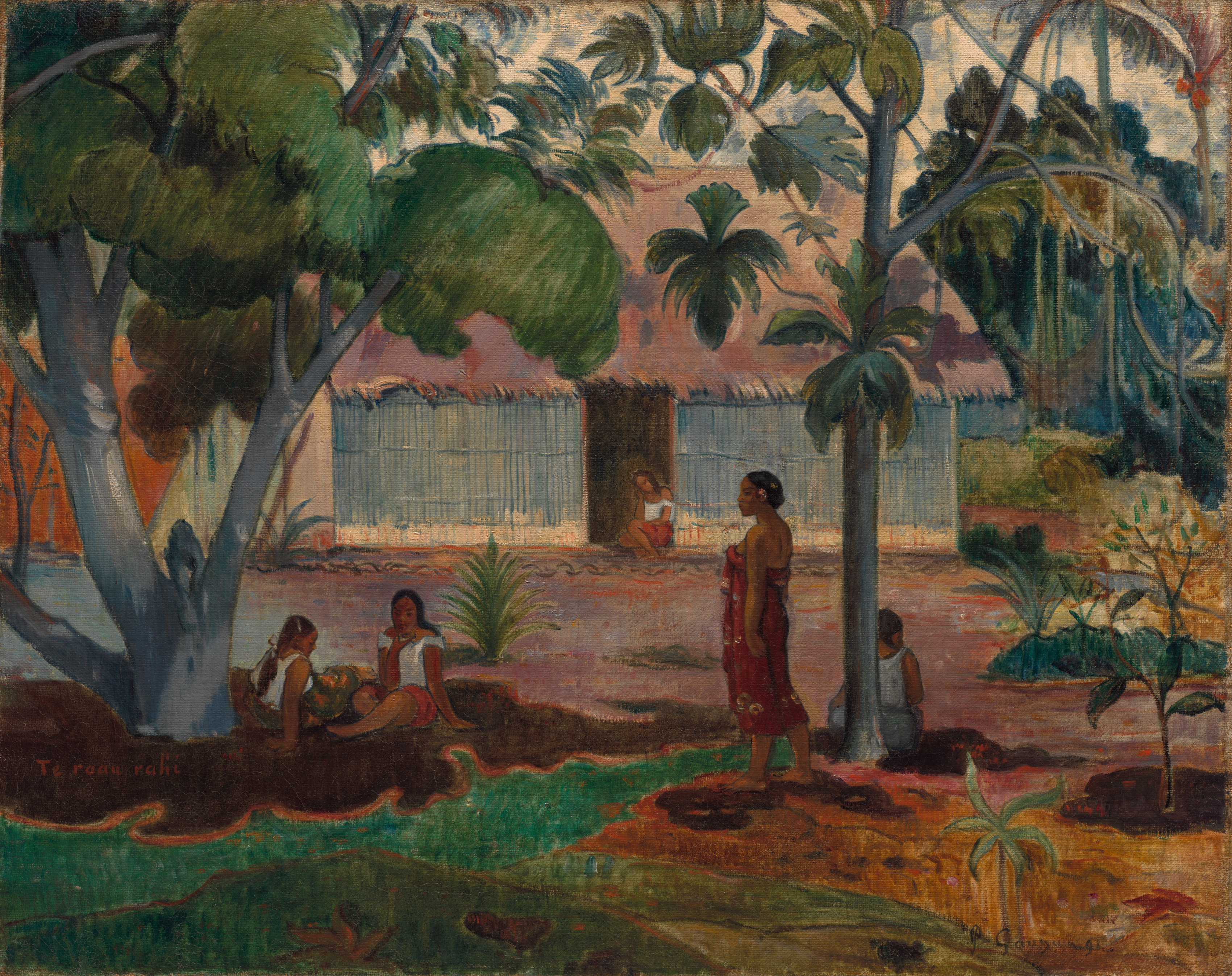
Begin with the adjoining areas of color. A dense green canopy fills the upper part of the picture. A broad pink roof runs across the middle, above a pale blue-gray wall. Near our feet, dark brown ground gives way abruptly to a brilliant strip of turquoise green. Trees, house and courtyard are easy to recognize. Before we have finished naming them, however, their colors have already proposed a route: into the dark green shelter, across the pale space outside the house, and back toward us along the curving ground.
The tree’s cool shade takes shape through those encounters between colors.
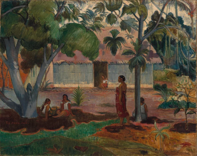
This essay reads the courtyard as both a recognizable place and an arrangement of color with a rhythm of its own. The breadth of the canopy, the horizontal house, the sloping branches and the gaps between people make shelter feel convincing. That conviction belongs to the organization of a painting. Turning it into a claim about the peacefulness of the life depicted requires a further judgment.
Gauguin first reached Tahiti in 1891, and The Large Tree is among his early paintings there. He had already experimented in Europe with broad areas of color and simplified outlines. The local trees, building and figures therefore meet a pictorial language he brought with him. Cleveland’s account draws attention to the friezelike arrangement of the foreground women and the contrast between shade and sunlight. Both observations can be tested by looking. Object information
How a canopy covers a house
The great tree stands on the left, but its foliage stretches into the center. It is much more than a tree placed somewhere in a distant landscape. A heavy blue-gray trunk rises close to us, forking in several directions. One slanting branch carries the eye toward the roof. The trunk broadens at its base, while patches of pale gray interrupt the darker surfaces around the forks. It has the bodily substance needed to support that mass of green.
Look at how the foliage is grouped. On the left, several dark green masses almost merge. Farther toward the center, the projecting branches carry lighter, broadly rounded clusters. Slanting marks animate them, but individual leaf tips are seldom described. Detail works within the larger contours: one cluster swells downward, another leaves a notch through which we see the roof. The canopy can look luxuriant while retaining the force of a few large shapes pressed across the upper picture.
Pink appears in the spaces between them. Attend only to the roof and it seems like a quiet, extended field of color. Notice the branches crossing it and it becomes the roof of a house farther away. Its pink is not uniform. Some areas darken near the foliage, and short dark marks roughen the lower edge. Seen as a whole, though, it remains continuous enough to set off the scattered greens.
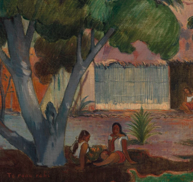
Overlap performs two jobs here. It places the tree in front of the house; it also turns the visible pink into a pattern of shapes between leaves. Landscape and decoration occupy the same passage. “Decorative” describes the pleasure of following colors as they adjoin, repeat and interlock on the canvas. It does not remove the courtyard’s depth.
The slimmer tree on the right offers another way of organizing green. Its branches divide overhead, carrying distinct hanging groups of leaves. Pale sky and pink roof remain visible between the groups. On the left, foliage makes a thick cover; on the right, it sets irregularly spaced marks against a light background. One tree shelters by its mass, while the other brings the roof to life through intervals. They support the composition together without becoming symmetrical partners.
The space between people
The wall extends to either side beneath an almost horizontal eave. Its dense vertical marks establish a direction different from the diagonal branches. A dark doorway breaks into the pale wall near the center. A smaller figure sits at the entrance, her scale and the wall surrounding her restoring depth to what might otherwise read as a flat horizontal strip.
The four foreground women form another sequence across the painting. Two sit close together on the left, one in profile and one more directly facing us. Their white clothing emerges from the darker surroundings. Farther right, a woman stands in red, her body reaching from the ground almost to the middle of the wall. Beyond her, a seated figure is partly screened by the slender trunk. Her pale gray back joins the cool colors of tree and house.
The intervals are notably unequal. Clothes, bodies and dark forms gather densely around the two figures on the left. Between them and the standing woman lies a broad stretch of open courtyard. A small plant spreads its pointed leaves in several directions, giving that open ground a focus of its own. The people have not been distributed like identical units in a border. Nearness and separation, standing and sitting, add pauses of different lengths to the eye’s journey across the picture.
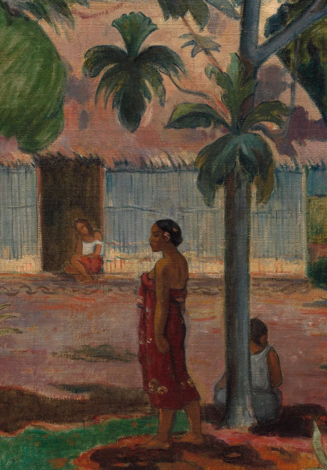
The red wrap is conspicuous, although its wearer is off-center. There are variations of shade within it and small motifs near its lower edge, yet it keeps the overall form of a long, narrow red area. It answers the much larger pink roof. The roof extends sideways; the dress rises vertically. One spreads out a space, while the other gathers attention around a particular body. The difference in color intensity keeps them from collapsing into a single plane.
The standing woman turns her head to the left. Her arm hangs beside her body, and one foot extends slightly outward. She connects the seated group on the left to the tree on the right without dominating the scene through a dramatic gesture. Nor do all the figures’ gazes converge to tell a single story. A more productive guide is the way their bodies occupy the color fields: white emerges from darkness, red crosses pale ground, and the right-hand figure returns to the blue-gray trunk.
Seen this way, a friezelike arrangement need not flatten every person. The small body at the doorway, the larger bodies in front and the intervening tree continue to locate figures at different depths. Repeated colors bring them back together on the surface. The eye moves into the courtyard and sideways across the canvas at the same time. Much of the painting’s liveliness resides in that double movement.
Why the turquoise ground matters
In a painting named for a tree, the ground may seem merely to hold it up. Cropping away the bottom would sacrifice much more than a few patches of earth. It would remove the picture’s sharpest change of register.
A broad dark brown area lies beneath the left-hand tree. Its boundary projects and withdraws in a series of curves. A thin warm-colored edge follows it, immediately adjoining the brilliant turquoise green. That green travels from the lower left toward the center, narrowing near the standing woman’s feet, beside a substantial area of ochre orange. It does not retreat according to the regular perspective lines of a tiled floor. Curves, points and chromatic intensity bring the foreground directly into our attention.
Following the boundary, we pass through a sequence: a wide dark band, a narrow warm line, a sudden bright green and a fuller area of orange. Shade and sun acquire a tangible force through this progression. Even without assigning every patch to a precise model of illumination, we can feel the change from shelter to brightness.
The shade itself is porous. Skin tones and white clothes open it up; the blue-gray trunk rises out of it; the bright neighboring strip gives its edge a path we can follow. The dark area feels inhabitable because it remains connected to the surrounding picture. An undifferentiated block of darkness would offer a less convincing shelter.
A duller green runs along the very bottom. Small brown shapes and low leaves are scattered through it, preventing the brighter ground from simply spilling out of the canvas. At the lower right, a plant lifts several pale, long leaves. Their upward movement answers the hanging leaf groups above. Having followed the curves of the earth, the eye finds a route back toward the canopy. The upright leaves near the bottom catch this turn, connecting the ground to the leaf clusters above in a returning path.
Nor are the color areas perfectly smooth. The official image reveals short lines, scuffed-looking variations and the texture of the canvas surface. Closely spaced vertical marks on the wall, bundled diagonal marks in the foliage and more dispersed strokes on the ground establish different directional energies. Large color fields hold together at a distance and remain active within their boundaries when enlarged. The visible surface alone, however, does not establish the order in which paint was applied. Cracking and present wear are not treated here as effects deliberately sought by Gauguin.
Coolness composed
The pleasure of this picture is quite immediate. Dense green, expansive pink and substantial blue-gray are punctuated by the clear turquoise below. Strong colors do not all compete for the same position. Foliage occupies the upper field, the house stretches through the middle, people connect different heights, and the ground curves beneath them. Each part has its own shape and gains force from its neighbors.
This organization can make us feel settled, even invite us to imagine the coolness under the leaves. Arranged in this way, the courtyard becomes a scene in which a viewer can linger. Placing that sense of ease within Gauguin’s artistic plans when he went to Tahiti also reveals its connections with European imaginings of life overseas.
A specific historical context matters here. In her study for the Metropolitan Museum of Art, Cindy Kang identifies the colonial pavilions of the 1889 Paris Exposition Universelle as an influence on Gauguin’s expectations of life overseas. His Tahitian project remained connected to his ambitions within the Parisian avant-garde. The paradise imagined beyond Europe had already been shaped by European display, looking and artistic competition. Context need not appear as an explicit emblem inside the picture to bear on its meaning. Kang on Gauguin
This changes how we understand the harmony. Tree, roof, white clothing and red wrap can continue to give pleasure. We can also recognize that their forms have been selected, simplified and organized into a Tahiti that a European painter could present to viewers. The figures possess particular positions and gestures; a harmonious palette cannot speak on their behalf about the ease of their lives. The branches dividing the roof and the bands of ground setting space in motion are the specific means by which this harmony is made.
The Large Tree rewards that twofold clarity. We can point to the means by which shelter becomes attractive, and recognize the position from which this attraction is offered. The dense canopy does not cover everything. Pink remains visible between leaves, open ground spreads between bodies, and branches keep changing the rhythm of the horizontal calm. Gauguin has made a place in which the eye is willing to linger. The painting’s power resides in arrangements we can return to and examine.
Optional reading Nearness and distance through SAE
The following exercise draws on Han Qin’s SAE, or Self-as-an-End, as a contemporary approach to viewing. It does not establish Gauguin’s intentions or the inner lives of his figures.
The SAE framework’s “internality of context” treats context as a constituent of beauty. Following this direction, we can place the painting within the context of European views of Tahiti and ask again: the shade invites us closer, but does the picture make the people equally approachable? SAE general framework, section 3.2
Follow the turquoise near the bottom toward the seated pair on the left. White clothes bring their bodies out of the darkness, while the heavy trunk occupies one side of their group. They face different ways; the woman turned more toward us reveals more of her face. Now look at the standing woman in red and the seated figure on the right. One turns her head sideways; the other presents her back and is partly hidden by the trunk. Color connects their bodies into a legible sequence, but their faces and bodies do not all turn to meet the viewer. The eye travels easily between color fields; its approach to the people encounters pauses.
Try describing the painting as both “approachable” and “distant,” finding two visible grounds for each word. For the first, you might choose the sheltering canopy and the white clothes adjoining dark earth. For the second, consider the turned back, the trunk screening the seated woman, or the small figure at the doorway across the open courtyard. Return both sets of observations to the whole picture. The arrangements that make the courtyard inviting to contemplate also leave the people only partly accessible to our gaze.
The colonial context gives a specific question importance: in enjoying this courtyard, do we mistake the sense of nearness created by the painting for an understanding of the people within it? This essay proposes that color makes the place feel hospitable to a lingering eye, while the figures’ orientations and the forms that obscure them preserve an interval. That interval can be pointed out in the image. On the next look, follow both the invitation of the colors and the distance retained by the bodies, and test how they coexist.
Images and sources
The visual analysis is based on the Cleveland Museum of Art’s official 3400 × 2695-pixel JPEG. The full image is supplied unchanged. The two details are crops retaining the source pixels at their original resolution and its embedded ICC profile. No color adjustment, sharpening, reconstruction or generated content has been added. A screen remains different from encountering the painting itself.
The images are supplied under the museum’s CC0 open-access policy. This is an independently written interpretation, not a museum endorsement. Historical and theoretical sources are linked above and recorded in References; image sources, crop coordinates and verification information appear in Image Credits.