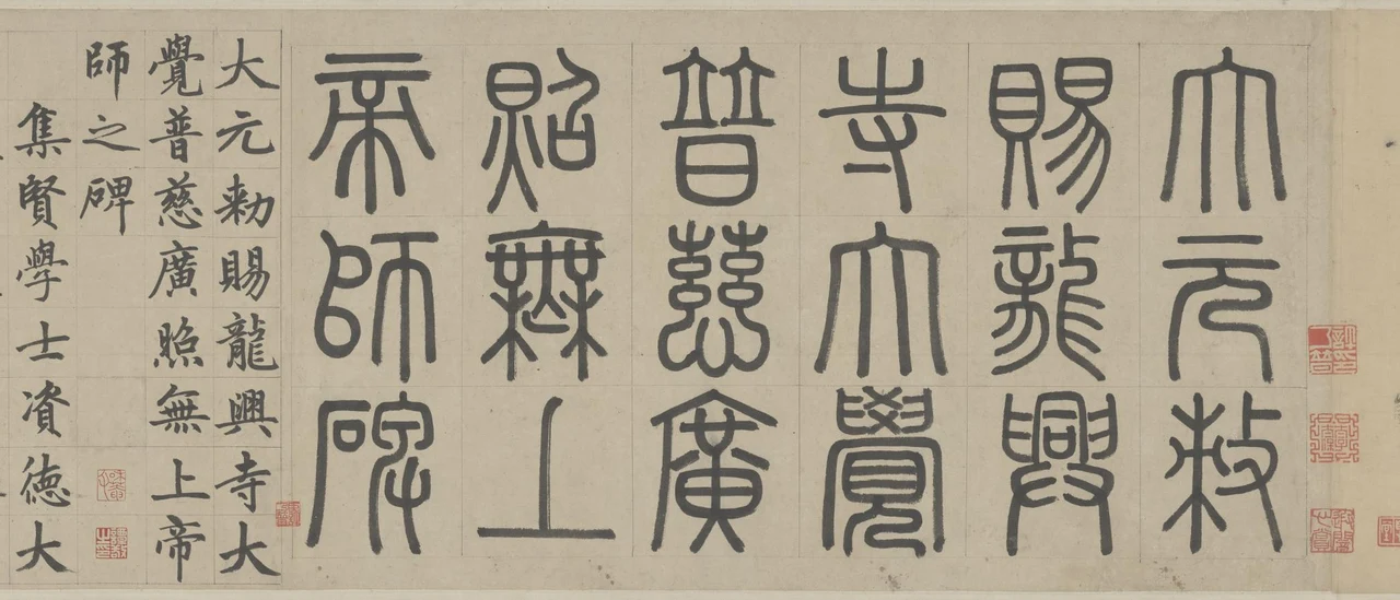
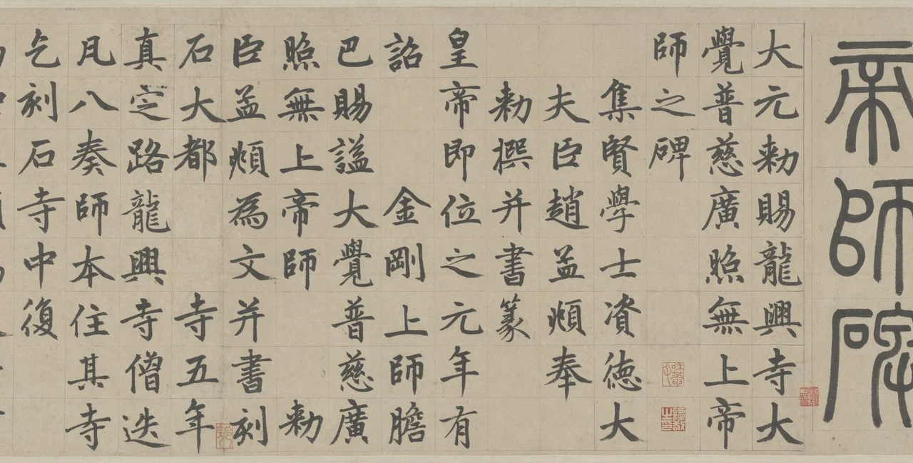
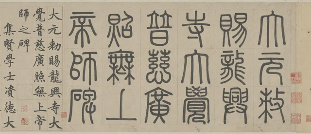
The title of the same inscription is written twice at the beginning of the scroll. First come eighteen large characters in seal script, in six columns of three. Farther left, the writing changes to much smaller regular script: nineteen characters in three columns containing eight, eight and three. The extra character is 之, “of”: 帝师碑, “Stele of the Imperial Preceptor,” becomes 帝师之碑, making that relationship explicit with the added particle.
The name is almost the same, yet the eye cannot read it with the same stride. The seal characters have long descending lines and curves enclosing relatively wide spaces; each compartment holds one large character. In the regular script, the diagonal strokes acquire pointed endings, while short horizontals and long verticals carry different weights. The height that held three characters now holds eight. Before the title has led us into the narrative, the scroll has already made us change our scale of looking.
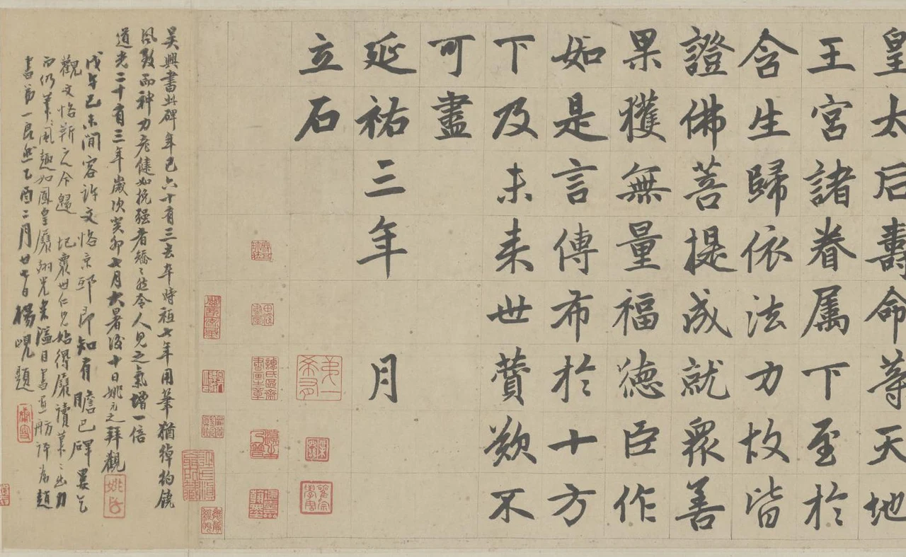
The familiar name 胆巴碑, Danba Stele, may make us think first of stone. What we are looking at here, however, is an ink-on-paper handscroll in the Palace Museum, Beijing: Zhao Mengfu’s handwritten stele inscription, with a seal-script heading and regular-script text. It is not a rubbing taken from an engraved stone. The end reads 延祐三年……月立石, “the stone erected in the […] month of the third year of Yanyou,” corresponding to 1316. The paper preserves words and writing organised for a stele; today we can still see directly how the ink lines lie within the colour of the paper. Palace Museum work description, in Chinese
The inscription commemorates Danba, a Tibetan Buddhist monk closely associated with the Yuan court who died in 1303. The honorific “Unsurpassed Imperial Preceptor” used here was bestowed after his death; it should not be taken as proof that he held that office during his lifetime. Zhao Mengfu was ordered to compose and write the inscription for Longxing Monastery in Zhending Circuit. It recounts Danba’s activities and the monastery’s history, ending with praise and wishes for blessings upon the imperial household and living beings. The text has a particular commission, a particular person to commemorate and a particular place of installation. Its solemnity resides both in its wording and in the positions assigned to different kinds of writing.
The heading gives a name; the credentials tell us who is speaking
First, let us read what the two scripts at the opening actually say. The transcriptions below use commonly printed simplified Chinese characters. Slashes mark changes of column in the manuscript, not punctuation. The images retain historical forms: for example, 赐 corresponds to 賜, “grant”; 龙 to 龍, “dragon,” part of the name Longxing; 师 to 師, “preceptor”; 阁 to 閣, “pavilion”; 铜 to 銅, “copper”; 铸 to 鑄, “cast”; 钱 to 錢, “money”; and 寿 to 壽, “longevity.” Printed characters help locate the writing without pretending to reproduce its exact shape. Each column reads downward, and the columns proceed from right to left.
Seal-script heading:
大元敕/赐龙兴/寺大觉/普慈广/照无上/帝师碑
“Stele at Longxing Monastery under the Great Yuan, commissioned by imperial decree to commemorate the Unsurpassed Imperial Preceptor of Great Awakening, Universal Compassion and Far-Reaching Illumination.”
Regular-script repetition of the title:
大元敕赐龙兴寺大/觉普慈广照无上帝/师之碑
“Stele at Longxing Monastery under the Great Yuan, commissioned by imperial decree to commemorate the Unsurpassed Imperial Preceptor of Great Awakening, Universal Compassion and Far-Reaching Illumination.” The added 之 expresses “of”; it does not change the person commemorated.
敕赐, “bestowed by imperial command,” signals imperial bestowal; the inscription’s opening explains that the honorific was granted to Danba posthumously. 龙兴寺 is Longxing Monastery; 大觉普慈广照无上帝师 is the complete honorific of the person commemorated. Together the title identifies the stele at the monastery and the man honoured by the Yuan court. It does not mean that the emperor simply gave a stone to the monastery. The heading itself does not contain 胆巴, “Danba.” The text that follows tells us who this preceptor was.
The seal heading does not keep the honorific’s phrases together within individual columns. 寺大觉, “monastery / great awakening,” 普慈广, “universal compassion / far-reaching,” and 照无上, “illumination / unsurpassed,” are cut apart and carried on by the three-character arrangement. Visually, we first encounter six columns of large characters with nearly equal heights. Their regularity belongs to the character count and the columns; it cannot simply be read as the segmentation of a sentence.
Look at 帝师碑, “Stele of the Imperial Preceptor,” in the leftmost column of the large seal heading. Each character has long downward lines, but they do not join into a single stroke. At the top, 帝, “imperial,” has a horizontal stroke and several long lines separating beneath it; in the middle, 師, “preceptor,” has a rounded left side and a straighter right side; at the bottom, 碑, “stele,” spreads downward. Each arranges a different kind of white space. Lines of relatively even thickness make it easier to notice how they enclose and divide. A character’s interior is not a solid patch filled with black.
The regular-script repetition gathers the reading into a narrower space. 大元敕赐龙兴寺大 runs from the top to the bottom of the first column; 覺普慈廣照無上帝 continues beside it; the final 師之碑, “stele of the preceptor,” occupies only three positions. These columns carry the full title translated above, even where their breaks split its phrases. In the last column, 師, “preceptor,” is at the top; 之, “of,” opens from a narrow upper part towards the lower right; 碑, “stele,” gathers its left-hand 石, “stone,” component and its right side into a denser structure. The stretch of blank paper below these three characters brings the title to a visible stop.
Only then do we read the author’s name and credentials:
集贤学士资德大/夫臣赵孟頫奉/敕撰并书篆
“Your servant Zhao Mengfu, Academician of the Jixian Academy (Academy of Assembled Worthies) and Grand Dignitary for Assisting Virtue (Zide), composed this text by imperial command and wrote both the main text and the seal-script heading.” These are Zhao’s scholarly and official titles followed by his deferential self-designation, 臣, “your servant,” addressed to the emperor. 大夫, “Grand Dignitary,” crosses a column boundary: the final 大 of one column and the initial 夫 of the next must not be read as two separate offices.
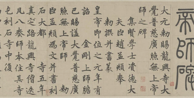
The credentials have not been reduced to a tiny marginal note. They remain clear, substantial regular script, but all three columns start about one character-position lower: there is blank paper above 集, the beginning of “Jixian”; 夫, completing “Grand Dignitary”; and 敕, “imperial command,” written here as 勅. Immediately after them, 皇, “imperial,” the main text’s first character, returns to the upper edge. Even before reading every word, we can see that the title, the author’s identification and the main text begin at different levels.
In the first credential column, 集贤学士资德大, the complex 集, “gather,” 賢, “worthy,” and 學, “learning,” which form part of the academy’s name and the academician’s title, stand next to the simpler 士, “scholar,” and 大, “great.” At 士, fourth from the top, a vertical passes through two horizontals, with the upper horizontal extending to either side. Farther down, 德, “virtue,” gathers many short strokes together again; the final 大 opens into two diagonals. The column keeps its direction, while the way black occupies the paper continually changes. The lowered beginning expresses a difference of rank or role; contractions and openings inside the individual characters give that distinction shapes we can still examine closely.
Eight characters in a column are not eight identical blocks
Once the narrative begins, many adjacent columns contain eight characters, with their upper and lower boundaries close to one another. A ruled grid is clearly visible across the scroll. Its fine lines provide positions without cutting every character’s outer contour into a square.
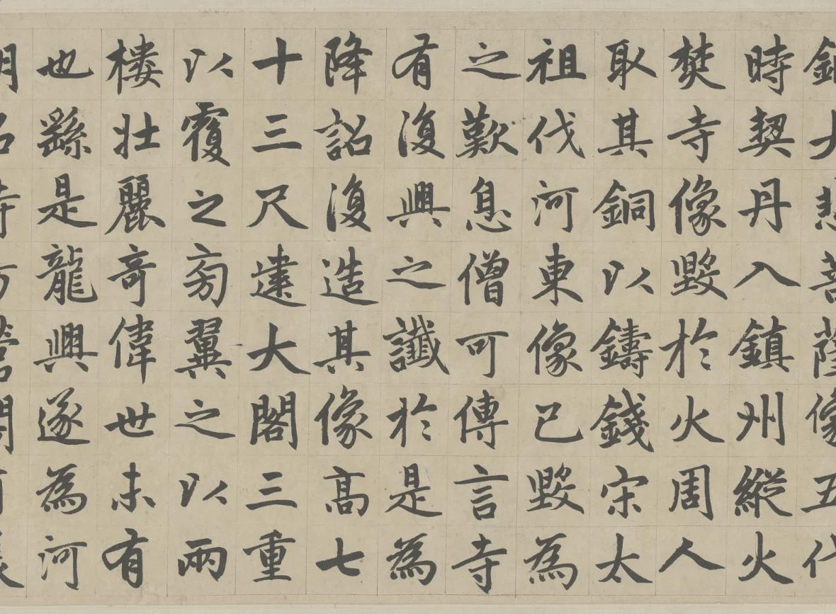
Let us look at the passage about Longxing Monastery’s image of the Bodhisattva of Great Compassion. To give full context to 铸钱, “cast coins,” 复造, “make anew,” 七十三尺, “seventy-three chi,” and 大阁三重, “a great pavilion of three storeys,” here is the passage in full. Modern punctuation has been added and common printed forms are used; the layout does not reproduce the manuscript’s columns:
龙兴寺建于隋世,寺有金铜大悲菩萨像。五代时,契丹入镇州,纵火焚寺,像毁于火,周人取其铜以铸钱。宋太祖伐河东,像已毁,为之叹息。僧可传言,寺有复兴之谶。于是为降诏复造其像,高七十三尺,建大阁三重以覆之。旁翼之以两楼,壮丽奇伟,世未有也。
Longxing Monastery was founded in the time of the Sui. It had a gilt-copper image of the Bodhisattva of Great Compassion. During the Five Dynasties, the Khitan entered Zhenzhou and set fire to the monastery. The image was destroyed in the fire, and the people of the Zhou dynasty of that period took its copper to cast coins. When Taizu of the Song campaigned against Hedong, the image had already been destroyed, and he sighed over its loss. The monk Kechuan said that there was a prophecy of the monastery’s revival. An imperial edict was therefore issued to make the image anew, seventy-three chi high, and to build a great pavilion of three storeys to shelter it. Two towers flanked it. Its splendour and extraordinary magnificence had no precedent in the world.
The passage says that the monastery was founded under the Sui and originally held a copper image of the Bodhisattva of Great Compassion. Warfare during the Five Dynasties destroyed both monastery and image, and the copper was taken for coinage. Taizu of the Song lamented the image’s destruction; the monk Kechuan spoke of a prophecy of revival. The court then ordered a new image seventy-three chi tall, a three-storey pavilion to cover it and flanking buildings. Chi is a historical unit of length; the measure is retained without imposing a modern conversion. We are recounting the inscription’s version of the monastery’s history, not treating its reported prophecy as an independently verified fact.
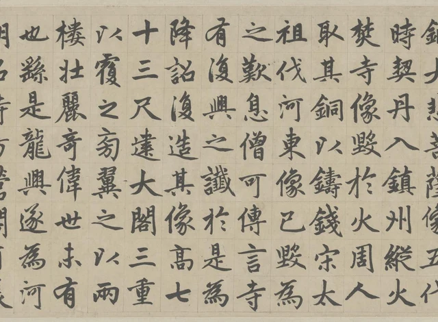
Find that column, 十三尺建大閣三重, in Figure 3. At the top, the long horizontal of 十, “ten,” crosses its vertical, leaving ample white around it. The three horizontals of 三, “three,” immediately below differ in length, thickness and spacing. Farther down, the diagonal extension of 尺, the unit chi, opens the lower right; 建, “build,” combines an interior of turns with a final stroke spreading to the right; 大, “great,” widens its lower part through two diagonals. Below it, 閣, “pavilion,” encloses short strokes within an outer frame, arranging black and white into more tightly nested spaces.
These characters do not grow in direct proportion to their number of strokes. 閣 has many, yet it does not push its neighbours above and below out of place. 十 has few, yet the white around it does not make it seem to have fallen out of step. Within comparable positions, a simple character establishes its extent through longer strokes, while a complex one admits more details into a denser interior. Our eyes can therefore travel down the column while continually changing how they pause within a character.
The two instances of 三, “three,” in this column have different neighbours. The upper one follows 十, “ten,” as part of “thirteen”; the lower one sits between 閣, “pavilion,” and 重, “storeys,” surrounded by much denser ink. Looking only at their three horizontals makes it easy to forget the particular stretch of paper each inhabits.
To the right, the column 取其銅以鑄錢宋太, “took its copper to cast coins / Song Tai…,” has a similar alternation. 銅, “copper,” 鑄, “cast,” and 錢, “coins,” gather many short strokes in their left-hand metal component and their right sides. Between the first two, 以, “to” or “for,” leaves a conspicuous opening. The final 太, “great,” part of the imperial name Taizu, extends longer diagonal strokes. Calling the whole passage “orderly” describes the broad arrangement of columns. Only when we see these widths and interior spaces do we understand why that order does not become a succession of identical black squares.
The traditional term 结体, jieti, “character structure,” can be located in specific things here: how strokes make room for one another, how a dense side coexists with an open one, where a character’s extension stops before its neighbour. 章法, zhangfa, “composition,” returns those characters to their columns, the title and credentials, and the whole scroll. These two ways of looking connect without first assigning a psychological word to every stroke.
In the eulogy, one verse line occupies two columns
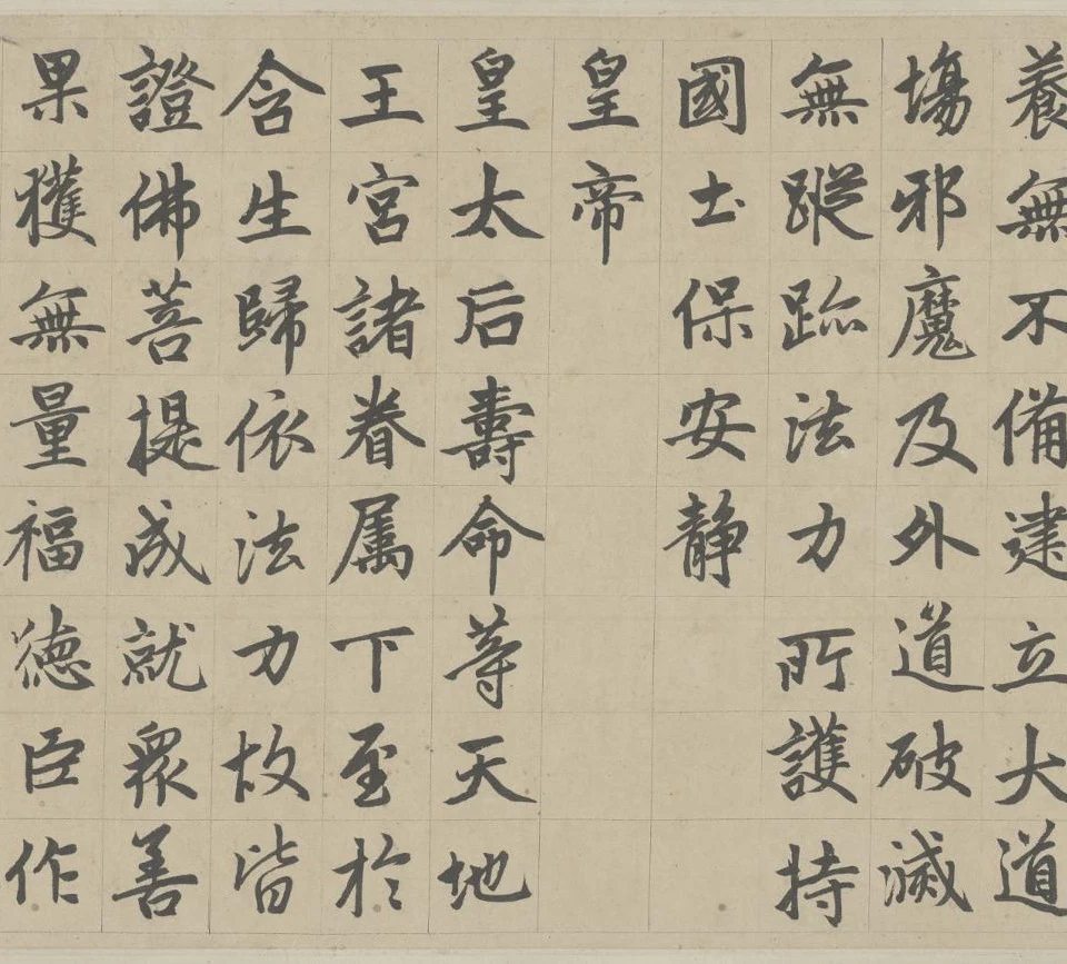
After the narrative, the inscription turns to a eulogy in five-character verse. It praises Danba’s religious practice and protective power, and wishes blessings upon the imperial household and living beings. Here is the final passage we are examining. The five-character verse lines help us read the meaning; they are not the manuscript’s columns:
法力所护持,国土保安静。
皇帝皇太后,寿命等天地。
王宫诸眷属,下至于含生。
归依法力故,皆证佛菩提。
成就众善果,获无量福德。
臣作如是言,传布于十方。
下及未来世,赞叹不可尽。
Protected by the power of the Dharma,
may the land remain peaceful and calm.
May the emperor and the empress dowager
live as long as heaven and earth.
From all the members of the royal household
down to every living being,
through taking refuge in the power of the Dharma,
may all realise the Buddha’s awakening,
bring every good fruit to fulfilment
and gain boundless blessings and merit.
I, your servant, compose these words
to spread them through the ten directions,
down to the ages still to come,
with praise that can never be exhausted.
The passage asks the power of Buddhist teaching to preserve the land’s peace, and wishes the emperor and empress dowager lives as long as heaven and earth. From the palace household to all living things, it wishes awakening, good fruits and blessings through refuge in the Dharma. The court servant writes these words to be spread in every direction, with praise continuing into the future. 十方, “the ten directions,” means all regions in this Buddhist context; 含生 means beings that possess life.
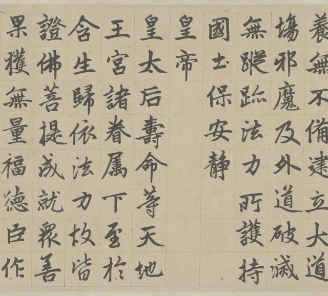
The manuscript does not place all five characters of 皇帝皇太后, “emperor and empress dowager,” in one column. First, 國土保安靜, the five characters for the land’s peace and calm, ends with blank paper beneath. The next column contains only 皇帝, leaving an even longer empty stretch. The following column begins 皇太后 and continues with 壽命等天地, “a life as long as heaven and earth,” all the way to the lower edge. A complete five-character verse line is distributed across two and three positions; its second part also joins the next verse line.
This blank space lets “emperor” and “empress dowager” each begin at the top, presenting the titles solemnly and separately. The text’s ceremonial hierarchy acquires visible positions. 皇帝 is not conspicuous because its characters are larger or its ink darker. There is very little other ink beneath it to disperse our attention, and the neighbouring long column makes that empty area clearer still.
Within 皇太后壽命等天地 there is another ordering of forms. 壽, “longevity,” fourth from the top, gathers many horizontals and turns into a dense area. Immediately below, 命, “life,” has a long central vertical that gives a clear downward direction. Next comes 等, “equal to”; then 天, “heaven,” opens its diagonals, while the final 地, “earth,” places its two components side by side. The eight-character column completes the blessing without filling every successive position with an identical shape.
For me, what makes this scroll so enduringly worth looking at is that these relations at different scales can hold together at once. From a distance, heading, credentials and main text have recognisably different levels. Close up, the openings and closures within characters are not swallowed by that hierarchy. Following the words, we find sentences crossing compartments and columns. Many particular differences together produce this clarity. Reduce it to “the characters are very correctly written,” and we lose much of what is there.
After “erecting the stone,” other people’s writing remains on paper
The eulogy ends with 赞叹不可尽, “praise cannot be exhausted.” Its last two characters, 可尽 (written 可盡), “can be exhausted,” stand at the top of a separate column, with no more eulogy below. Next come 延祐三年, “third year of Yanyou,” and 月, “month,” with a gap between them. Finally, 立石, “erect the stone,” forms another short column of its own.
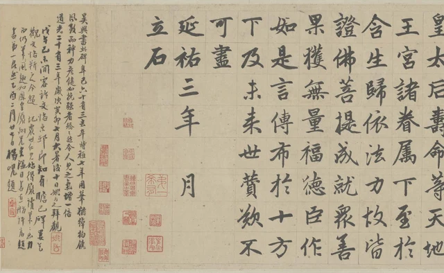
立石 identifies the act towards which the inscription points, yet the object before us is still a roll of paper. It shows the inscription’s handwritten form rather than making us see the characters through a stone surface and a rubbing. Some ink edges taper to points; other turns are rounder and thicker. The paper’s ruled grid, title and intervals between texts remain together with the ink in the same image.
The dense small writing to the left belongs to another writer. It begins 吳興書此碑…, “Wuxing wrote this stele…,” and comments on the work; farther left are colophons, or appended comments, by several other later readers. The Palace Museum’s catalogue lists Qing-period contributors including Yao Yuanzhi, Yang Xian and Li Hongyi. These texts help us understand how later viewers regarded Zhao’s calligraphy. They cannot be attached to his 立石 as if they were the main text’s uninterrupted continuation by the same hand.
From the opening to this point, the seal heading, repeated regular-script title, credentials, inscription, date and later colophons do different things. Being mounted in a single scroll has not erased their differences. Return to the beginning after looking through it, and the title’s two appearances are more than repetition. The first establishes a solemn entrance through six columns of large characters; the second brings the name into a smaller regular-script scale. Only then do credentials and narrative begin in their separate ways.
The beauty of the Danba Stele Scroll does not have to wait for a character to break through the whole scroll’s arrangement. It is already present in a sparse 十, “ten,” a dense 閣, “pavilion,” the lowered credentials and a suddenly shortened column. The paper distinguishes positions and preserves differences. Once we understand the inscription, we can still look at how each character finds its place without becoming the same as every other one.
Optional further reading: recognise the text, then look at where it stands
Return to Figure 2 and first identify just three things: where the title is, where the author’s credentials are and where the main text begins. If you understand the words, this recognition can happen quickly.
Then, for a moment, stop asking what each group of words reports and look along its upper edge. The title’s three columns begin high; the three credential columns step down; 皇, the beginning of “emperor” in the main text, returns to the higher level. Look farther down: there is blank paper below 師之碑, “stele of the preceptor”; the credential columns end at different points; the main text’s unfilled positions differ too. Knowing what each text is for has not done the looking at these heights and lengths on our behalf.
In “As the Light Fades, the Garden Appears Differently”, I wrote about how colour still deserves our attention after we have recognised a blue flower. SAE, or Self-as-an-End, and its “beauty of perception” can direct us here back to the paper after the words have conveyed their information. The credentials are more than a means of “telling me who the author is.” They have a lower starting point, several kinds of interior white space and a particular distance from the neighbouring title.
This does not ask us to forget ceremony or purpose. Understanding 臣, “your servant,” and 奉敕, “by imperial command,” helps us notice the differences of position. But finishing the explanation of a use does not use up the form. Letting the titles remain titles, while allowing the height of a single character-position to come clearly into view, already gives us a way of looking worth staying with.
Image and textual notes, including dimensions and image processing
This essay is a close reading of the Palace Museum’s publicly available high-resolution digital images, not a record of viewing the original in person. Photographs and screens affect paper colour, ink colour and the sense of scale. Comparisons mainly concern character forms, strokes and intervals within the same image.
- The object is the Palace Museum’s 赵孟頫楷书帝师胆巴碑卷, “Zhao Mengfu’s Handscroll of the Stele Inscription for Imperial Preceptor Danba in Regular Script,” ink on paper, collection number 新00153386. The seal heading, regular-script inscription and later colophons are distinguished as separate layers. “Stele” is part of the work’s customary name; it does not make this object a stone carving or a rubbing.
- The museum’s 2017 special-exhibition description records a height of 33.6 centimetres and a width of 563 centimetres. No independent dimensions for the main text, mounting or later colophons are inferred from the digital image’s aspect ratio. The 166- or 400-centimetre lengths found elsewhere online are not adopted as dimensions of the same catalogued unit.
- The seal heading has eighteen characters, in six columns of three; the repeated regular-script title has nineteen, in columns of eight, eight and three, adding 之, “of.” Common printed forms are reading aids, not facsimiles of the manuscript. 敕, “imperial command,” appears in the image as 勅. Where the transcription here has 隋, the Sui dynasty, the museum prints 陏. Modern punctuation has been added to quoted prose.
- There really is a gap before 月, “month,” in 延祐三年……月立石, “the stone erected in the […] month of the third year of Yanyou.” The museum transcribes □月. No month supplied by another chronology has been inserted into this manuscript. Nor is the date of “erecting the stone” equated without evidence with the precise day or time of writing.
- The eulogy is set out in five-character verse lines to help with its meaning, but one verse line does not correspond to one manuscript column. The excerpts give the complete monastery-history passage and the final eulogy passage discussed here, each followed by a full English translation. The museum’s work page supplies a transcription of the complete inscription.
- The five close-reading images were made by reconstructing the museum’s public DeepZoom tiles at their original coordinates, then taking rectangular crops that preserve adjacent columns. A full-scroll locating view and a six-band sequential index are also supplied. Processing was limited to joining display tiles, removing duplicated tile edges, proportional reduction and JPEG encoding. No strokes were added or altered, seals removed, sharpening or recolouring applied, or calligraphy generated with AI. Crop boundaries and SHA-256 hashes are in the accompanying image manifest.
- The illustrations were originally supplied with a local review package and are now used here for commentary on the work. No additional written republication permission has been obtained from the museum. Attribution and official links do not constitute authorisation. For the full statement, see Permissions and credits.
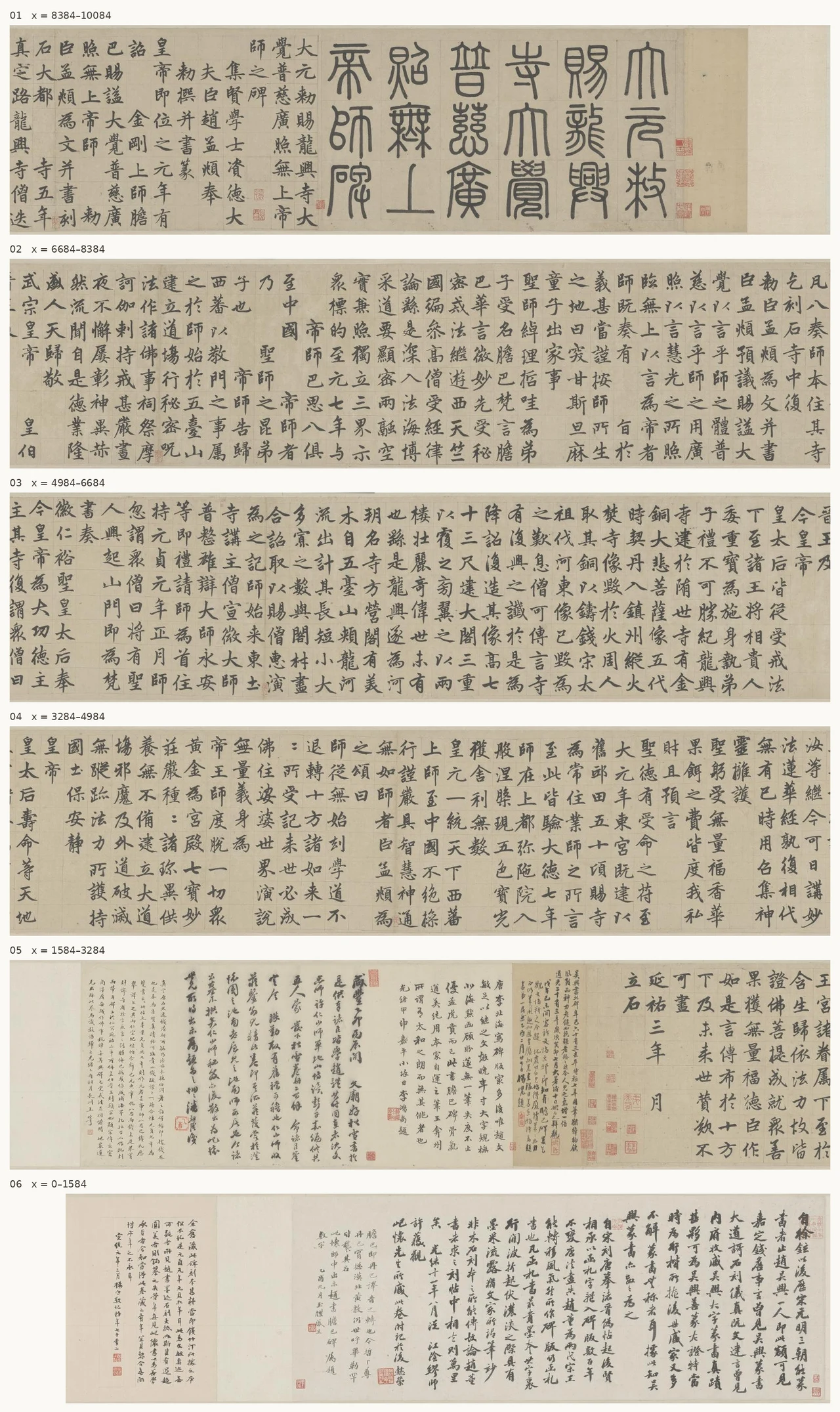
Full-scroll locating view: the seal heading begins at the right, and later colophons end at the left. Six-band sequential scroll index: follow the numbered bands from top to bottom; within each band, read from right to left and each column downward. The numbers identify bands and image coordinates, not historical dates or physical measurements. The index preserves the original sequence, beginning with the seal heading and ending with later colophons.

Further images and reading
- Palace Museum: Zhao Mengfu’s Danba Stele Scroll: description of the ink-on-paper object, transcription, colophons and image access, in Chinese.
- Palace Museum: high-resolution scroll viewer: zoomable views of the seal heading, main text and later colophons.
- Palace Museum website terms of use: conditions for using website materials; including images in this package does not confer a new publication licence.
- Han Qin, “As the Light Fades, the Garden Appears Differently”: the complete English essay used in the optional further reading; the Chinese original is also available.