After 伏惟, “I respectfully ask,” a substantial interval of paper passes before 鑒察, “your consideration.” The formula belongs together, yet the eye must cross a distance greater than the neighboring spaces between characters. Farther left, the date begins near the middle of the sheet, with no continuous text above it. Even at its ending, this short thank-you letter changes where its words sit.
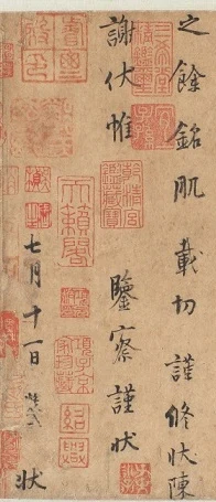
The Chive Flowers Letter is often described as spacious. Its spaces, however, are unequal: inside characters, between characters, interrupting a courteous phrase, or lowering an entire final column. This reading asks how those different spaces make a letter of clearly separated characters remain continuous.
First, which version are we seeing? Yang Ningshi (873–954) lived through the late Tang and Five Dynasties and was admired by Song calligraphers. This letter, traditionally attributed to him, thanks someone for food. It gives the eleventh day of the seventh month but no year. The object here is Wuxi Museum’s former Qing imperial version, catalogued as ink on hemp paper, seven columns and sixty-three characters, 26 × 28 cm. It must not be conflated with the former Luo Zhenyu version, other transmitted copies, or the engraved Sanxitang modelbook. In “A Morphological Study of Shaoxing Imperial Seals,” Palace Museum Journal, 2016, no. 4, p. 53, Niu Kecheng identifies the Wuxi sheet as a Ming outline-and-fill copy. The discussion therefore concerns the visible forms and positions in this transmitted version, not an uncontested autograph by Yang. Museum account; Niu’s study
Read the whole letter first
The transcription follows Wuxi Museum in modern simplified forms, retaining 輖 and 羜. Punctuation is supplied; paragraphs do not reproduce the manuscript’s columns.
昼寝乍兴,輖饥正甚,忽蒙简翰,猥赐盘飧。当一叶报秋之初,乃韭花逞味之始。助其肥羜,实谓珍羞。充腹之余,铭肌载切。谨修状陈谢,伏惟鉴察。谨状。七月十一日状。
Having just risen from a midday sleep, I was very hungry when your letter unexpectedly arrived, together with the food you so generously bestowed. It is the moment when a single leaf first announces autumn and chive flowers begin to display their flavor. Accompanying that tender, fat lamb, they truly deserve to be called a delicacy. Beyond satisfying my hunger, your kindness is deeply inscribed upon me. I respectfully write to express my thanks and ask your gracious consideration. Respectfully submitted. Written on the eleventh day of the seventh month.
簡翰 means a letter; 猥賜 is the recipient’s deferential acknowledgment of a gift. 盤飧 refers to food on a dish, 羜 to a young lamb, and 羞 in 珍羞 to delicacies. 銘肌 imagines gratitude as a memory engraved upon the body. The difficult opening expression 輖飢 follows the museum’s reading; context supports “hungry,” without inventing an action from its components. 狀 denotes a written statement, and its repetition belongs to the document’s courteous register.
The letter moves from bodily hunger through the arrival of writing and food, the early-autumn season, and flavor, to gratitude toward the giver. Courtesy does not erase the meal: chive flowers, lamb, and a full stomach remain explicit. Nor does the letter stop at “delicious.” 銘肌載切, deeply felt gratitude, joins one meal to a relationship.
Separated characters can still lead the eye downward
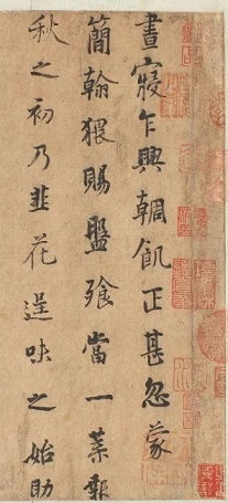
Follow 晝寢乍興, “just risen from a daytime sleep,” down the rightmost column. Many strokes terminate within their own characters, leaving distinct paper between one character and the next. No continuous cord of ink binds the column together. 乍, “just,” is relatively spare, while 興, “rise,” below it spreads out. Farther down, the complicated 輖 and 飢 gather their strokes; 正, “right then” in this phrase, again holds its place with only a few lines. Complex and simple characters have not been reduced to an equal area of black.
Here is the first work done by space. A character that occupies less leaves more surrounding white; a denser one gathers the white inward. The column’s axis remains broadly legible, but the lateral edges of its ink forms do not align. Downward reading encounters forms that widen and narrow, rather than a stack of identical blocks.
At the foot, 忽蒙, “unexpectedly receiving,” has not completed its meaning: 簡翰, “your letter,” is already at the next column’s top. The second column reaches 一葉報, “one leaf announces,” then sends us to 秋, “autumn,” at the left-hand column’s head. A new column does not necessarily begin where a sentence ends. Meaning crosses the wider intercolumn spaces, joining different heights. The more distinctly the individual characters stand apart, the more perceptible our work of joining them into a letter becomes.
The traditional term xingqi, the continuity of a column, need not mean fine connecting threads of ink. Continuity here has tangible supports: a preceding character’s orientation, the next character’s placement, and the continuation found in the neighboring column. Space is part of that route, not an absence that simply cuts it off.
Chive and flower share a column but not a shape
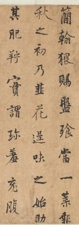
The title’s 韭花 occurs midway down the third column from the right. In 韭, paired short horizontal strokes gather around vertical elements, steadied by a lower horizontal. 花 beneath it has a lighter upper part, while its lower diagonal and curved strokes open outward. The two name one food, yet their black-and-white structures differ. 韭 gathers inward; 花 admits more surrounding paper.
Isolated, 花 could become an attractive character for practice. Restore its neighbors and a further relationship appears. To its right, 盤 and 飧 are relatively intricate; to its left, 肥 and 羜 are more open. Its extension occupies a place among forms of differing density, rather than reaching into unspecified emptiness.
Below come 逞味之始助, ending with “assist/accompany.” The spare 之, a linking particle, opens clearly sideways; 始, “beginning,” brings the eye into a denser interior. 助 at the column’s foot leaves the grammar pending until 其肥羜, “that fat lamb,” at the next column. A culinary pairing becomes a movement across paper: one must shift the eyes to finish reading how the chive flowers complement the meat.
Spaciousness therefore is not merely small writing scattered over a large sheet. Each character has tight and loose parts, and neighboring characters carry unequal quantities of black. They compare across the paper between them. An equal-size, equal-spacing typesetting could preserve the message while changing these relationships.
The widest interval lies inside a courteous formula
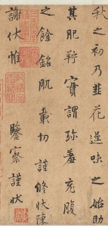
After 充腹, “filling the stomach,” the next column begins 之餘, “beyond this,” followed by 銘肌載切. No suddenly gigantic characters follow the meal. Gratitude unfolds in the same separated writing, while shapes and intervals continue to vary. The language is earnest without requiring a sheet saturated in dark ink to make that earnestness legible.
In 謹修狀陳謝, “respectfully writing to express thanks,” 謝 is moved to the next column’s top. 伏惟 follows; then comes the sheet’s most conspicuous internal pause. 鑒察 resumes in the lower half, followed by 謹狀, the respectful close.
This interval differs from the smaller space between 韭 and 花. Ordinary gaps allow shapes to stand independently; the larger 惟/鑒察 interval stretches a request addressed to the recipient. Courtesy, spacing, and deference have traditions in letter-writing. Without assigning an emotion to every inch of paper, we can see that courteous language here acquires a specific distance. Knowing that both parts belong to one phrase does not remove the journey between them.
The date changes the arrangement again. 七月十一日, “eleventh day of the seventh month,” starts lower than 謝 at the neighboring column’s head; the final 狀 approaches the paper’s edge. The ending is divided into the end of the message and the end of its dating, rather than forming a neat rectangle.
Blank space thus operates at several scales. Above the date, it lowers a whole column; after 惟, it delays a phrase internally; within characters, it keeps strokes distinct. All may be called “reserved white,” but they do different things. “Airiness” alone does not yet describe where the eye has stopped.
Keeping the scale of a small letter
The sheet measures only a little over twenty centimeters each way, although a screen can enlarge it dramatically. Close attention to a stroke’s edge can make us forget a short letter meant to be viewed nearby. Return to the whole-sheet image: the unequal column lengths, lowered date, and interruption of the courtesy formula appear together again.
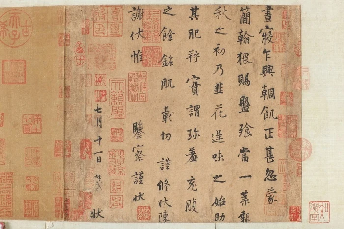
Many red seals also attract attention. Some overlap the vicinity of characters; others occupy otherwise open areas. They belong to the work’s later collecting history. Their density should not be counted as the original text’s density, although looking need not pretend they are absent. Distinguishing them allows marks from different times to occupy their own places on one sheet.
What rewards repeated looking is the variety of distances within so brief and intelligible a note. Characters stand apart while sentences cross between columns. Food remains concrete, while courtesy opens out through blank paper. At the final 狀, the letter has completed its business, yet its spatial relationships still sustain another look.
Optional reading: How the same paper gains different weight
Return to the overview and follow the white upward between the columns. Its channels are not equally wide: 花 extends into one, while a tightly gathered character allows another to widen. In Figure 1, the white between 惟 and 鑒 seems able to join the surrounding space, yet the two pieces of one formula give it definite endpoints.
In “As the Light Fades, the Garden Appears Differently”, I wrote about sensation as both recognition and an appearance that recognition does not exhaust. At the perceptual level, SAE’s Judgment and Aesthetics distinguishes such looking from immediately converting sensation into a use. This direction allows the white paper to do more, for a moment, than separate written signs. Theory
Looking at white does not require removing the characters. 花’s long stroke, the lowered beginning of the date, and the separated positions of 惟 and 鑒 give the same paper color different widths and directions. Following the writing, then following what lies beside it, changes the emphasis. Spaciousness becomes identifiable: not just less ink, but writing that gives the remaining paper a particular shape.
Image and transcription notes
- This reading uses public museum photographs, not firsthand examination. The official whole-sheet image is 700 × 466 pixels, not a high-resolution scan. Four details retain neighboring columns and involve rectangular cropping and JPEG encoding only, without enlargement, reconstruction, recoloring, or seal removal.
- Wuxi Museum retains the traditional attribution and notes disputed versions. Niu Kecheng’s 2016 study, p. 53, identifies this former imperial version as a Ming outline-and-fill copy. The article preserves both the traditional attribution and the distinction between versions.
- The museum’s sixty-three-character transcription ends 七月十一日狀. Small traces between 日 and the final 狀 are not confidently expanded from this modest-resolution image. 凝式 in the Taipei Sanxitang engraved version is not imported into this text. The entire letter and a complete translation appear above.
- Separate reproduction permission has not been obtained. Public access does not constitute publication authorization. Credits, source links, and crop coordinates are recorded in IMAGE_NOTES.md; rights require separate verification before public republication.
