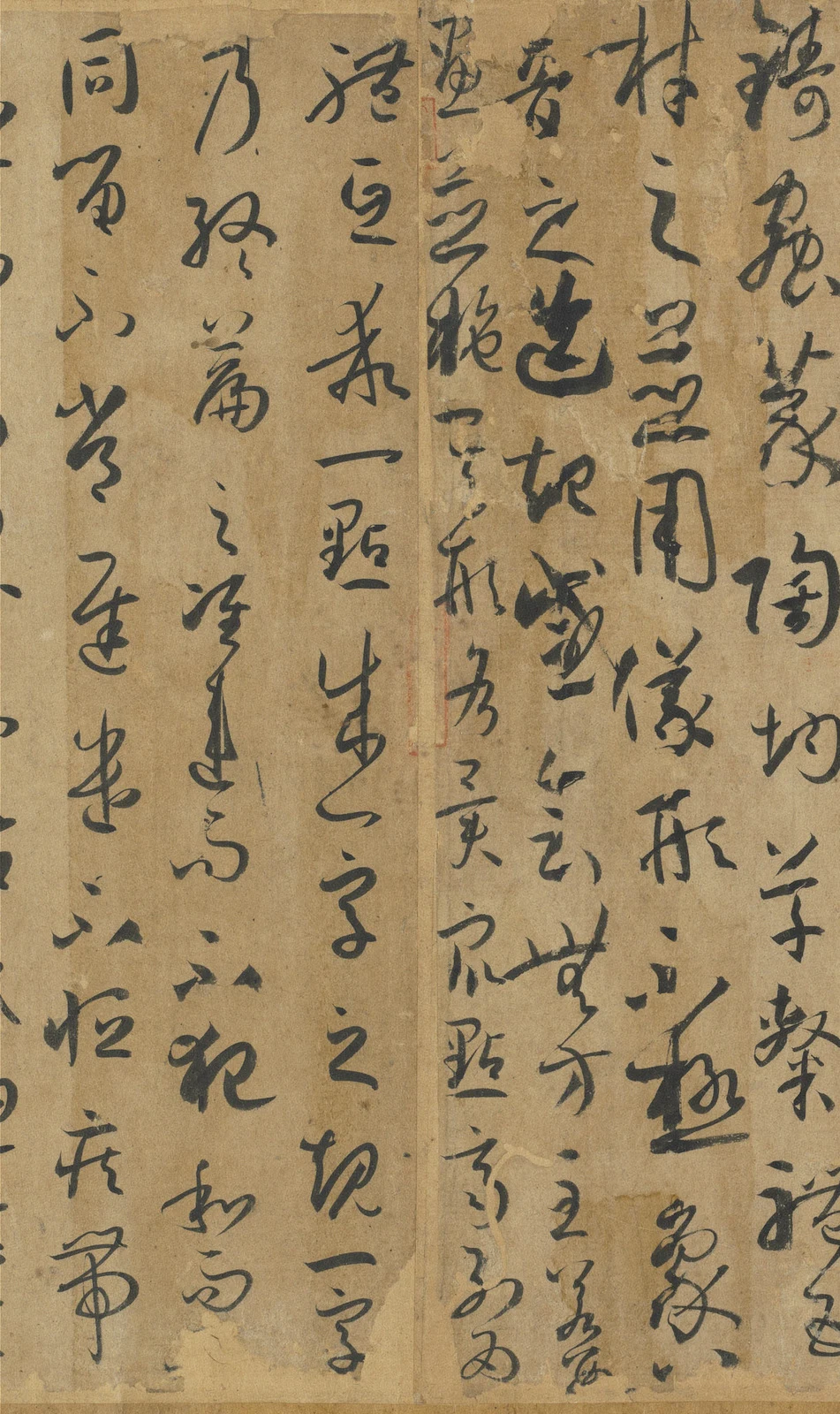
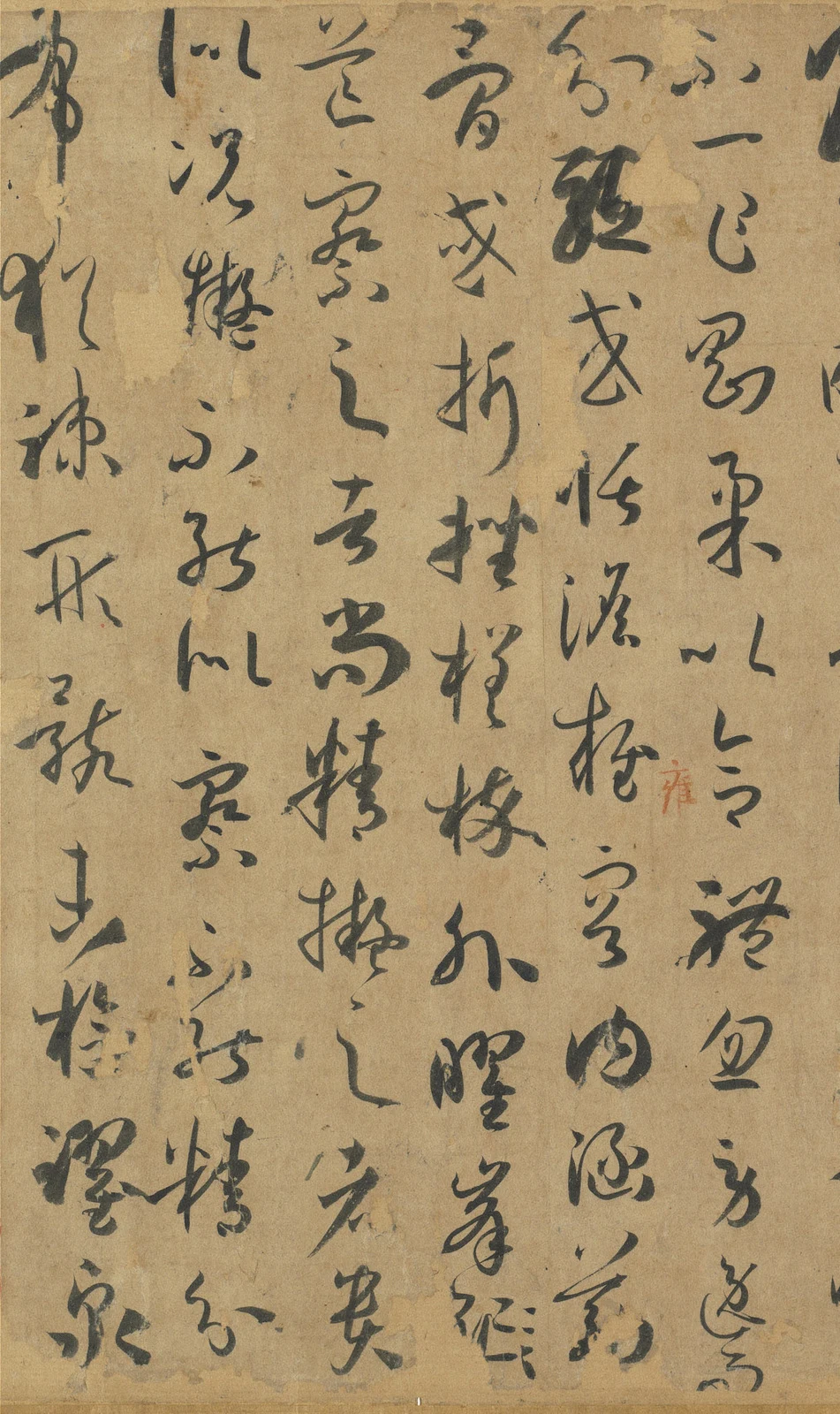
“A dot establishes the measure of a character; a character sets the standard for the whole piece.” In this sentence about rules, two instances of 字, “character,” happen to fall in the same column. One, below 成, “forms” or “establishes,” has a relatively rounded body and a small returning curve below. The other has reached the foot of the column and has a more slender outline. They are recognisably the same character. Neither repeats the other’s shape.
Look at what comes between them: 之, “of,” 規, “measure” or “rule,” and the horizontal 一, “one.” After the second 字, the reader must change columns, continuing with 乃, “then,” at the top of the column to the left. A theory about “one character” is carried by many characters of unequal size.
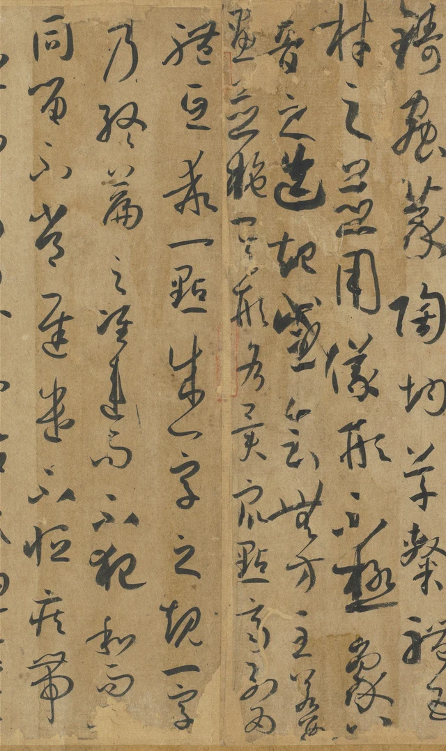
The Shupu, or Essay on Calligraphy, can easily become a book mined for memorable sayings. It can just as easily become a beautiful cursive scroll whose words need not be read. I prefer to let these two approaches question one another. The text explains how to learn and judge; the ink makes those explanations specific again. If 規 and 準, “measure” and “standard,” mean no more than a uniformly neat outline, they cannot account for the two different 字 before us.
We are reading the ink handscroll in the National Palace Museum, Taipei, catalogue number 故書000058, not a rubbing of an engraved version. Its opening names “Sun Guoting of Wu Commandery” as author; the closing date is the third year of Chuigong, 687. Sun was active in the later seventh century. Rather than filling out a complete portrait of his life, we can attend to something more firmly present: this long scroll preserves both his discussion of calligraphy and a particular work in cursive script. Museum record and transcription, in Chinese
When a character becomes a measure
The sentence in Figure 1 needs the turns of argument that follow it. Here is the complete unit from 至若 to 筌蹄, in standard traditional Chinese characters, with modern punctuation. The printed paragraphs do not reproduce the manuscript’s columns. Each passage below is followed by a complete translation.
至若數畫並施,其形各異;眾點齊列,為體互乖。一點成一字之規,一字乃終篇之準。違而不犯,和而不同;留不常遲,遣不恆疾;帶燥方潤,將濃遂枯。泯規矩於方圓,遁鉤繩之曲直;乍顯乍晦,若行若藏。窮變態於毫端,合情調於紙上;無間心手,忘懷楷則。自可背羲獻而無失,違鍾張而尚工。譬夫絳樹青琴,殊姿共豔;隨珠和璧,異質同妍。何必刻鶴圖龍,竟慚真體;得魚獲兔,猶吝筌蹄。
When several strokes are set together, their shapes differ; when many dots stand in an array, each takes a different form. A dot establishes the measure of a character; a character sets the standard for the whole piece. They diverge without clashing, harmonise without becoming identical. Holding back is not always slow; releasing is not invariably swift. Dryness accompanies moisture; density gives way to dryness. Rules dissolve into square and round forms; the hook and marking line disappear within curves and straight strokes. Now manifest, now obscure, the movement seems to advance, then to conceal itself. Exhaust the transformations at the brush tip and bring expression into accord upon the paper: mind and hand are no longer divided, and the rules need no longer occupy conscious attention. Then one may depart from Wang Xizhi and Wang Xianzhi without going wrong, differ from Zhong Yao and Zhang Zhi while remaining accomplished. Think of Jiangshu and Qingqin, differently beautiful women; or the Sui pearl and He jade, different materials of equal beauty. Why carve a crane or draw a dragon only to be shamed by the true form? Having caught the fish or rabbit, why still cling to the fish trap or rabbit snare?
Jiangshu and Qingqin are names of exemplary beauties here, not two colours on the paper. The pearl and jade are celebrated treasures. The traps invoke the Zhuangzi’s “External Things”: once the fish or rabbit is caught, the means can be forgotten. The issue is treating a means as an end. Sun does not begin by rejecting rules. He first insists on measures and standards; only then does he describe an accomplished practice in which the implements of measurement need not keep showing. Zhuangzi, “External Things,” Chinese text
Return to the two 字. The upper one has a tighter little curve below and still sits within the column; the lower one reaches its end, its terminal line extending down. The instances of 一 above them also vary: the one in 一點, “one dot,” spreads horizontally, while the short strokes before 字 occupy their own positions. The character remains identifiable and the column remains readable. Yet it is hard to extract one shape as a template and call every other occurrence a faulty deviation.
This does not establish that Sun deliberately designed two different 字 to illustrate his proposition. What matters is the meeting of two kinds of evidence. The argument asks for relations maintained through variation; the paper presents different forms that require individual comparison. Calling them “harmonious without being identical” still obliges us to say where they differ and how they continue to work together.
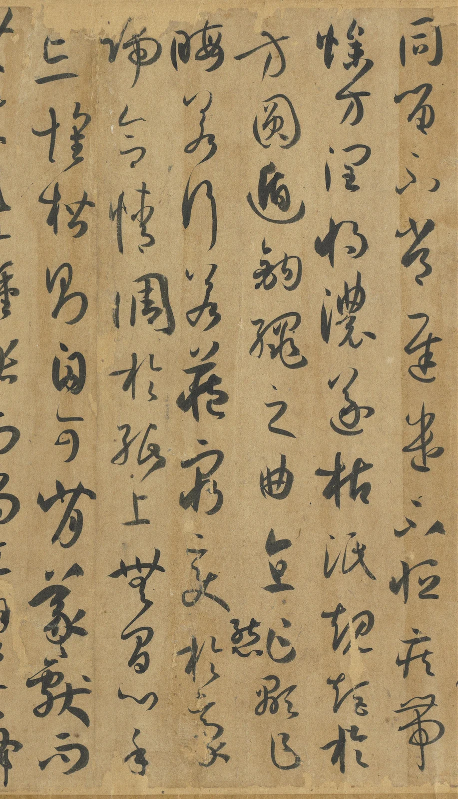
Following the scroll leftward brings us to 留不常遲,遣不恆疾, “holding back is not always slow; releasing is not invariably swift.” This pair of propositions asks us to bring the words describing brush movement back to the actual ink.
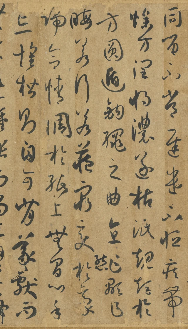
將濃遂枯, “density gives way to dryness,” readily tempts us to find a demonstration that runs from black to white. In Figure 2’s second column from the right, 將 and 濃 are indeed relatively dark. But after the finer 遂, 枯 has not dissolved into an almost invisible trace. Its two sides remain distinct; the horizontal stroke on its left extends outward. The word “dry” and the ink used to write it need not behave like matching labels.
Following the entire column is more rewarding. At the top, 燥, “dry,” 方, “just” or “then,” and 潤, “moist,” have different forms. Darkness gathers in the middle, then gives way to finer lines below. In the neighbouring column, beginning 方圓遁鉤繩之曲直, the turning contour of 圓, “round,” and the conspicuous lower curve of 遁, “disappear,” make further differences. Change extends over a span longer than one descriptive word. A stroke must be returned to its column, and that column to its neighbours, before we can judge whether one dark passage overwhelms another or how a fine line lets the next character emerge clearly.
A “standard” here is closer to a set of mutually adjusting relations. Arbitrarily move or enlarge one character, and its neighbours’ relations change. But this does not require equal squares for every character. The writing of Shupu makes “having rules” a more exacting matter than “looking the same.”
Returning to balance does not return to the starting point
How is such a measure learned? Earlier, Sun describes a process often detached into three slogans:
若思通楷則,少不如老;學成規矩,老不如少。思則老而逾妙,學乃少而可勉。勉之不已,抑有三時;時然一變,極其分矣。至如初學分布,但求平正;既知平正,務追險絕;既能險絕,復歸平正。初謂未及,中則過之,後乃通會。通會之際,人書俱老。仲尼云:“五十知命,七十從心。”故以達夷險之情,體權變之道,亦猶謀而後動,動不失宜;時然後言,言必中理矣。
In thinking through the principles of writing, the young do not equal the old; in learning its rules through practice, the old do not equal the young. Reflection can become subtler with age, while learning calls for effort in youth. Continued effort involves three stages, each with a change that brings its capacities to their fullest extent. When first learning arrangement, seek only balance and correctness. Once these are understood, pursue perilous extremes. Once the extremes are mastered, return to balance and correctness. At first one has not reached the goal; in the middle one goes beyond it; only afterwards does understanding become integrated. At that point, both the person and the writing have matured. Confucius said, “At fifty I understood Heaven’s mandate; at seventy I followed my heart.” Thus one understands ease and peril, embodies the way of adapting to circumstances, and acts as one who considers before moving, so that action is appropriate, and speaks at the fitting time, so that the words accord with reason.
“Old” here includes maturity and seasoned understanding. These observations about age belong to Sun’s account of teaching; they are not modern laws by which to judge every individual’s ability to learn. Nor can 平正, “balance and correctness,” be extracted from the three stages as though he allowed only a single upright manner. His process already includes 險絕, “perilous extremes,” and ends with 通會, integrated understanding.
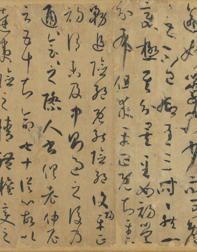
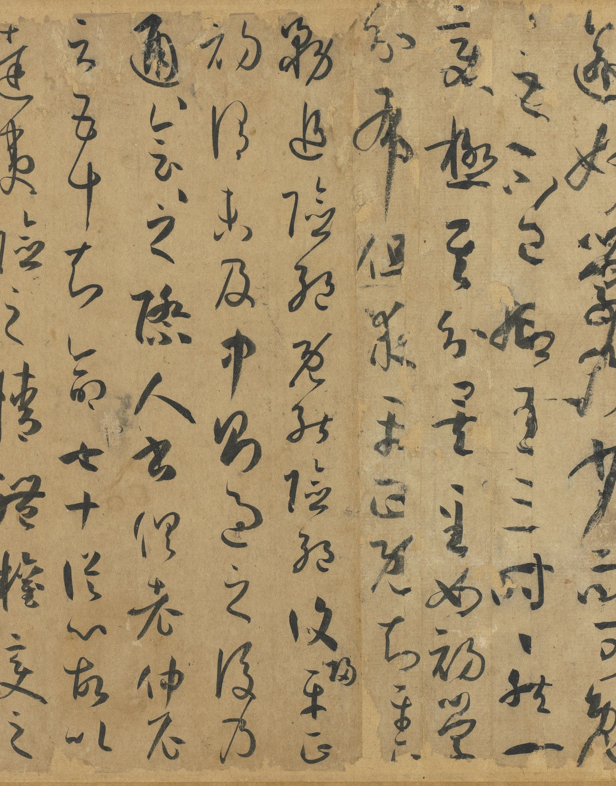
Follow these three 平正 in Figure 3. The stages of the argument have positions on the paper. The first pair sits below 但求, “seek only,” within one column. After 既知, “once understood,” 平 has reached the foot, and 正 must be found at the top of the next column to the left. The third pair appears at the top of the following column.
Compare the three 正, “correct” or “upright.” The first is relatively square, with clearly discernible horizontal elements. The second, at the column’s head, has a different pattern of turning and closure. The third follows 平 at the next column’s head and contracts again. They do not enact “beginning,” “after extremes” and “integration” as three separate scripts. They remain repetitions within one cursive scroll; wear in the ink also affects their surviving completeness. Yet repetition is not copying. Identity of concept and difference of form can coexist.
This passage is particularly good at resisting an easy judgment: “He writes about balance, so all these characters ought to be level.” Sun’s argument already opposes stopping at the first stage. The ink lets us see the same word taking form again in different positions. The final balance is not an emptiness left by erasing extremes; it includes the capacity to accommodate variation.
Position, shape and continuity give the teaching argument a visible specificity. They need not assign a particular character to youth, middle age or old age.
Theory, too, gets corrected on paper
Another passage makes a stricter distinction between speed and slowness. It follows a warning about observation and imitation:
至有未悟淹留,偏追勁疾;不能迅速,翻效遲重。夫勁速者,超逸之機;遲留者,賞會之致。將反其速,行臻會美之方;專溺於遲,終爽絕倫之妙。能速不速,所謂淹留;因遲就遲,詎名賞會!非夫心閒手敏,難以兼通者焉。
Some have not understood lingering, yet pursue only vigorous speed; unable to write swiftly, others imitate slowness and weight. Vigorous speed offers the possibility of soaring freedom; lingering can embody appreciative understanding. Turning back from speed, one may approach the way in which beauties converge; sinking wholly into slowness, one misses the excellence of the exceptional. To be capable of speed without always using it is what is called lingering. To remain slow because one can only be slow: how could that be appreciative understanding? Without an unhurried mind and an agile hand, the two are difficult to command together.
Neither “fast” nor “slow” is enthroned as the highest standard. Sun distinguishes two outwardly similar kinds of slowness. One can vary and chooses to linger; the other lacks alternatives. Naming the tempo is insufficient. We must ask what capabilities and relations make it possible.
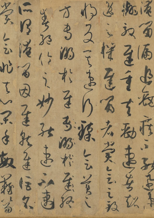
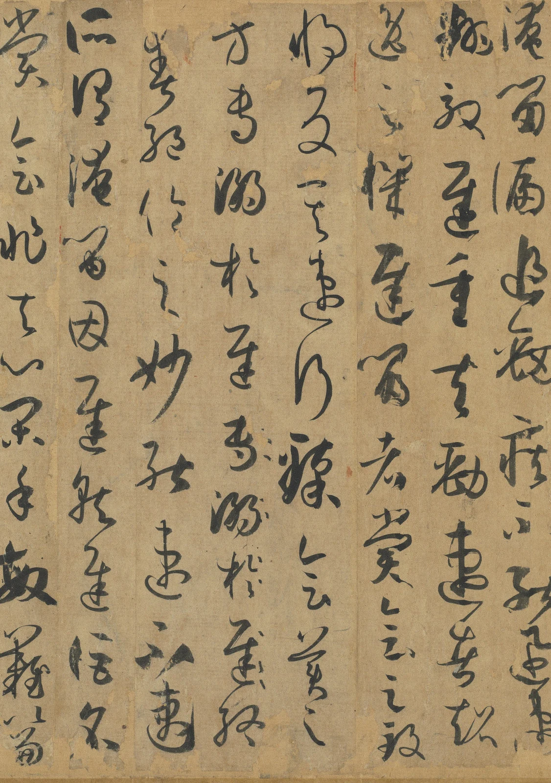
Here 專溺於遲 has been written twice, the second occurrence cancelled. A printed transcription can retain only one; the paper keeps the length of both. Follow the column downward. In the first occurrence, 溺, “sink into,” is relatively gathered; beside the second there are small dots. In the next column, the two 速, “swift,” of 能速不速 turn in related but different ways. Characters retained in the text, characters rejected but still visible, and the dots of cancellation occupy the paper together.
The repetition and cancellation preserve a correction. Its cause may be unknown, but its place remains visible. This gives the theory a specificity absent from a clean printed edition: the person discussing accomplishment and understanding is also writing on paper that cannot automatically return to its former state.
Now the preceding instruction 察之者尚精, “precision matters in observation,” deserves another reading. Here is the complete warning:
然消息多方,性情不一。乍剛柔以合體,忽勞逸而分驅。或恬澹雍容,內涵筋骨;或折挫槎椊,外曜鋒芒。察之者尚精,擬之者貴似。況擬不能似,察不能精,分布猶疏,形骸未檢,躍泉之態,未睹其妍;窺井之談,已聞其醜。縱欲唐突羲獻,誣罔鍾張,安能掩當年之目,杜將來之口!慕習之輩,尤宜慎諸。
There are many ways of adjusting and changing, and expressions of character are not uniform. At one moment firmness and softness join in a single form; at another, exertion and ease take separate courses. Some writing is tranquil and spacious, with sinew and bone contained within; some breaks and turns like uneven branches, displaying its sharpness outwardly. Observation prizes precision; imitation values resemblance. If imitation cannot resemble its model and observation cannot be precise, if arrangement remains deficient and the form has not been brought under control, the beauty of a movement like a leap from the water has not yet been seen, while the ugliness of the narrow talk of someone peering from a well is already heard. Even if one wishes to disparage Wang Xizhi and Wang Xianzhi, or speak falsely of Zhong Yao and Zhang Zhi, how could one cover the eyes of contemporaries or silence later judgment? Those who admire and study calligraphy should be especially careful.
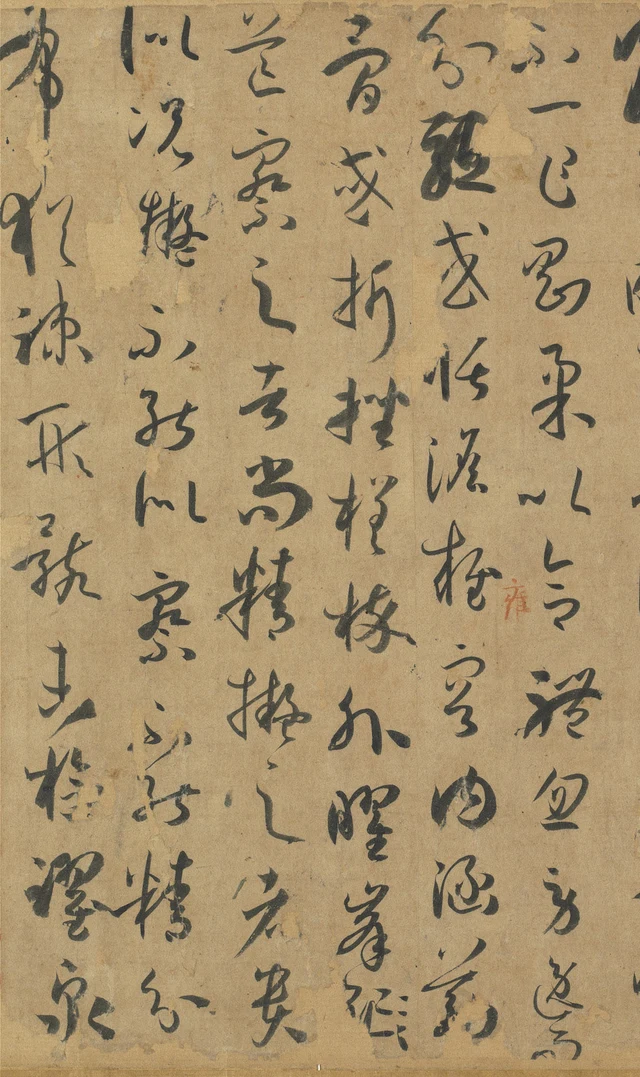
In Figure 5, 察, “observe,” is not especially large, nor is 精, “precise,” raised into isolation. They share a column’s uneven sequence with 之, 者, 尚 and 擬. The stronger lines of 折挫, “breaking and turning,” stand in the column to the right; 況擬不能似, “if imitation cannot resemble,” contracts into smaller writing on the left. The instruction to observe precisely itself requires close observation to be read among its neighbours.
Sun does not announce that all judgments are arbitrary, or withdraw the demands of learning because writing can vary. His tone towards careless criticism is severe. That severity is compatible with “harmonious without being identical.” Precisely because difference is not arbitrariness, judgment cannot end with “good” or “follows the rules.”
My reading must submit to the same demand. If the two 字 differ, Figure 1 should make the difference locatable. If 枯 has not become a pale trace, Figure 2 should allow that claim to be checked. If some small dots cancel text, image and transcription must testify together. A theory of calligraphy should not become merely a vocabulary for praising its author.
Shupu leaves later readers an exacting way of looking. Having learned a concept, one must test its application here. Having seen a difference, one must explain why the relations have not fallen apart. The two 字 remain in their original column. They do not look alike, and theory has not thereby failed. It has begun to require a more precise account of “rules.”
Optional further reading: a question, too, can be questioned
“Are these characters balanced?” is answerable, but it can also bring our looking to an end too early. If “balanced” already means identical sizes and perfectly aligned columns, the answer has been settled before Figure 3 has been explored.
In “The House Is Still Unsold. The Argument Has Changed.”, I describe a family moving beyond a dispute between price and remembrance to ask who pays for repairs and who fears losing a place to return to. The crucial change is not only a new question. They go on to question the distinction between “money” and “home,” rather than fixing it into two final boxes.
SAE, or Self-as-an-End, and its “beauty of philosophy” offer an occasion to examine our questions. They do not supply Sun with a replacement standard for calligraphy or establish moral character from handwriting. We can replace “Why is this not neater?” with “What relations make these characters work?” We must then ask whether our new question indiscriminately excuses every tilt, sluggishness or omission.
The useful movement is the question’s capacity to turn back. If we say that final balance accommodates variation, we can examine how the three 平正 are actually written. If a detail does not support our account, we revise the account. Understanding remains, but a famous saying no longer exempts it from inspection.
Such reading need not produce agreement. One person may prefer the 字 below 規; another may linger over 能速不速, “able to be swift, yet not swift.” At least disagreement can be brought to the same place on the paper: each reader points to what they see and leaves it open to another’s inspection. A question that clarifies the writing without dictating what the next viewer must see has accomplished something real.
Image and textual notes
- The object is 故書000058N000000000, record 14900, the ink handscroll rather than a similarly named rubbing. The museum’s appreciation page gives paper, 26.5 × 900.8 cm. This essay translates the four complete units discussed here, not the entire scroll of more than three thousand Chinese characters.
- Quotations use standard traditional characters and added punctuation. Cancelled wording is excluded from the corrected text; the repetition in Figure 4 is discussed separately. 槎椊 follows the museum’s wording. 分布猶疏, “arrangement remains deficient,” follows the visible form at Figure 5’s left edge and the museum’s Song-engraving rubbing transcription, record 32071, which has 猶疎. The ink-scroll record prints 踩 here; it is not interpreted as “trample.” The rubbing is used only for textual comparison, never as an image source. 將反其速,行臻會美之方 retains the museum’s wording. Chinese character forms in the prose are locating aids, not traced outlines.
- Figures 1–5 are rectangular crops from the appreciation site’s 3056 × 2018-pixel photographs, proportionally reduced. No strokes, seals or colours have been altered; no sharpening or generated writing is used. Figures 1 and 2 share an overlapping column and must not be treated as a seamless measurable reconstruction. Coordinates and checksums are in the image manifest.
- These are observations from digital photographs. Wear, photography and display affect detail; speed, force and momentary emotion are not directly measured from them. Collectors’ seals and mounting traces do not reproduce the paper’s state when Sun wrote. The surviving scroll has missing and misplaced text; these selected passages have been checked against the museum’s transcription rather than used to reconstruct its entire original mounting order.
- Image use is recorded under the actual source and the museum’s Government Website Open Information Announcement, with attribution and cropping disclosed. A CC BY 4.0 label from another download route is not automatically assigned to these JPEGs. Attribution does not imply museum endorsement. Full details are in the accompanying permissions file.