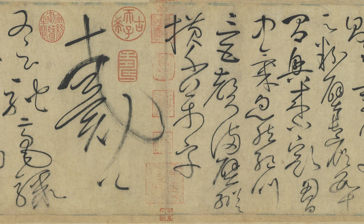
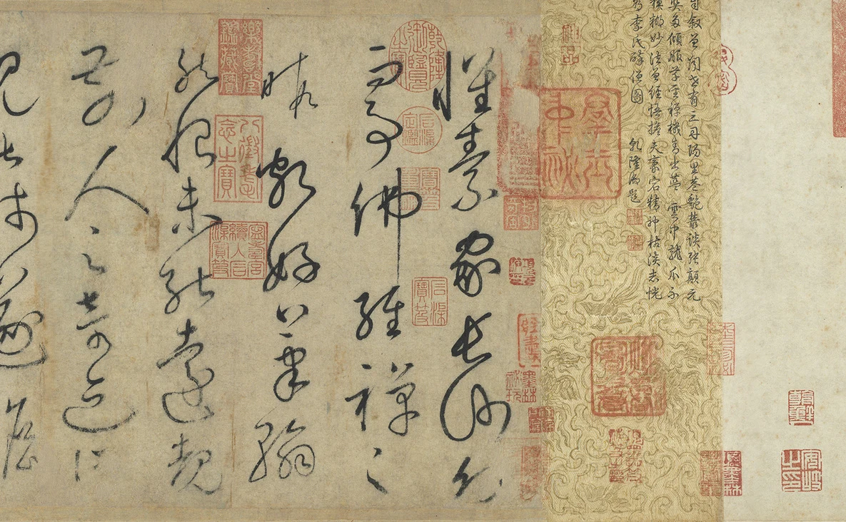
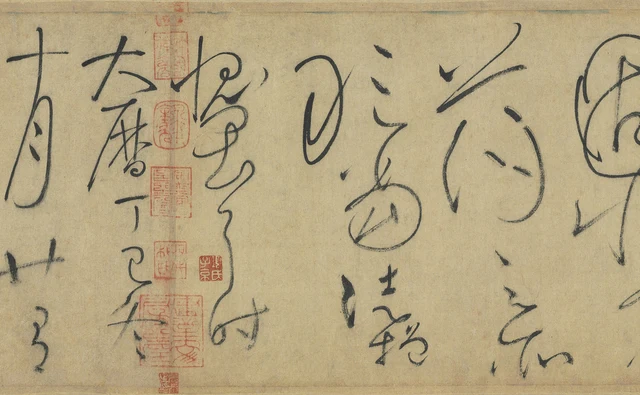
戴公, “Master Dai,” consists of only two characters, yet occupies an entire column in the Autobiography. 戴, the surname Dai, opens out below its upper horizontal stroke; several oblique lines turn back across the form. 公, the respectful title beneath it, contracts to a much smaller size. The column immediately to the right reads 橫千萬字, continuing a description of countless characters spread across a wall; the next holds six characters, 三五聲滿壁縱, about cries ringing out and writing covering the wall. The full lines and their translation follow below. The same height of paper suddenly accommodates very different quantities of writing.
“Master Dai” refers to the poet Dai Shulun. The following 又云, “also says,” introduces another couplet by him. An ordinary attribution within the prose becomes one of the most conspicuous forms in this passage. Importance within a sentence and the amount of space occupied on paper have not been assigned in matching proportions.
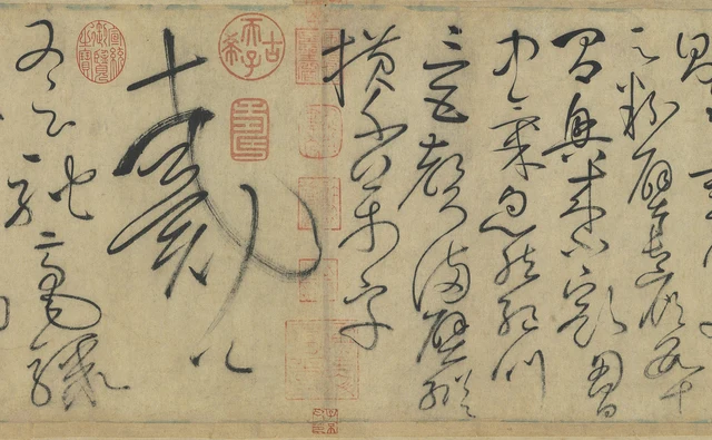
This is where I would like to enter the Autobiography, or Zixu tie (自敘帖). Its cursive writing can make a character very large while supporting it mainly through lines and the paper between them. It can also bring several characters close together without making them an undifferentiated mass. What concerns us is how these expansions, contractions and interruptions answer one another across the scroll.
The work examined here is the ink handscroll held by the National Palace Museum in Taipei, accession number 故書000062. The museum continues to catalogue it as the Autobiography of Huaisu of the Tang dynasty. Its inscription gives the year Dali dingsi, corresponding to 777. Scholars disagree over whether the surviving ink is in Huaisu’s hand and how it should be dated; a Northern Song tracing-copy has been proposed, among other views. Research published by the museum records this dispute. This essay retains the familiar title and examines this particular object; visual force is not used to settle authenticity. Collection record, in Chinese; museum research journal, page 178 and note 2, in Chinese.
Huaisu was a Tang Buddhist monk celebrated for cursive calligraphy. The text begins with his search for earlier calligraphy and encounters with leading contemporaries, then incorporates a preface by Yan Zhenqing and praise from several poets. This “self-account” thus includes how other people saw him. Its snakes, sudden rain, drunkenness and speed first belong to quoted poems and commentary. They help us understand the language without becoming eyewitness records of every stroke in this manuscript.
Read the complete passage around Master Dai
We need not identify every cursive character first. Read the two quotations involved in Figure 1, then return to locate them. The Chinese uses standard printed forms and modern punctuation; its paragraphs do not reproduce the manuscript’s columns.
语疾速,则有窦御史冀云:“粉壁长廊数十间,兴来小豁胸中气。忽然绝叫三五声,满壁纵横千万字。”戴公又云:“驰毫骤墨列奔驷,满座失声看不及。”
On speed, Censor Dou Ji says: “A long corridor of whitewashed walls, several tens of bays; when inspiration comes, he gives a little vent to the spirit in his breast. Suddenly he cries aloud three or five times, and countless characters cover the walls, lengthwise and across.” Master Dai also says: “The racing brush and rushing ink are ranks of galloping teams; the whole company cries out, unable to see quickly enough.”
Dou Ji’s poem imagines a corridor many architectural bays long and an impulse finding expression across its walls. Dai Shulun compares the brush and ink to galloping teams of horses, with spectators unable to keep pace. The poems’ exaggerations convey the impact of witnessing a calligraphic performance. “Countless” and “unable to see quickly enough” need not be converted into actual character counts or measured times.
Figure 1 distributes part of this passage into columns: 云粉壁長廊數十 (“says / whitewashed walls / long corridor / several tens”); 間興來小豁胸 (“bays / inspiration comes / a little vent / breast”); 中氣忽然絕叫 (“inner spirit / suddenly / cry aloud”); 三五聲滿壁縱 (“three or five cries / filling the wall / lengthwise”); 橫千萬字 (“across / countless characters”); 戴公 (“Master Dai”); and 又云馳毫驟 (“also says / racing brush / rushing…”). The photograph shows only part of the passage; the second couplet continues farther left. The poems have seven-character verse lines, while the cursive columns follow another arrangement.
Look again at 戴. It has not become a solid black block. The upper horizontal stroke remains clear; the turns below enclose open areas of varying widths. A long curve on the right pushes the character towards its neighbour. Fine exposed streaks appear in the drier-looking stretches, but the direction of the line can still be followed. The small 公 beneath concludes the column. Its neighbours, each carrying a succession of characters, make the scale of 戴 particularly apparent.
The column’s role becomes clearer beside those neighbours: it draws an eye that has been travelling downward into a lateral expansion, then returns it to the more numerous characters on the left. Variation in a long scroll can occur at an ordinary respectful form of address. It does not wait for words meaning “startled,” “wild” or “cry aloud.”
How a turning line leaves room for a character
Earlier in the scroll, Huaisu describes travelling to study:
遂担笈杖锡,西游上国。谒见当代名公,错综其事。遗编绝简,往往遇之,豁然心胸,略无疑滞。鱼笺绢素,多所尘点,士大夫不以为怪焉。
So, carrying a book satchel and a monk’s staff, I travelled west to the capital. I visited the eminent men of the day and examined the matter from different sides. I often encountered surviving writings and fragments of earlier works; my mind opened, with scarcely any doubt or impediment remaining. I marked many sheets of fine paper and plain silk, and the scholar-officials did not find this strange.
The book satchel and the monk’s staff belong to a journey of learning. Meeting earlier works dispels uncertainty; 尘点, literally “dust and spots,” modestly describes his own writing on the materials offered to him. 鱼笺, written 魚牋 in the scroll, names a kind of paper; 绢素 means plain silk for writing. They are not a picture of a fish and an abstract claim to purity.
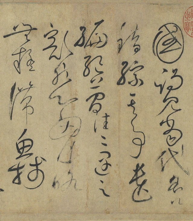
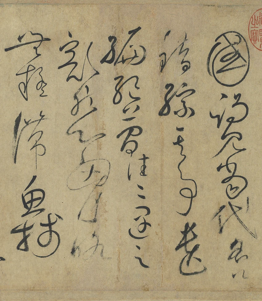
At the upper right, 國, simplified 国, completes 上國, “the capital.” Its outer edge resembles an upright ring, with turning, overlapping lines inside. Its enclosed opening may be what we notice first. Following the column downward, however, we soon encounter the more open, finer sequence 謁見當代名公, “visit the eminent men of the day.” 公, “eminent men” in this phrase, becomes small near the foot. The paper does not maintain a single scale after its large opening character.
The left column, 無疑滯魚牋, offers another arrangement. 無, “no,” opens sideways at the top; finer lines appear around 疑, “doubt,” and 滯, “impediment.” Below them, 魚 and 牋, together naming the writing paper, gather relatively substantial strokes. The right column carries more weight at the top, the left at the bottom; the intermediate columns have their own densities. These displaced centres of weight pull the gaze sideways as well as downward.
Rounded turns do not mean that every line is joined. Notice the paper exposed between 國 and the next character, then the distance between 無 and 疑 on the left. Fine lines, pointed endings and gaps still distinguish beginnings and endings. Some connections are actual ink lines. Others require the eye to move from a previous stroke’s direction to the position of the next character. The traditional phrase 筆斷意連, “the brush breaks off, yet the connection continues,” can be located in these visible relationships rather than left as an uncheckable compliment to spirit or vitality.
Cursive script has established forms and conventions for omission and combination. Recognising characters requires learning; we cannot freely decide that any curve represents any word. Even before recognising them all, however, we can see which outline encloses a patch of white, which character makes room beside it, and which interval separates two forms. A transcription then helps us correct our grouping. It does not cancel those spatial relationships.
A large character can remain open inside
Return to the writing after “Master Dai.” Once Dai Shulun’s couplet is complete, the text turns to Qian Qi:
目愚劣,则有从父司勋员外郎吴兴钱起诗云:“远锡无前侣,孤云寄太虚。狂来轻世界,醉里得真如。”
In speaking of my foolish, inferior self, my senior kinsman Qian Qi of Wuxing, Vice Director in the Bureau of Merit Titles, has a poem: “Travelling far with the monk’s staff, no companion goes before him; a solitary cloud lodges in the vast sky. In wild inspiration he takes the world lightly; in drunkenness he attains true suchness.”
The poem places intoxication beside the Buddhist term 真如, “true suchness,” bringing apparently distant states together. 目愚劣 is a self-deprecating phrase. Here 目 means “describe” or “regard”; 愚劣 means “foolish and inferior.” The first character is functioning as a verb, rather than as the noun “eye.”
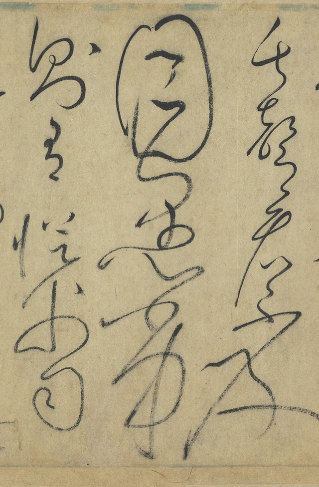
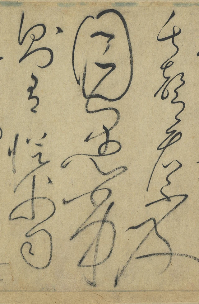
目 is much broader here than its ordinary printed form suggests. The outer line turns around the interior. Short horizontal marks and a line folding downward do not fill the outline; plenty of paper remains between the strokes. 愚 and 劣 below it continue the expansion, so that three characters occupy the column’s full height. Both adjacent columns carry five.
This 目 challenges the idea that “large” means “much ink.” Its area is large, and so is its opening. At a smaller display size, the pale shape enclosed by a fine edge may be what emerges first. The weight of a stroke lies partly in the shapes it gives to the surrounding paper and to the paper inside it.
This column also shows that cursive forms do not have to illustrate the meaning of every word. The prose is self-deprecating while the writing remains expansive; 目 is not depicting an eye here. Praise, modesty and quotation alternate in the text, while the strokes have their own relations of size and connection. Allowing these to meet leaves more room for the work than treating its calligraphy as an emotional graph.
Modesty ends the account without making the writing shrink
Near the end, the text reads:
皆辞旨激切,理识玄奥,固非虚荡之所敢当,徒增愧畏耳。时大历丁巳冬十月廿有八日。
Their words and meanings are all intense and earnest, their insight profound. Someone as shallow and unrestrained as I could certainly not presume to deserve them; they only increase my shame and awe. The twenty-eighth day of the tenth month in winter, in the dingsi year of the Dali reign.
The speaker responds modestly to the preceding praises, then supplies the date. 廿有八 means twenty-eight. This is the manuscript’s traditional calendar notation, not a modern Gregorian date.
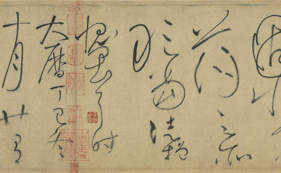
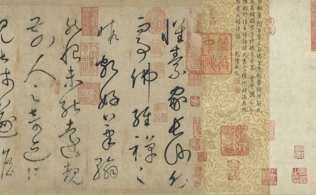
Locate 愧畏耳時 in Figure 4. The upper characters have conspicuous looping turns; lines below extend downward, without filling every intervening space. In the column immediately right, 敢當徒增, large upper turns coexist with tighter small forms below. Farther left, the date 大曆丁巳冬 remains spacious. As words, 愧畏, “shame and awe,” conclude the response to praise; as ink, they continue to demand attention.
The enlargement towards the end cannot simply be read as a chart of mounting emotion culminating in complete loss of control. Some late columns do expand dramatically. Yet 戴公, 目愚劣 and 愧畏耳時 differ in the number of characters they accommodate, their interior openings and the density of their lines. Saying “wilder and wilder” sweeps those differences away.
Within the larger turns, clear relationships remain: where an outline closes, where a fine line reveals pale streaks, where the next character reappears. The intensity of cursive writing can arise from those relationships continuing to hold after being stretched very far. At moments it seems almost to scatter; a closer look finds a route again. This ability to sustain connection through expansion is what most invites me to stay with this scroll.
The scroll we see has passed through many hands
The beginning deserves attention too, together with its history of transmission. Li Dongyang’s later colophon says that Su Shunqin supplied the first six columns. The account recorded by Wen Zhengming likewise refers to damage to the original first sheet and Su’s replacement writing. The opening columns in Figure 5 cannot therefore be used indiscriminately to narrate Huaisu’s bodily state from first stroke to last. The larger questions of authorship and date require combined study of paper, inscriptions, seals, related copies and engraved versions, and historical documents. A few details viewed on a screen cannot carry that authentication.
The red seals also change today’s encounter. They cluster between characters and near joins; some approach or overlap the ink. When considering the arrangement of the writing, we need to distinguish these later reds from the calligraphy. When looking at the transmitted object before us, we cannot pretend they are absent. Collecting has left its own density on the paper.
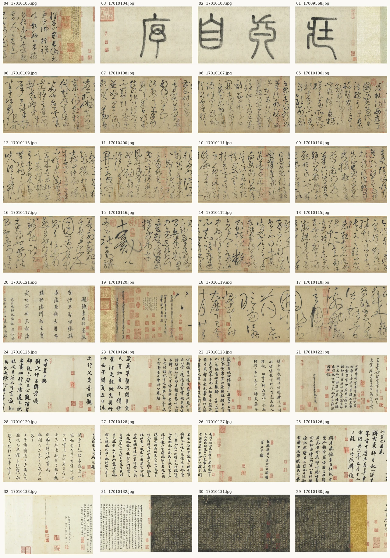
The index of the museum’s photographs arranges all 32 published views in reading order: right to left within each row, then down to the next. It includes the title section, main text, later inscriptions and the attached engraved-version material. Adjacent photographs overlap. This is an aid to finding images, not a seamless reconstruction of the scroll.
Return to 戴公 and we can say more precisely what these two characters do. They make a continuous passage suddenly spread sideways; they place the little 公 below the enormous 戴 in a single column; they draw the reader from crowded writing on the right into a different scale. The title and transcription tell us whose work we are looking at and what it says. These particular relationships keep this Autobiography before our eyes.
Optional further reading on the shapes left after recognition
Look first at Figure 3 without immediately reading down it. There is a broad enclosure in the middle, with white between its short horizontal marks and turning line; below it, the line extends outward. Then read the explanation of 目愚劣 and locate 目, 愚 and 劣 separately. The same strokes begin to take shape as characters. Curves previously seen as merely adjacent acquire boundaries of belonging.
Once you have recognised them, look again. The space within 目 has not become smaller, and the interpretation has not filled the gaps between columns. Recognising the writing makes looking better grounded. It has not done the looking for us.
In “As the Light Fades, the Garden Appears Differently”, I begin with a garden at dusk to consider how perception makes things appear in particular ways, and how we may linger after recognising a flower. I wrote there: “Its name has simply not done the looking on your behalf.” Applied to cursive script, this asks us to keep looking after identification, without forgetting the meaning of the words.
The “beauty of perception” in SAE, Self-as-an-End, encourages that continued attention after recognition. We know whom 戴公 refers to and can still compare the expansion of 戴 with the contraction of 公. We have translated 目愚劣 and can still attend to the paper enclosed within it. Naming identifies the forms; they retain their widths, densities and distances.
Some readers recognise the script immediately; others need a transcription. From different starting points, each can point out what is visible: this loop is here, this line becomes finer here, the neighbouring column begins again here. When such observations can be checked against the same image, not knowing every cursive character need not prevent serious looking from continuing.
Image and textual notes including attribution, dimensions and processing
This essay is based on official digital photographs, not an encounter with the original. Screens, photography and scaling affect the sense of size and ink. The discussion compares lines, positions and intervals within the same photograph; darkness is not converted into pressure or writing speed.
- The object is National Palace Museum accession 故書000062N000000000, record 14901, not the similarly titled record 14890, accession 故書000381. The catalogued main unit 本幅 measures 28.3 × 755 cm. The trailing section, frontispiece and separating strips have separate measurements. This is not the length of the entire mounted scroll with all inscriptions.
- The year 777 corresponds to the inscribed 大曆丁巳. The museum retains the attribution to Tang Huaisu. Modern scholarship disputes autograph status, copying and date. Neither the catalogue title, the historical replacement account nor one scholarly opinion is presented as proof that the dispute has ended.
- Quotations use standard printed forms and added punctuation, following the transcription for this specific object. Only the complete passages relevant to this close reading are quoted; no full column-by-column facsimile transcription is claimed. 國/国, “capital”; 魚/鱼 and 牋/笺, together “writing paper”; 戴, “Dai”; and 目, here “describe,” help locate forms but do not reproduce cursive outlines.
- Figure 2 retains five consecutive columns; Figure 3 retains 目愚劣 and its two neighbours. Figures 1, 4 and 5 retain the complete museum photograph before proportional reduction. There is no added writing, seal removal, sharpening, colour alteration or generated calligraphy. Exact crop coordinates and pixel dimensions are in the image manifest.
- Figure 4 excludes the final 八日, “eight / day.” Continue in the next official photograph. Later small inscriptions are not part of Huaisu’s main text.
- The shared image index has numeric labels and official filenames. Read the thumbnails right to left across a row, then continue on the next row. It retains overlaps and is not a stitched image.
- The images come from the museum’s Selected Treasures website. The museum website’s open-information statement supplies the recorded reuse framework. Source attribution and processing descriptions are retained. CC BY 4.0 terms from a separate download channel have not automatically been transferred to these JPEGs, and no individual museum endorsement of this essay has been obtained or claimed. See the package’s permissions file.

Further images and reading
- Museum appreciation page and original photographic sections: the actual image source, with original views approximately 1580 × 976 pixels.
- Museum collection record 14901, in Chinese: accession number, dimensions, transcription and inscriptions.
- Open Data record for the same object: alternative museum download resolutions; check terms against the file actually downloaded.
- Liu Yi-hsuan, study of Shen Mingyi and his Shuijingtang rubbing of Huaisu’s Autobiography, in Chinese: National Palace Museum Research Quarterly, 41.3, 2024. Only page 178 and note 2 are used here to establish the existence of the attribution dispute and Fu Shen’s position.
- Han Qin, “As the Light Fades, the Garden Appears Differently”: the complete essay used in the optional reading.