The upper half of 曰, “said,” is almost nothing but two long lines facing one another. Its transverse strokes sit lower down, drawing a tall stretch of bare paper into the character. It occupies a distinct cell without filling that cell with numerous strokes.
Find 曰 in the middle column below: 子, the second character of 弟子, “disciples,” stands above it, and 試, “try,” below. The lines of 子 gather towards the top before a long curve reaches down. In 試, short strokes stack up on the left, while the right side leaves a more open space. Three neighbouring characters give the eye three different internal distances to travel. The fine lines do not make the column insubstantial.
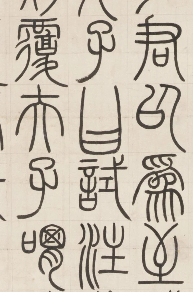
What attracts me most in this seal-script work is the way a line makes the space within a character longer, narrower, or newly open at a turn. The strokes are relatively fine, and many characters take elongated forms, so the paper enclosed by the ink becomes unusually clear. Complex characters gather short lines together; simpler ones ask a few long lines to carry the height of the whole form. Set side by side, both sustain the downward extension.
The Palace Museum in Beijing catalogues this ink-on-paper hanging scroll as 邓琰篆书荀子宥坐篇轴, “Deng Yan’s Xunzi, Youzuo chapter, in seal script.” Deng Yan is Deng Shiru (1743–1805), a mid-Qing calligrapher especially known for seal and clerical scripts. Yan was his original personal name; he later used his courtesy name Shiru to avoid the name taboo surrounding the Jiaqing emperor. He was an important figure in the Qing revival of interest in ancient inscriptions. The museum associates this earlier work with the seal forms of the Qin Mount Yi inscription and the Tang calligrapher Li Yangbing. It is signed “Deng Yan” and bears no date. We are looking at this particular 117 × 74 cm paper manuscript. Palace Museum object record, in Chinese
Put a long line back inside its character
Before reading the whole story, look at the opening name 孔子, Confucius. 孔, Kong, is at the very top of the rightmost column; 子, the honorific “Master,” follows below. Both have rounded enclosures above and a longer curve reaching down. 孔 adds another long arc on the right, bending outward as it descends. That additional side changes the internal white from the more concentrated space in 子 to two areas facing across the character.
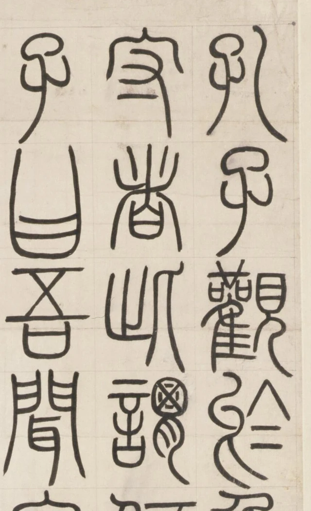
Move down the right column to its third character, 觀, “look” (观 in simplified print). Here the arrangement changes. A cluster of short horizontal lines and turns fills the left side; another enclosure sits at the upper right, while a single longer curve opens outward below it. Much of the character’s structure stays high, leaving openings beneath. Its parts have not all been stretched evenly from top to bottom.
聞, “hear” (闻), at the foot of the left column, offers another solution. Two longer sides enclose shorter central strokes, with space still open beneath the centre. From the outline alone, we might simply call it a tall character. Following its interior reveals how that height is established jointly by short strokes and long edges.
Nor do these fine lines maintain exactly the same thickness. The right-hand arc in 孔 changes width as it bends downward, ending more sharply. The long descending stroke of 子 also has fuller and finer stretches. These shifts do not turn the line into a succession of dark ink masses, but they make its direction tangible. The museum places this work within the traditional “jade-chopstick seal script,” 玉箸篆, associated with fine, rounded, relatively even strokes. Each stretch still needs looking at: “even” cannot describe every ending for us.
A long stroke does more than add black. As two lines extend, the white between them lengthens too; when an arc opens outward, the adjoining white widens. In these elongated seal forms, black and white are difficult to treat as separate stages. The course of a line simultaneously shapes the spaces on both sides.
What the scroll says
The passage tells of Confucius examining a tipping vessel. Empty, it leans; moderately filled, it stands upright; full, it overturns. A disciple then asks how someone who already possesses much can preserve that condition without falling. The story moves from a vessel to human self-restraint.
Below is the complete text, checked against this scroll and the museum’s transcription, in simplified print with modern punctuation. Paragraphs do not reproduce the calligraphic columns. The title follows the museum’s catalogue; the wording follows this particular scroll rather than being replaced with a commonly printed Xunzi text.
孔子观于鲁桓公之庙,有欹器焉。问于守者:“此谓何器?”对曰:“此盖宥坐之器。”孔子曰:“吾闻宥坐之器,虚则欹,中则正,满则覆。明君以为至诫,故常置之于坐侧。”顾谓弟子曰:“试注水焉。”迺注之水,中则正,满则覆。夫子喟然叹曰:“于戏!夫物有满而不覆者哉!”子路进曰:“敢问持满有道乎?”子曰:“聪明睿智,守之以愚;功被天下,守之以让;勇力振世,守之以怯;富有四海,守之以谦,则所谓损之又损之道也。”
Confucius was looking around the temple of Duke Huan of Lu, where there was a tipping vessel. He asked its keeper, “What is this vessel called?” The keeper replied, “This, I believe, is a vessel placed beside one’s seat as a warning.” Confucius said, “I have heard that such a vessel tilts when empty, stands straight when moderately filled, and overturns when full. A wise ruler treats it as a most serious warning and therefore keeps it beside his seat.” Turning to his disciples, he said, “Try pouring water into it.” They poured in water: moderately filled, it stood straight; full, it overturned. The Master sighed deeply: “Alas! Is there anything that becomes full without overturning?” Zilu stepped forward and asked, “May I ask whether there is a way to preserve fullness?” The Master answered, “Intelligence and discernment: preserve them by not parading your cleverness. Achievement reaching throughout the world: preserve it through yielding. Courage and strength that shake the age: preserve them through caution. Possession of the wealth of all under heaven: preserve it through humility. This is what is called the way of diminishing and diminishing again.”
欹 means “tilt.” 宥坐 here names an admonitory object kept beside the seat. 迺 is a form of 乃, “then,” and 于戏 is an exclamation. At the end, 愚, literally “foolishness,” and 怯, “timidity,” answer intelligence and courage respectively. Within this exchange they counsel restraint of self-conceit, rather than praising ignorance or cowardice themselves. After the passage comes the dedication and signature, 颐斋大人属书。邓琰, “Written at the request of the honoured Yizhai. Deng Yan.” It identifies the work as written in response to a request.
Having read the story, we may naturally return to the writing with “full” and “empty” in mind. But the vessel’s water level cannot simply be converted into a quantity of ink. The complex character 謙, “humility” (谦), does not become sparse because its meaning commends humility. The simpler 以, “with” or “by,” does not lose its footing because it contains more open space. The calligraphy faces its own concrete problem: how different characters acquire clear forms within comparably sized cells.
How dense forms keep their spaces open
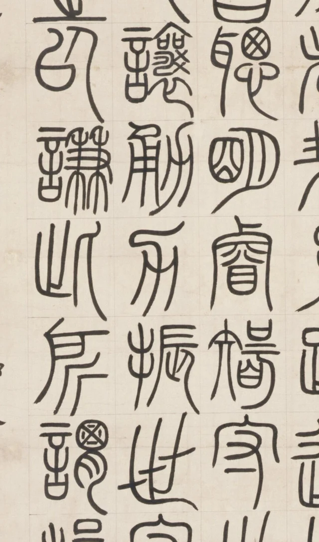
Find 謙 in the left column. 以 stands above it and 則, “then” (则), below. Several horizontal lines gather in the upper half of its right-hand component, while fine vertical lines separate out below. The top is relatively dense, but the channels between the lower lines remain long and distinct. Stop at the upper portion and it can look merely intricate; follow it downward and several openings towards the lower edge become visible.
Its speech component, 言, occupies a narrow strip on the left, stacking short horizontal strokes and rounded enclosures vertically. The first character in the adjacent middle column, 讓 (让), has the same component, but packs more compact turns into its right side. At its lower right, the curve stops adding layer after layer and opens outward. Each complex character finds a place from which its dense structure can unfold.
This does not mean that every seal character follows one recipe of “dense above, open below.” In the right column, 明 sets two parts beside each other and extends the right-hand arc downward. The following 睿 puts long outer lines around the interior, with a small enclosure lower down. Below that, 智 has an extended stroke on the left and stacked enclosures on the right. All three are tall, yet their internal spaces arise through juxtaposition, surrounding, and stacking respectively. A general description can start the eye moving; the particular character determines where it must pause.
The faint grid makes these comparisons firmer. It places neighbouring characters at a comparable scale, letting us see how one cell contains a large opening while another contains many narrow channels. They still belong to the same array. The grid supplies a shared size; each character must arrange its contents anew, line by line.
Cut these forms into isolated character cards and their long strokes and small openings would remain. But an important comparison would disappear: what the next character does differently within a similar height. The openness above in 以, the branching spaces inside 謙, and the descending line in 則 alternate within one continuous column. A character’s weight becomes visible partly through the forms it is leaving and approaching.
The weight of fine lines across a hanging scroll
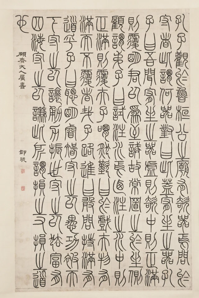
Stepping back to the whole work, those long lines establish a shared vertical tendency. They do not literally connect one character to the next. Their lengths, the comparable spacing, and the succession of positions let the eye descend along a column. Look horizontally and the dense parts of different characters occur at different heights. The eye does not encounter rows of uniformly heavy black blocks.
A hanging scroll can be viewed as a whole and approached for closer reading. Its 151 main seal-script characters form ten long columns of fifteen, with one remaining character. To follow the story, we proceed column by column. To view the composition, many columns are present together. The fine lines must sustain the turns and intervals seen close up while also giving the entire work presence from farther away.
I especially like the way density never swallows the line, while empty space remains part of the character. 謙 has so many internal paths; 曰 needs only a few long lines to occupy a tall cell. Each establishes itself and makes its neighbour more distinct. The weight of writing lies partly beyond the area covered by ink: it also depends on how much paper a line draws into a recognisable form.
Return to 曰 in Figure 1. Its sides contain few lines, but the white between them already has a definite height. It is no longer simply a place with “few strokes.” The lines have drawn that white into the column, and into the shape of the whole scroll.
Optional reading | How much does “elongated seal script” help us see?
“Elongated,” “fine-lined,” “dense above, open below”: all are useful descriptions. With them, 謙 in Figure 3 quickly comes into focus. Move to 明 and 睿, however, and the description needs refining. One lengthens itself through adjoining curves; the other places a small enclosure within long sides. Neither is deficient because it differs from 謙.
In “Naming the Stars Does Not Finish the Sky”, I consider how names and diagrams help us look, and how they can bring looking to a premature end. The “beauty of chaos” in SAE (Self-as-an-End) asks there whether a successful explanation has thereby earned the right to prescribe the only possible appearance of what lies before us.
Try one small return to the image: first identify a character that really is dense above and open below, then one whose space needs a different description. The first account has not been discarded; the next character has not been forced into it. Naming the script has not made it beautiful. These recognisable differences let the name continue to guide looking, rather than hurry us towards being finished.
Image and reading notes: object, text and processing
- The work is the Palace Museum’s 邓琰篆书荀子宥坐篇轴, accession 新00187665, ink on paper, 117 cm high × 74 cm wide. Deng Yan and Deng Shiru are the same person. The museum identifies an early work; the scroll has no dated inscription. No exact year is inferred from the signature.
- The main text contains 151 characters: ten columns of fifteen and a final 也. The dedication is excluded. Modern punctuation and conventional printed characters aid reading; they do not reproduce seal-script forms. Chinese quotation uses simplified print. Discussed traditional reference forms correspond to simplified 试/試, 观/觀, 闻/聞, 谓/謂, 谦/謙, 让/讓, 聪/聰 and 则/則. 迺 and 于戏 are retained. The semicolon after 富有四海 in the museum transcription is changed to a comma. The catalogue title is retained although this scroll’s wording differs from the commonly printed Xunzi passage.
- All four illustrations derive from the same official 3416 × 5120-pixel layer. Published DeepZoom tiles were reassembled at their original coordinates, then rectangularly cropped, proportionally reduced for the overview and JPEG-encoded. No strokes were added, seals removed, colours changed, sharpening applied or calligraphy generated. Small fragments of neighbouring characters remain at the edges of Figures 1–3; the principal forms discussed are complete. Coordinates, sizes, official links and hashes are in the image manifest.
- This is a reading of digital photographs, not a record of examining the original in person. Internal spaces, grid and line relationships can be compared within the same image. A photograph alone cannot establish writing speed, hand pressure or the calligrapher’s state of mind.
- The illustrations were originally supplied with a local editorial review package and are now used here for commentary on the work. The rights in the historical calligraphy and the modern photographic assets are treated separately. No additional written republication permission has been obtained from the museum. Public access and attribution do not amount to permission for republication, commercial use or sublicensing. See Permissions and credits.
Continue looking and reading
- Palace Museum object record: identification, measurements, transcription and museum dating, in Chinese.
- Official high-resolution viewer: the full work and enlarged details.
- Palace Museum website terms: conditions concerning website materials.
- Han Qin’s complete ray essay: the optional reading’s source.