Begin by following both sides of the large wheatstack on the right. Against the pale sky, the orange-brown left slope is easy to make out. Follow the summit around to the right, however, and blue-white becomes increasingly prominent. At the shoulder, it meets the blue-white of a roof farther back. The two sides are not equally distinct, yet the stack still feels substantial and heavy. What sustains its weight?
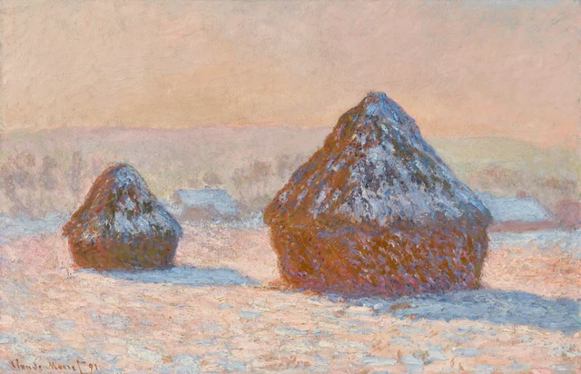
This reading follows that difference. Monet does not cut the stack cleanly out of its winter morning with an equally distinct boundary all around. Its strong left edge, less distinct edge at the right shoulder, broad lower body, and shadow on the ground together make it stand firm. One part approaches its surroundings; another separates it from them. We can recognize a solid object while seeing how the same light crosses the divisions between objects.
These stacks store harvested grain. The series is often called Haystacks in English, suggesting dried grass, but the Getty explicitly titles this work Wheatstacks, and its curator identifies the crop as wheat. These are large structures for storing grain in a field, with rounded lower bodies and sloping tops, far larger than the small hay bales familiar today. Monet repeatedly painted wheatstacks near his home at Giverny in 1890–91; this canvas belongs to that series. A familiar, recurring shape makes differences under light easier to notice. Even in this single painting, though, each stack’s edges, surface, and shadow allow us to read the particular morning. Getty’s account; Getty curator conversation
1 The two sides are not equally distinct
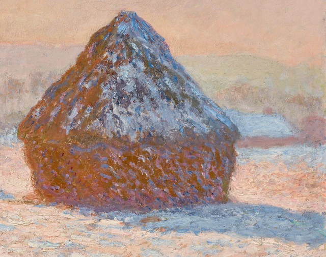
Strong orange-brown runs up the large stack’s left slope, with pinkish and violet touches near the sky. No uniform line traces it from summit to base, but its boundary is assured. Denser, stronger color meets very pale pink-gray, bringing the stack out of the air. The left edge is irregular, with strokes protruding here and there, yet these breaks do not weaken its overall direction.
The right slope works differently. Blue and light blue gather more densely there. The slope spreads downward to the right and, at the shoulder, meets the blue-white of a snow-covered roof behind it. Color does not separate the forms as emphatically as on the left. To distinguish the near and distant objects, the eye must continue along the stack’s long incline, then notice the lower, flatter roof edge and the pink-brown wall visible beneath it. The point of contact need not be entirely clear: these neighboring relationships are still enough to put the house behind the stack.
Now look at the snow below the summit. The light color does not make a smooth, sealed cap. Blue-white touches follow the slope, exposing brown, violet, and gray-green between them. Some stretch out; others gather into thicker patches. They show us snow while repeatedly revealing the stack beneath. The snow has not replaced the grainstack’s rough surface; it makes the unevenness more noticeable.
The lower body is much broader and fuller. Orange-brown joins into larger solid areas, scattered with small violet, pink, and blue strokes. Above, marks more often follow the incline; below, they are broken and frequently spread sideways. The eye reads two surfaces: one tapers toward the top, the other bulges. A nearly horizontal tonal change suggests a shoulder between them, still interrupted by scattered colors. Even without looking at the outer edge at the right shoulder, these internal turns already give the stack considerable volume.
The less distinct edge at that shoulder therefore does not mean that the whole stack is dissolving. The left slope lifts it out of its pale setting, the lower body retains a dense, solid area, and slanting strokes describe the spread of its upper part. Several assured relationships allow another passage to approach the background. The stack’s solidity is established across the painting; every section of its edge need not insist on it with equal force.
2 Standing firm also needs the shadow below
The large stack stands to the right, its summit passing above the low distant ridge into the sky. The smaller stack on the left stays lower, its entire summit set against pale mauve-gray. The shapes resemble one another without lining up. The large stack’s base reaches farther down the picture, while the smaller one stands back. Differences in size and position begin to establish a field with near and distant ground.
The smaller stack does not copy the larger one’s colors, either. Gray-green and dark olive are more evident in its lower body, and a deep blue passage marks part of its right edge. The brighter red-brown of the large stack gives way here to a darker solid area. The shapes are related, but the eye cannot read them through an identical arrangement of colors. Its own darks, blue edge, and attached shadow make the smaller stack stand firm. It recedes without becoming a miniature emblem of the larger one.
Follow the blue shadow rightward from the smaller stack’s base. It enters the interval between the stacks, breaking up as it approaches the larger one’s left side and leaving light pink ground. Beneath the large stack, another, broader blue shadow extends downward to the right, toward the picture’s edge. Their related directions place separate objects on the same ground. The breadth of their spread also lets us feel the space occupied by the stacks from their bases outward.
These shadows do not repeat the stacks’ pointed summits. They spread low, translating an upright form into a direction along the ground. The deepest blue-violet at the large stack’s base is especially important in joining the weight of orange-brown to the field. Farther right, lighter strokes enter the blue, and its edges interlock with the snow. The stack has a firm footing without requiring the shadow’s outer end to be equally heavy.
These changes also make the ground tangible. Creamy marks and warm gaps appear inside the shadow; blue-white and pink are scattered outside it as well. The rough surface does not abruptly stop at the shadow’s boundary. We see the same field passing through areas of different light, rather than one blue field with a separate pink field beyond it. Contact between stack and ground depends both on the darker band at the base and on these small continuities between shadow and light.
3 The same blue goes in different directions
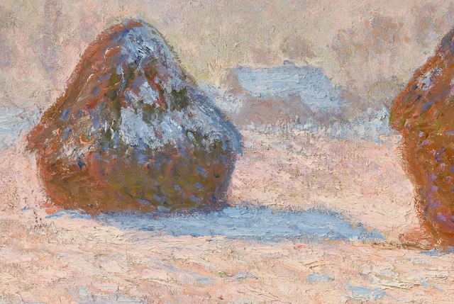
Shift your gaze from the blue shadow beneath the small stack to the pale blue roof behind it. Their colors are close, but their positions differ. Walls support the roof and lift it off the ground; the shadow extends from the stack’s foot along the field; blue-white on the stack follows its slope. Blue is not reserved as a label for any single kind of object. Following it, the eye rises from the ground to the roof and returns to the stack.
The less distinct meeting of the large stack and roof on the right now gains a wider significance. They have not actually become a single thing. The painting provides enough differences of height, direction, and overlap for us to separate near from far. Yet color prevents that separation from making them unrelated. Similar blue-white appears at different distances, allowing us to see houses, grain, and snowy ground sharing one morning.
The light pink ground between the stacks matters here. It gives the small stack’s blue shadow a conspicuous upper edge and separates that stack’s right slope from the large stack’s left. No new object occupies this passage, but it preserves a distance between two volumes. If the passage were as dense as the stacks’ bodies, or formed a continuous blue area like the shadows, their separation would not feel so light and luminous.
Pale pink, apricot, and cream also appear in the sky without making it merge with the field. Changes across the sky are gentler, leaving broader areas of color between marks. In the foreground, blue, pink, pale ocher, and near-white interlock densely. A pale mauve-gray ridge stretches between them with gentle undulations. Related colors recur, but differences in direction, area, and density keep sky and ground in their own places.
“Complementary blue and orange” cuts this experience short. Monet has not simply given the stacks warm colors and assigned cool ones to winter. Blue-violet already enters the orange-brown, light strokes appear in the shadows, and a distant roof can momentarily approach a nearby stack-top. Color relationships cross the names of objects, while other relationships maintain their distinct shapes. A boundary becomes less emphatic in one place, making these connections easier to see.
4 How a morning holds up to prolonged looking
On the ground beneath the large stack in Figure 2, some pale strokes have pronounced, ridge-like relief, beside thinner, more open areas. In Figure 3, the snow on the small stack, the roof, and the nearby field all contain light blue, but the marks vary in width and density. The nearby ground has many raised touches for the eye to linger on; the distant roof coalesces more quickly into an area. Color connects them while surface handling continues to establish distance.
In his gallery conversation with Beth Harris, Getty curator Scott Allan draws attention to this work’s impasto and to passages between thick strokes where thinly covered canvas remains visible. He also emphasizes that different surface treatments help distinguish foreground from distance. These alternations of thick and thin preserve the snowy field’s roughness, rather than covering it with an even white coat. Conversation transcript, approximately 3:01–3:31
The strokes reward close looking, but each cannot be treated as a comparably sized patch of snow in the landscape. Enlarged, the pale ridges, brown gaps, and overlapping marks are conspicuous. In the full image they become a sloping stack-top, an extensive field, or a more distant roof. We need not forget the paint in order to see the field again. Its thickness and direction are precisely how the field acquires distance and texture.
The Getty explains that Monet began outdoors and continued revising in the studio, bringing each canvas’s color relationships into harmony. The gallery conversation also describes his repeated work on these paintings. The unified light of this particular moment could therefore emerge through many acts of painting. The freshness of short strokes does not mean the entire canvas was executed rapidly during a single fleeting look. Getty’s account
Return to the point where the large stack’s right shoulder meets the roof. It remains harder to separate from the background than the left slope. Close looking has not supplied a complete outline; we simply know more clearly what else the eye can rely on. The broad lower body, direction of the incline, spreading shadow, and wall behind together sustain the stack. The blue-white that approaches the roof can belong to a solid object while connecting it to the surrounding winter morning. The air Monet paints is not only outside objects. It enters the way we recognize them.
Optional reading Must a solid form be distinct everywhere
The Beauty of Perception, part of Han Qin’s SAE (Self-as-an-End) aesthetics, distinguishes an appearance before our eyes, its naming, and whether it gives pleasure. That distinction prompts a question about this essay’s judgment. When we call the stack convincingly solid, have we quietly assumed that every boundary must be discernible? This is a contemporary question about looking, not a claim about Monet’s philosophy. The Beauty of Perception, sections 2–3
Look again at the blue-white junction of stack and roof in Figure 2. First try to follow a boundary that stays clear from beginning to end. If a passage repeatedly requires you to look back at the neighboring slope or wall, leave it uncertain for a moment instead of completing it. Then return to the full image. Has that local uncertainty cost the whole stack its volume? If it has not, “the boundary is insufficiently clear” and “the object has not been made visible” are different judgments.
We can also test this essay in the opposite direction. A reader may still find the right-hand junction too indistinct without feeling that it adds atmosphere. The comparison then concerns whether the clear left edge, substantial lower body, and spreading shadow really supply enough to compensate for what is not fully specified at the right shoulder. If they do not, the essay’s claim for solid volume needs narrowing. If they do, we have reason to allow an object’s edges to appear with unequal clarity, without making its clearest passage the standard every other passage must meet.
This question also differs from a preference for certain colors. Someone may not favor pink and blue yet still see how the stack stands firmly among them. Another may love the palette without being able to explain how its volume is established. SAE offers an additional step here: asking separately about liking, recognizing an object, and judging whether its painted form has weight. Returning to that blue-white junction, we need neither automatically praise indistinctness as beauty nor treat it invariably as a defect awaiting repair.
Images and sources
The visual reading uses Getty’s official 4096 × 2634-pixel IIIF image. The full image preserves the downloaded file unchanged. Figures 2 and 3 are crops of its decoded pixels, saved as PNGs with the source ICC profile retained. They have not been resized, recolored, sharpened, restored, or generated. Digital reproductions and screen display cannot substitute for the original painting’s color and surface, or establish a particular stroke’s pigment or order of application.
Getty provides the image under CC0; its accompanying texts have a separate CC BY 4.0 license. The interpretations here are independent. Historical and material information is supported by the linked sources and does not imply museum endorsement. See also References and Image credits.
