Having read 天地玄黃, “Heaven is dark, earth yellow,” we encounter the same words again immediately to the left. Nothing has been added to their meaning, but their appearance has changed. In the right column, 地, “earth,” clearly separates its earth radical from its right-hand component; the left column gathers them into tighter turns. Near the bottom, the right-hand 日, “sun,” is a small angular enclosure, while its partner is rounder. We are returning to words already read, travelling through them differently.
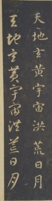
The special quality of this work is more than its demonstration of two scripts. “Standard script,” called 真書 here, means regular script, not “genuine” as opposed to “false.” By placing identical passages beside each other, the work alternates recognition and comparison. Standard script helps us find our way through cursive; cursive sends us back to the ways standard characters unfold. The second reading adds no verbal information, yet crosses distances the first reading did not.
The object must be identified precisely. This is not ink directly laid on paper by Zhiyong, but a Song-dynasty rubbing in the Palace Museum, Beijing, inventory 新00045734. It belongs to the Guanzhong version, engraved in 1109. Zhiyong was a monk-calligrapher active during the Chen and Sui dynasties. His calligraphic tradition, the Song engraving, this particular rubbing, and its modern photograph are different layers. The pale writing against black comes from recessed lettering left uninked in the rubbing process. The black background is not a wash of ink painted by Zhiyong. Museum record
From heaven and earth to writing and clothes
Compiled by Zhou Xingsi during the Liang dynasty, the Thousand-Character Classic uses four-character phrases to connect celestial phenomena, products, history, ethics, and daily knowledge. We examine selected columns in the first three openings. Here are all eighty-eight characters covered by this reading, ending with 乃服衣裳, not the complete thousand-character text. Familiar printed forms and modern punctuation aid reading; the historical forms remain visible in the photographs.
天地玄黃,宇宙洪荒。日月盈昃,辰宿列張。
寒來暑往,秋收冬藏。閏餘成歲,律呂調陽。
雲騰致雨,露結為霜。金生麗水,玉出崑岡。
劍號巨闕,珠稱夜光。果珍李柰,菜重芥薑。
海鹹河淡,鱗潛羽翔。龍師火帝,鳥官人皇。
始制文字,乃服衣裳。
Heaven is dark and earth yellow; the universe is vast, the remote beginning unformed. The sun inclines westward, the moon waxes and wanes, and the stars stand arrayed. Cold arrives and heat departs; autumn brings harvest, winter storage. Intercalation incorporates the calendar’s surplus days into the year; musical pitches harmonize with the seasonal forces. Clouds rise and bring rain; dew congeals into frost. Gold comes from the Li River, jade from the Kun mountains. The famous sword is called Juque, the pearl “Night Light.” Among fruits, plums and nai are prized; among vegetables, mustard and ginger. Seas are salty, rivers fresh; fish dive and birds fly. Ancient tradition names dragon masters, a fire emperor, bird officials, and human sovereigns. Writing was then devised, and people dressed in upper and lower garments.
This is an ancient ordering of knowledge. 律呂, “pitch standards,” belongs both to musical theory and to ideas connecting music with the seasons. “Dragon masters” and the other titles belong to legendary antiquity, not modern natural history. Without accepting every part of this worldview, we can hear its four-beat groupings: cold and heat, autumn and winter, sea and river, fish and birds. Oppositions give memory footholds. Historical text
Three orders on one opening
In the complete first opening, the right half begins with the title and Zhou Xingsi’s official designation. The text below proceeds through 天地玄黃宇宙洪荒日月. At the beginning of the left half it continues 盈昃辰宿列張寒來暑往, then 秋收冬藏閏餘成歲律呂. 日月/盈昃, “sun and moon / their changing conditions,” crosses between the two halves; 律呂/調陽, “pitch standards / harmonize the seasonal forces,” crosses into the next opening.
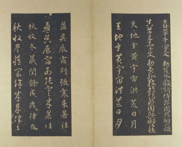
The four-character phrase does not determine a separate column or compartment. The text has its reciting rhythm, the scripts have their pairing, and the album has its own boundaries. The museum records twelve characters per column on the original stones. These pages in their present album format should not be treated as miniature photographs of the eight stone surfaces. What we can directly inspect is the preserved arrangement of characters and their paired comparison.
These orders coexist productively. To read the text continuously, follow the standard columns and skip their cursive repetitions. To study cursive forms, return to the neighbouring column after each passage. To examine composition, compare the widths of paired vertical groups. A fixed opening accommodates several different, legitimate viewing speeds.
The first 天, “heaven,” is already unlike a printed character centred in a square. A shorter upper horizontal gives way to spreading lower diagonals, allowing blank space to enter from either side. 地 gathers the centre again through its left-right structure. 宇 and 宙, the two characters in “universe,” both have covering upper elements, but contain different spaces beneath them. Standard script achieves clarity by articulating relations among parts, not by giving every character an identical outline.
In the adjacent cursive column, 天 is more gathered; 地 joins its turns; the lower portion of 玄, “dark,” curls differently. 日 and 月, “sun” and “moon,” remain distinguishable rather than becoming one tangled line. Cursive reduces some separations and repeated starts while preserving recognizable relationships and downward continuation. It is neither miniature standard script nor a requirement that every character connect.
Where cursive feels swift, and where it holds us
The right half of the second opening contains 調陽雲騰致雨露結為霜, “harmonize the seasonal forces; clouds rise and bring rain; dew congeals into frost.” Standard characters are clearly distinct; 騰, 露, and 霜 have relatively crowded interiors. The neighbouring cursive column gathers some parallel elements into successive turns, making the downward route feel smoother.
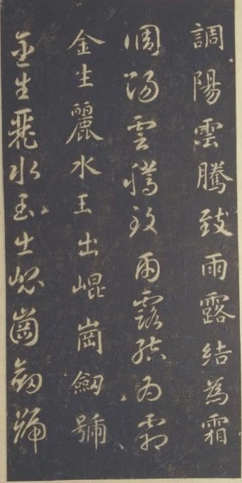
Pause at 雨, “rain.” Its cursive outline and small interior marks still enclose a space in which the eye can linger. Below 露, “dew,” 結 and 為 vary their width and profile; 霜, “frost,” gathers the curves again. Expansion and concentration both occur within this one column. “Fast” alone cannot describe it.
Compare 水, “water,” in the pair to the left. Its standard form separates outward strokes around a central vertical; cursive draws the outward portions back into a turning route. 玉, “jade,” is shorter, while 出, “emerges,” rebuilds an upper-lower relationship through angles. Although 金生麗水 speaks of natural products, these shapes do not illustrate gold, water, or mountains. Meaning reaches us through recognizable writing; calligraphy adds width, direction, and intervals.
“Swift” here first describes how readily the eye travels. Engraving, stone wear, the application of paper, and the handling of rubbing ink all affect the edges now visible. We can compare wide and narrow areas within the same rubbing. We cannot calculate the force or instantaneous speed of Zhiyong’s original brush from a pale pointed ending. That limit makes our comparison more exact, rather than making it pointless.
A model that is more than a conversion chart
On the right-hand leaf of the third album opening, 始制文字乃服衣裳 concerns the invention of writing itself. Figure 4 crops this leaf; the passage appears in the pair of columns on the left within that image. In standard 字, “written character,” the roof covers 子 beneath it; cursive gathers these components into a shorter route. 衣 and 裳, “garments,” extend downward and sideways. Corresponding characters do not all occupy precisely matching heights.
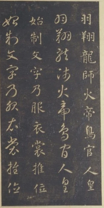
This can teach recognition and handwriting, but it is no mechanical chart converting one font into another. Repetition makes the questions of how each character stands and how it delivers the next one available for comparison. The scripts share readable words while arranging space differently. Recognition has accomplished only the first task.
In traditional criticism, Su Shi praises Zhiyong’s firm foundations and varied resources, then emphasizes the spare ease attained through consummate skill. The useful point is that conspicuous display is not the only evidence of mastery. Return to 日 and 月: each character completes itself, then leaves an interval for the next. Cursive does not fill every gap with a connecting thread. Rich resources can appear in a precisely judged restraint. We are testing an older judgment against particular columns, not treating it as proof that this rubbing is an autograph. Museum discussion of Su Shi’s judgment
To label standard script “constraint” and cursive “freedom” would diminish both. Standard diagonals also extend; cursive abbreviations also obey habits of recognition. Without the first script’s clarity, the second may remain obscure. Without the second’s transformations, we may overlook the first’s variety. They illuminate each other rather than occupying successive rungs of a ladder.
Return once more to 天地玄黃. First standard script made it readable. Next its known meaning guided us through cursive. A third look can return to standard 地 and notice its outward reach. Four unchanged characters have not been exhausted by the journey.
Optional reading: after recognition, appearance remains
Temporarily cover the standard column in Figure 1. Cursive forms that resist recognition may stop you. Uncover standard script, and some become clear immediately. Now compare the space beneath the two versions of 月 and the openings beside 地, without treating recognition as the finish line.
“As the Light Fades, the Garden Appears Differently” offers a related direction: perception can serve a task, yet the visible form still merits attention when the task is done. SAE’s discussion places this under perceptual beauty without equating beauty with successful identification or pleasure. Theoretical essay
Try two reading orders. Read each passage in standard and then cursive: at 日月, return to its nearby cursive counterpart. Or follow standard alone, skip the repetition, and cross the pale middle to reach 盈昃. The first route turns back locally; the second carries an unfinished phrase farther away before completing it. The words are the same, but we can point to different places of pause. This paired album gives those two journeys a concrete form.
Version and image notes
This reading uses public digital images, not firsthand examination. The museum records twenty-seven openings, each half 23.8 × 11.5 cm; screen dimensions are not object dimensions. Images were only rectangularly cropped or proportionally reduced, without reconstructed strokes, removed damage or seals, recolouring, or AI generation. Pale lettering, background ink, and mounting traces belong to this rubbing and its photography, not directly to the original brushwork. Public display does not establish an open licence. Reproduction permission has not been obtained; the images accompany this reading edition and require rights clearance before public publication. See the separate image and source notes.