From the lower part of 薄, “to approach,” a long line runs diagonally down to the left. It passes beyond the character’s principal dark mass into the space beneath. Across the intervening second column, to the right in the first column, 子, here referring to juvenile plumage, also draws a slender tail from a substantial upper form. Around them, 年, 落 and 復 stand squarely. The two long lines become especially conspicuous.
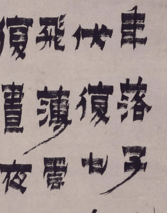
If we remember only that Jin Nong’s “lacquer script” has thick horizontals and thin verticals, our eyes may collect the wide, dark bars first. In this hanging scroll, however, fine lines also determine how much ground a character occupies. The horizontals establish it; the oblique and upturned fine strokes extend its reach. The interest lies in how these two measures coexist.
The work is in the Palace Museum, Beijing, catalogued as Jin Nong’s Classic of Judging Cranes in Clerical Script. Written on paper in 1752, the seventeenth year of the Qianlong reign, it is dated to the eleventh month of the renshen year. It excerpts an ancient text on cranes, with a smaller explanatory inscription and signature after the large characters. The museum identifies it as characteristic of Jin’s 漆书, qishu or “lacquer script.” That name describes a style associated with dense ink, wide horizontals and angular turns; it does not mean this work was written in lacquer. Museum record
What kind of crane does this text describe?
Start with the whole-work orientation image. The large text begins at the upper right. Read down each column and then move left. The first five columns each contain ten characters. The final column has four: 落茸毛生, “fall; soft plumage grows.” Smaller inscriptions occupy the space below. The complete fifty-four-character main text follows, with modern punctuation. Sentence divisions do not reproduce the divisions of the original columns.
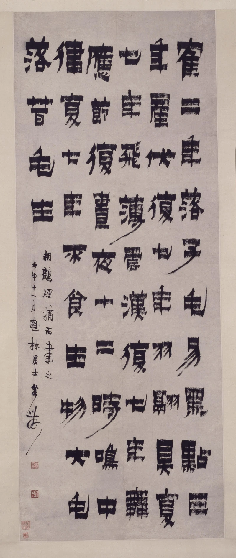
鹤二年落子毛,易黑点;三年产伏;复七年羽翮具;复七年飞薄云汉;复七年舞应节;复昼夜十二时鸣中律;复七年不食生物,大毛落,茸毛生。
“In its second year, the crane sheds its juvenile plumage and its black markings change. In its third year it breeds and incubates. After another seven years, its flight feathers are complete; after another seven, it flies close to the River of Heaven; after another seven, its dancing accords with the beat. It also calls in accord with musical measures through the twelve double-hours of day and night. After another seven years, it no longer eats living things; the large feathers fall and soft plumage grows.”
翮 originally names the shaft of a feather and here belongs with flight plumage. 薄 means “to approach”; 云汉 is the celestial river, or the high heavens. In 中律, 中 is read zhòng and means “to accord with,” here with musical pitch or measure.
The inscription reads 相鹤经摘而书之。壬申十一月,〔一字未释〕林居士金农: “Excerpted from the Classic of Judging Cranes and written here. Eleventh month of renshen; Jin Nong, the layman [one character unread] Lin.” It identifies the source, date, sobriquet and writer. The character before 林 remains undeciphered in this reading; see Figure 4 and the notes below.
This is not a modern husbandry timetable. Different transmitted versions of the Classic of Judging Cranes place bodily features, calls and extraordinarily long life within one scheme of thought. I follow Jin’s particular inscription rather than replacing his 产伏, “breed and incubate,” or repeated 复七年, “another seven years,” with wording from another text. Transmitted texts of the Classic
Its narrative is distinctive. It describes repeated waiting, rather than an instant of flight. Complete feathers, flight toward the heavens, dancing to a beat and measured calls arrive one after another with age. Each 复七年 begins again, allowing the crane to acquire its capacities across a prolonged duration. Jin turns these short statements into a calligraphy that can hang before us. We can confront them together without waiting for those years to pass.
How broad horizontals make a character
At the upper right, 二, “two,” consists of two broad horizontal strokes with a clearly visible pale interval between them. Beside it, 產, “to give birth,” contains more internal horizontals, narrowing the white gaps. Below, the vertical in 年, “year,” passes through several thick horizontal strokes and projects upward in a small pointed tip. These forms give comparable weight to the horizontal, but their internal spaces differ considerably.
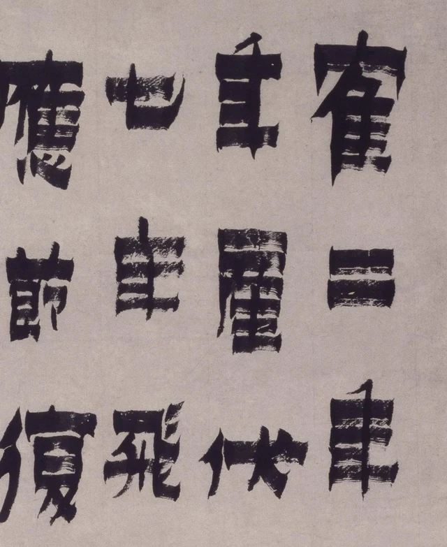
年 makes the phrase “thick horizontals, thin verticals” particularly tangible. The vertical still strings the horizontal layers together, but never acquires their breadth. Its fine, pointed projections make the thicker parts look stacked. A similarly thick vertical would fill the character more completely. The narrow gaps left here are among the conditions that allow it to be weighty and still distinct.
The traditional term 方笔, “square brushwork,” can be approached through the ends of the horizontals. Many beginnings and endings have distinctly angular edges; the upper and lower contours form broad bands. Enlarge them, however, and parallel streaks of exposed paper appear inside, with small irregularities along their boundaries. The photograph records contact between brush, ink and paper: a clear silhouette surrounds an interior that is not evenly painted solid.
The traditional idea of 金石气, an affinity with inscriptions on bronze and stone, thus has visible content. Angularity, abrupt edges and concentrated forms recall old inscriptions and their rubbings, while the fine streaks within the strokes preserve the quality of ink on paper. This connection concerns ways of handling stroke shape, weight and inner space. It need not transform every edge into stone or turn squareness into a claim about the writer’s moral character.
Return to the opening 鶴, “crane.” Its complex parts are concentrated into a comparatively solid outer form. The following 二 abruptly reduces the number of internal turns. No thread of ink joins the two, yet their corresponding breadths and distinct interval maintain their succession. Independently formed characters can still compose a column.
Fine lines extend the blocks, giving blank space direction
In Figure 1, the long strokes of 薄 and 子 both extend to the lower left, but their surroundings differ. 子 is in the rightmost column; its line enters the larger gap immediately below it. 薄 is in the third column; its line approaches the space above 夜, “night,” in the neighboring column to the left. One lengthens a character; the other also creates an oblique relation between columns.
Farther down, 易, “to change,” in the first column and 物, “living things,” in the fifth both have fine diagonal strokes. 時, “time,” in the fourth also sends a long stroke downward from its lower part. These lines occur at different heights rather than becoming a mechanically repeated ornament.
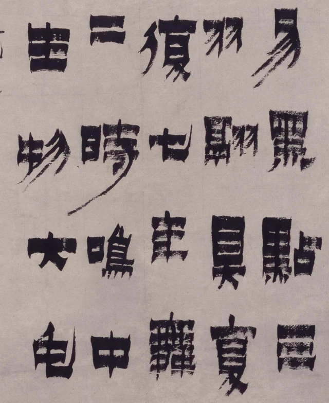
七, “seven,” and 毛, “plumage,” provide another form of extension. 七 has a wide horizontal; after bending down, its end rises into a fine point. 毛 likewise forms a long, thin hook on the right. Neither proceeds through right angles alone. The pronounced squareness of this script accommodates curves and brush tips of unequal length.
This matters because the characters’ broadly independent shapes do not have invisible, hard boundaries. Strokes can extend beyond them, changing the direction of the white ground. 布白, the traditional practice of arranging blank space, means more here than allowing equal gaps between characters. It includes the differently shaped openings around wide horizontals, beside fine lines and between neighboring forms. We are looking at dark masses, but also at how they make white areas narrow, turn obliquely or open a passage.
The same “another seven years” does not become a repeated type
复七年 occurs several times. Its meaning lets us identify recurrence quickly; our eyes can use it for comparison. 復, the written form of 复, places a slender left component beside a right side built from heavier horizontals. Its lower diagonals sometimes close in and sometimes spread more widely. The broad bars of 年 do not always sit at precisely the same angle or height. The same number of strokes still produces distinct proportions of ink and pale ground.
The overall ordering is clear: ten characters per column, with some horizontal levels approximately corresponding. But lightly articulated characters such as 二 and 七 and complex ones such as 翮 and 舞 cannot all work through the same uniform filling of space. Jin gives the few-stroke characters sufficient horizontal weight and preserves thin gaps inside the denser ones. Tips of unequal length reopen the otherwise orderly intervals. What is traditionally called archaic simplicity emerges here through careful handling of different character structures.
The leftmost column finishes after 落茸毛生, and small inscription characters enter beneath it. On the right, 食、生、物、大、毛, “eat, living, things, large, plumage,” continue as large forms; the small writing has already entered the adjoining space. The scale of attention abruptly changes. These are still ink lines, but their turns have become lighter and more closely spaced.
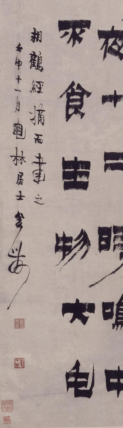
The end of the signature draws another long line downward, distantly answering the fine lines that extend beyond the large characters. The squareness of the main text, the more mobile small writing and the square red seals together bring the lower left to a close. This work is therefore more than a specimen of an unusual script. How large characters stand separately, how small writing enters, how repetition changes and how fine lines pass beyond substantial outlines all receive specific treatment on one sheet.
The broad horizontals that first attracted attention remain. But the long lines in 薄, 子 and 時 have changed how we see them. Squareness and delicacy do not need to take turns occupying the picture. Their coexistence makes the weight of each kind of stroke more distinct.
Optional reading: Which fine line appears first?
Reduce Figure 3 and notice the regularly distributed dark forms. Then enlarge it and find the interrupted pale streaks inside the diagonals of 易 and 物. The object has not changed, but the first thing to become conspicuous has. A smaller view helps disclose spacing; a larger one restores edges and interiors. Each offers part of the work.
In As the Light Fades, the Garden Appears Differently, I discussed how perception brings things before us in a particular appearance. SAE’s “beauty of perception” suggests a modest exercise here. Each time the image changes size, identify which fine line first becomes clear and which dark form stands out, then see how they shape the nearby pale spaces.
Digital resizing is not the mechanism of twilight vision discussed in that essay. The relevant connection is simply that viewing conditions contribute to what appears. At a smaller scale, a long line may offer only a hint of diagonal movement. Enlarged, its interrupted pale interior and narrowing tip become easier to distinguish. The diagonal hint was not wrong; closer attention unfolds its interior.
Image and transcription notes
- This reading uses the Palace Museum’s public images, not observation of the original. It follows the museum’s title, paper support and date of 1752. The catalogue lists 278 × 50.7 cm, but this essay does not equate that measurement directly with the proportions of the photographed writing area; the relation between measurement and photographic coverage remains unverified.
- All fifty-four large characters are transcribed. The character before 林 in the inscription remains independently undeciphered. The museum webpage leaves a space, but the image contains ink. The uncertainty is marked rather than guessed away or described as damage. Traditional and variant forms are rendered in ordinary characters for reading; the photographs retain the originals.
- The images derive from the museum’s public Deep Zoom photographic data. The local source uses its 1948 × 4609-pixel level, assembled according to the original coordinates and overlaps. The five reading images use only cropping, proportional reduction and JPEG encoding. There is no redrawing, distortion, seal removal, color alteration or AI generation.
- The ancient text is public domain. This work is one excerpt, not a definitive text common to every version of the Classic. The translation explains the old account; it is not presented as modern ornithology.
- Museum permission to republish the photographs has not been obtained. These details are supplied for this reading. Consult the museum’s image authorization and copyright statement before public publication.