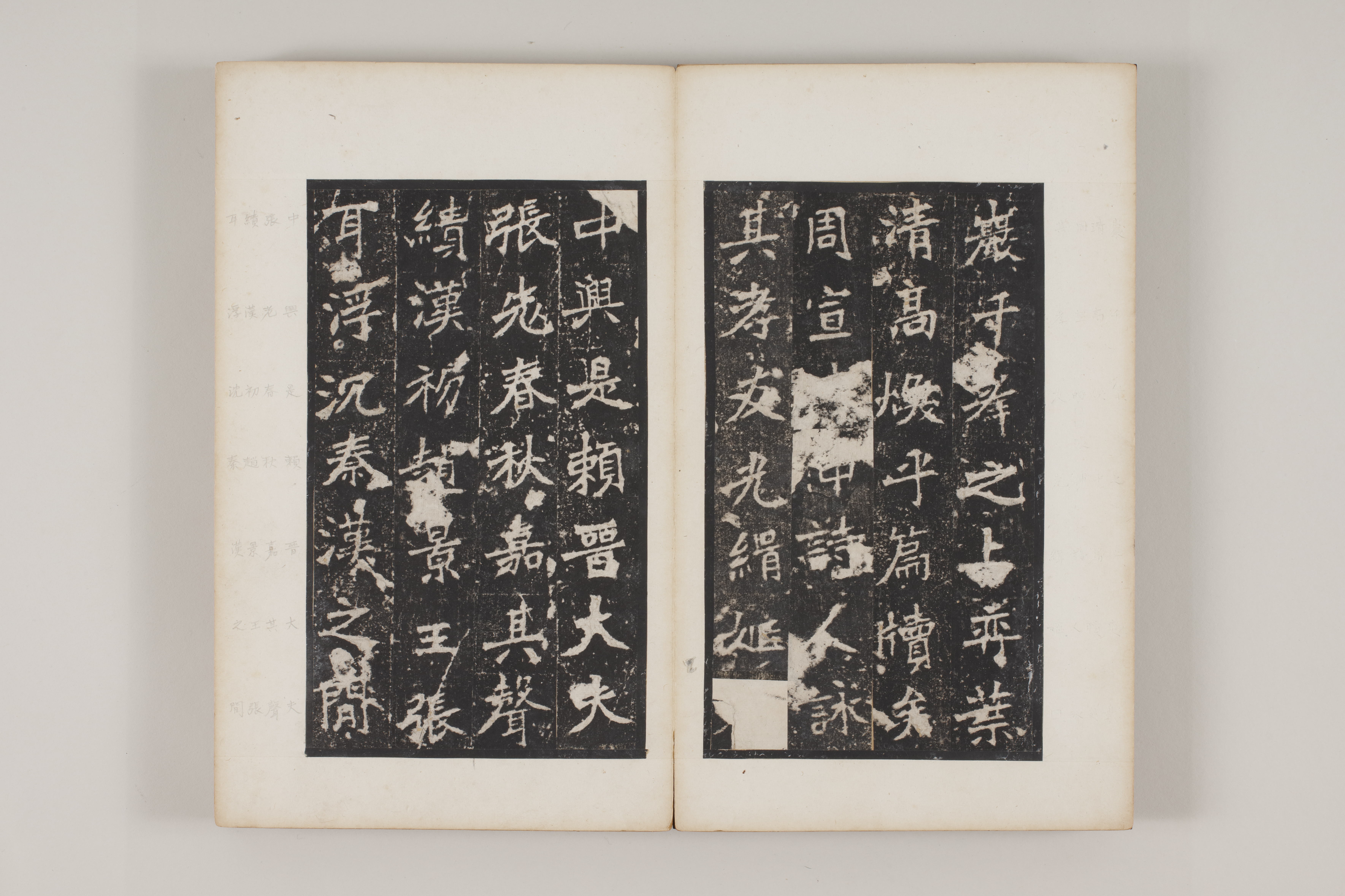
In 春秋, “Spring and Autumn,” 春 (“spring”) begins by lifting its horizontal strokes toward the upper right. They differ in length. The descending strokes open to either side, while the 日 (“sun”) component below contracts within them instead of occupying the character’s full width. 秋 (“autumn”) works differently: the 禾 (“grain plant”) component on the left is compact, while the slanting strokes of 火 (“fire”) spread outward on the right. The two characters are easy to read in succession. To the eye, however, they are not two identical square blocks.
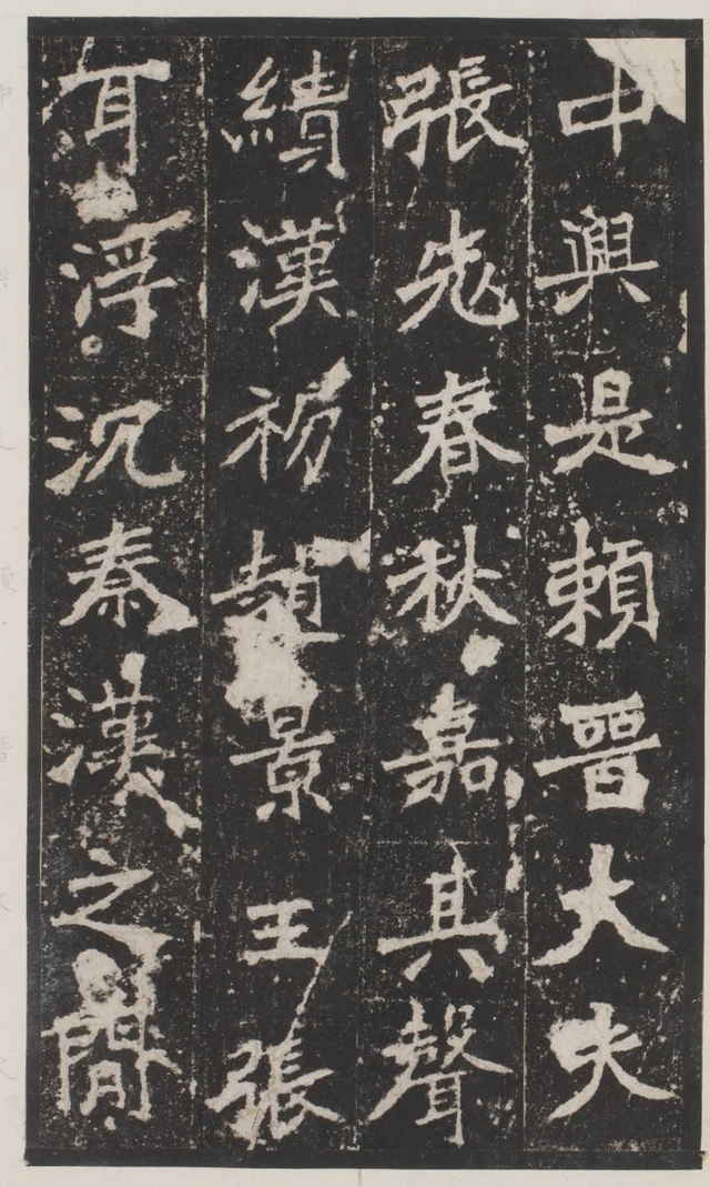
The horizontals in 春 slope, yet the character does not topple. Its spreading diagonals, contracted lower part, and the room left by its neighbors accommodate that upward movement. Here lies a particularly rewarding feature of the Zhang Menglong Stele: stability emerges after different directions have answered one another. Slants and corners make the process of standing upright visible.
This essay examines one album in the Department of Calligraphy at Daito Bunka University, Japan, catalogue number DAITOB00043. The university describes an accordion album approximately 31 × 18.6 centimeters, identifies the original inscription as Northern Wei, and does not date the making of this rubbing. The stele was erected in 522, the third Zhengguang year, to honor Zhang Menglong, governor of Lu Commandery. That is the date of the stone inscription, not automatically the age of these paper leaves. The sources used here do not identify its calligrapher or stonecutter. The original stele survives at Qufu, Shandong. University catalogue; Palace Museum account of the stele and a different, Ming-period rubbing
A rising horizontal changes the surrounding spaces
First isolate the horizontals of 春 in Figure 1. They are not equal-length parallel bars. A longer stroke extends to both sides, bringing the diverging diagonals below within its span; shorter parts concentrate the visual weight above the middle. The black intervals are consequently not evenly stacked compartments. The upper part is dense; the interior of 日 below is clearer. The eye moves from intersecting lines into a smaller, steadier enclosure.
We are looking at a rubbing, with pale characters against a dark ground. The pale forms broadly correspond to recessed parts of the stone that did not receive ink. Dark areas between strokes make the internal spaces legible. To call an area dense or open is to observe both where pale lines gather and how the dark ground passes among them. Tracing only the pale contour would miss half the relationship.
秋 organizes itself differently. It lacks the small lower enclosure that gathers 春 together. Its right-hand diagonals open outward, while the more upright left portion preserves a standing framework. The characters follow one another in a column, but open and close in different ways. Above them, 先 (“first; earlier”) has a divided, open lower half; below them, 嘉 (“praise”) contracts again through stacked horizontals and mouth-shaped enclosures. Along one reading route the eye has already passed through alternating openness and density.
This helps explain the traditional term jieti, the construction of a character. It means more than placing components inside a square drawn in advance. Each stroke receives a particular job: one part may extend while another must gather; a small interval must remain; a long line will direct attention sideways. Recognition persists while local relationships vary. The stele’s distinctive presence comes from these choices working together.
The 大 (“great”) and 夫 (“man”) in the neighboring column on the right offer useful comparisons. Together 大夫 is an ancient official title, conventionally read dafu. With few strokes, their diagonal expansion is conspicuous. 春 and 嘉 contain more strokes, so their expansiveness requires a more complicated interior support. We can sense distinct centers of balance without drawing an axis through every character. Enlarge them all to one width and level their horizontals, and these differences disappear.
Why praise of a governor brings in spring plants and new lotus leaves
The inscription traces the Zhang lineage, recounts Zhang Menglong’s filial conduct, career, and administration, then closes with a rhymed eulogy. 春秋嘉其聲績 recalls the achievements of Zhang ancestors in the state of Jin during the Spring and Autumn period. Together with the later reference to Zhang Er in the early Han, it places the governor within a long family history. Here 春 first belongs to a historical account.
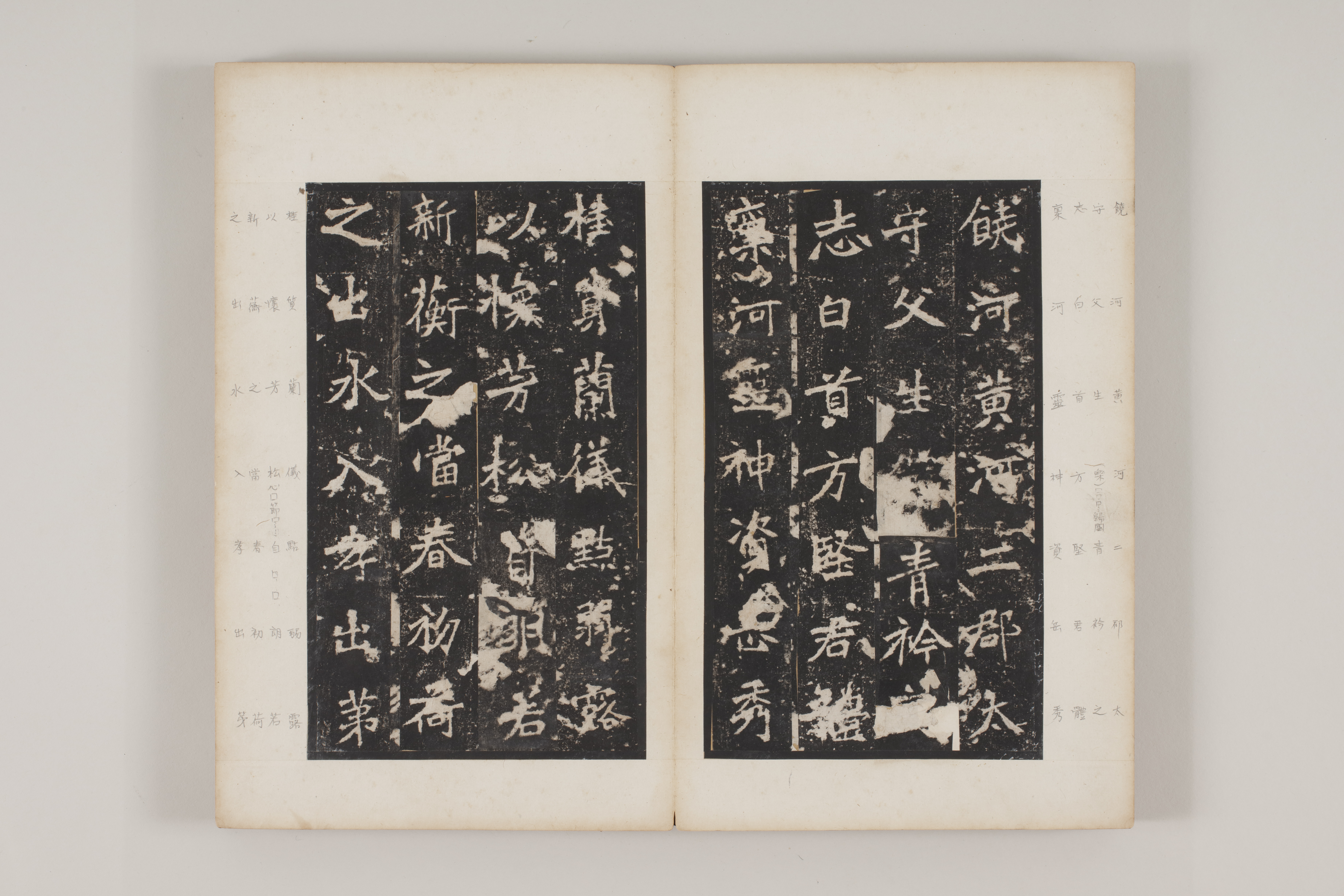
On another opening it enters a comparison: 新蘅之當春,初荷之出水, “new fragrant plants meeting the spring, young lotus leaves emerging from water.” The text praises the man’s bearing and qualities through fresh, beautiful vegetation. Recognizing the purpose of the praise clarifies what the inscription is doing: shaping a local official into someone worthy of remembrance.
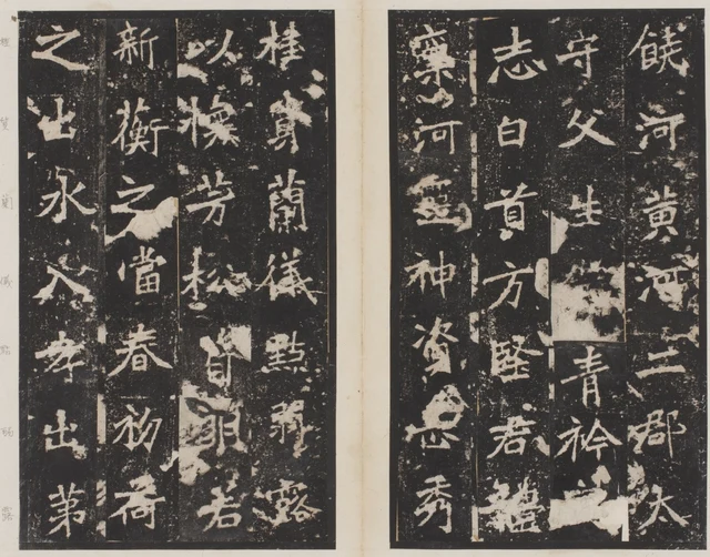
Compare this 春 with the one in Figure 1. Its upper portion is again dense, its lower part small, with room to open sideways. But it now lies between 當 (“at; during”) and 初 (“new; beginning”): the former has more stacked elements, the latter distributes its two components laterally. The dark-and-light rhythm of the column has changed. Recognizing the same character does not mean recognizing the same neighborhood.
水, “water,” in the adjacent column on the left is more open. A long central line stands between outward-reaching branches, with broad dark areas between them. 入 (“enter”) below it continues that openness with still fewer strokes. Farther down, 孝 (“filial piety”) returns to a combination of horizontals and vertical elements. These changing widths give a fluent sentence several visually distinct hesitations.
白首方堅, “steadfast into white-haired old age,” appears near the middle of the right leaf. The upper and lower parts of 首 remain relatively narrow; 方 opens diagonally below; 堅 follows with denser stacked elements. Every character has corners, but no single outer shape governs them all. The traditional description of Northern Wei writing as angular and steep becomes useful when attached to specific starts, endings, turns, and contours.
A rubbing records a carved surface through a further process of ink and paper. Pale edges have notches, small pale specks interrupt the dark ground, and some characters are more extensively damaged or indistinct. The resulting sharpness is interrupted rather than smooth. Visible angular turns support comparisons of form. Reconstructing the brush hairs, pressure, and speed from every notch would require additional evidence. The most dependable first step is to establish the clearly readable lengths, directions, and positions.
Across four columns, a broad character does not monopolize the route
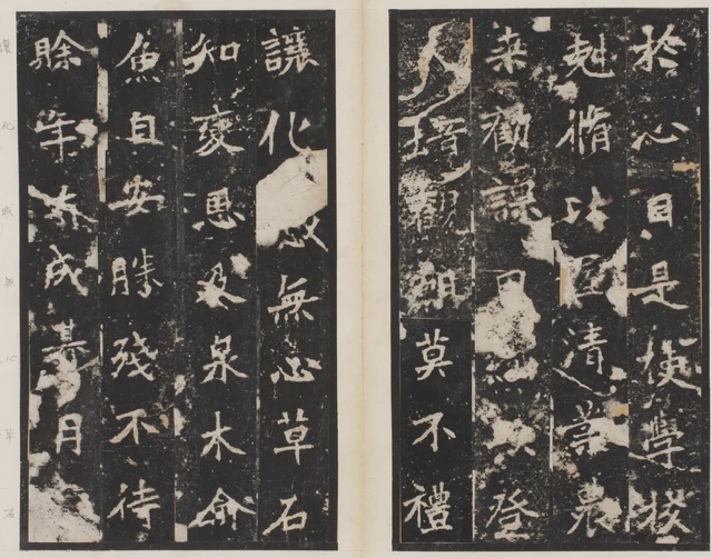
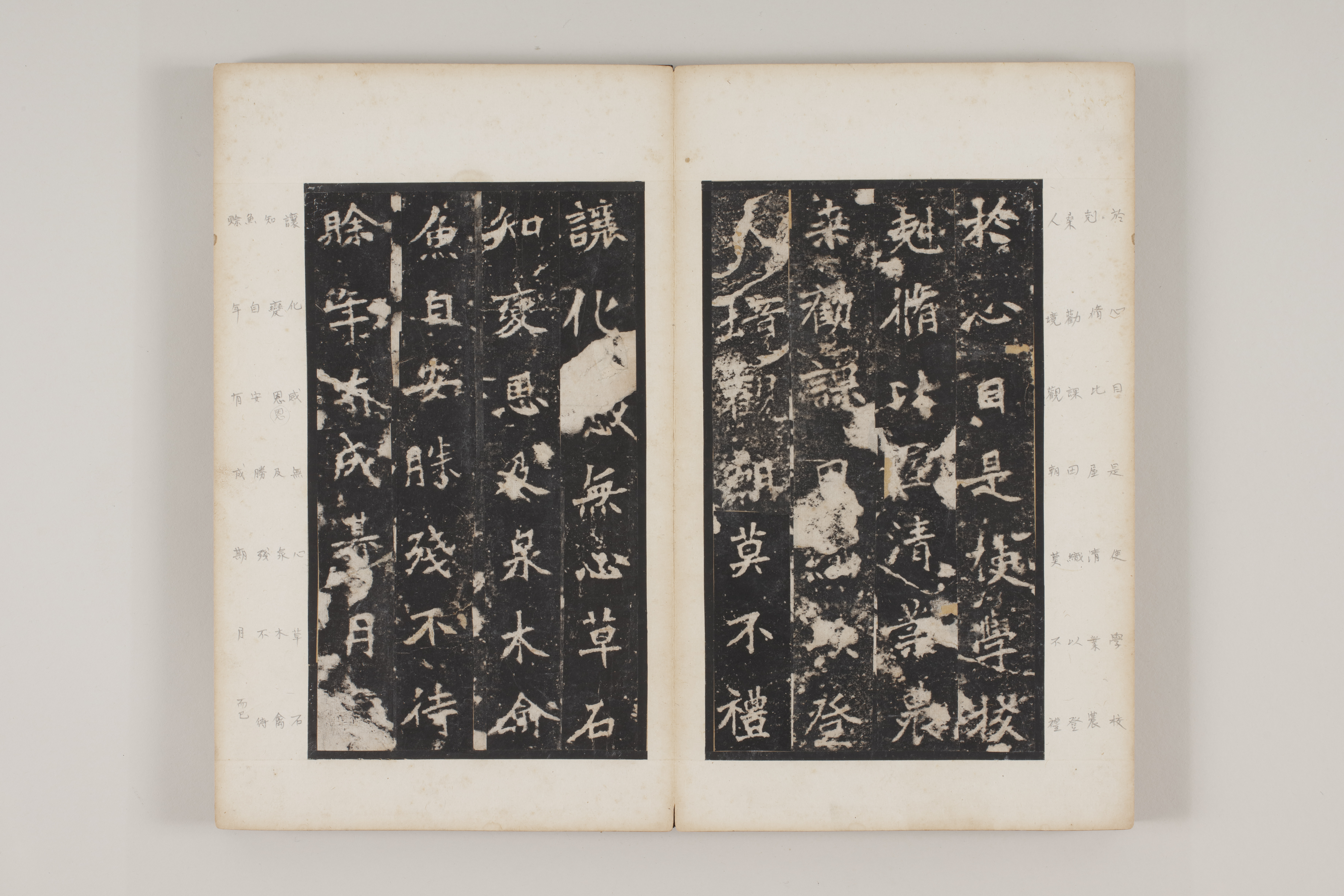
Here the inscription praises the restoration of schools and encouragement of farming and sericulture, then extends the governor’s benevolence to plants and animals. 是使學校剋脩 means that schools were thereby put in order and repaired. 恩及泉木,禽魚自安 means “benevolence reaches springs and trees; birds and fish rest at ease.” The effects of government become an expansive, ordered world.
Look at 木, “tree,” on the left leaf. Its horizontal stretches across, a longer vertical occupies the center, and diagonals descend to both sides. Its column also contains the denser 變 (“change”) and 恩 (“benevolence”) and the sparsely stroked 及 (“reach”). The characters are broadly arranged along a column, but the area actually occupied by pale strokes varies greatly. The dark ground around 木 is the condition of its expansion, not merely unused space left over by other characters.
Near the top of the right leaf, 心, “heart/mind,” has separated parts through which the dark interior communicates with the exterior. 目, “eye,” below it is more enclosed. Together they form 心目, but their forms move from dispersal to enclosure. We read one expression while seeing two markedly different spaces. Meaning and construction can become clearer together.
This album mounts cut sections of the rubbing in several columns per leaf. The broad pale gutter belongs to the album’s mounting. Some unusually straight vertical boundaries within the rubbing also result from cutting and mounting. These four-column groups permit study of distances, but cannot be treated as the complete original layout of the stone without reconstruction. Faint marginal characters add another reader’s transcription. They help identify difficult forms and turn the album into a book visibly used and checked.
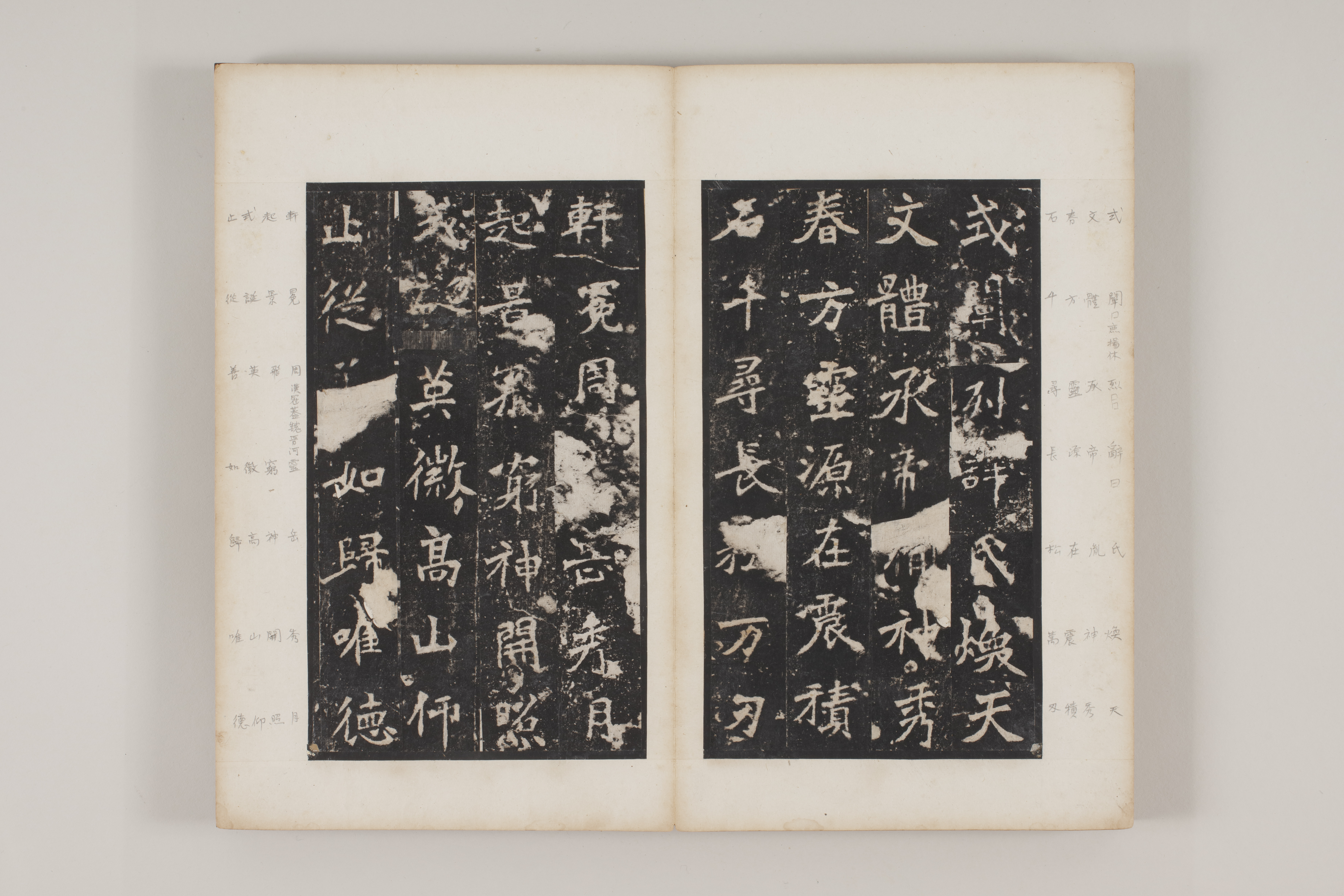
This format has its own viewing rhythm. The eye enters a dark rectangle, moves among pale characters, and reaches a paper edge before the page is turned. A long public inscription has become something that can lie close at hand for repeated comparison. The few familiar characters practiced by later students reached them through this material transformation.
From a sentence of praise back to a column
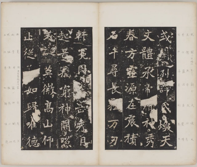
春 returns in the eulogy, in 春方 on the right leaf. Once again its dense upper portion and contracted lower part work together. 方 below is sparse, while 體 in the adjacent column is much denser. A familiar form produces new comparisons within a new set of neighbors.
高山仰止, “I look up toward the lofty mountain,” on the left leaf borrows from the Book of Songs to express admiration. 高 contains several enclosures; 山 suddenly simplifies the structure. 仰 separates into two components, and the final 止 moves to the top of the next column. Meaning directs us upward, while the paper takes us through density and openness before returning the eye from below to the upper left. The verbal upward gaze and the physical column change illuminate one another; this does not make an arrangement mediated by later mounting the Northern Wei calligrapher’s symbolic design.
Return to Figure 1. 春秋 remains where it was. “Slanting,” “angular,” “precarious,” and “stable” now have identifiable grounds: rising horizontals meet spreading diagonals, dense areas require open neighbors, and an outward-reaching character coexists with narrower ones. These are aspects of one act of looking, rather than interchangeable compliments.
The regular script of the Zhang Menglong Stele makes each character independent while letting it draw on surrounding space. A character stands because every side has not been locked shut. At this point “vigorous” becomes a set of relations we can explain stroke by stroke, rather than a personality assigned in advance.
Optional further reading | Another layer of time beside the pale characters
Reduce Figure 3 and the characters first appear as rhythmic forms. Enlarge it and marginal readings, cut edges, and damaged strokes separate. They share a photograph but have different histories.
“The Wood Still Holds That Dry Year” follows SAE’s “beauty of causation,” asking how the past remains in the shapes it has affected. Before this album, that direction invites a further question: which operation left this particular boundary? If a carved character, a paper join, and a later transcription can be distinguished, the album’s time acquires layers.
The faint marginal characters are especially useful. They tell us what someone read, and show someone continuing to read beside the main text. We can appreciate neighboring thick and thin forms while identifying the sequence of rubbing, mounting, and annotation. Provenance becomes legible through evidence, without inventing a story of weathering for every mark.
The general SAE essay on judgment and aesthetics treats a ray as a direction of judgment. Here it does not rename structural analysis. It helps us see, after studying the strokes, how the book bearing them came to have its present form.
Edition, images, and reading notes
This essay is based on public digital images from Daito Bunka University, not an in-person examination. All four illustrations come from DAITOB00043. Processing is limited to rectangular cropping and proportional reduction; strokes, damage, and seals are neither reconstructed nor removed, and no other rubbing supplies missing characters. The original stele’s date, 522, is distinguished from the undated production of this rubbing. The catalogue’s approximate 31 × 18.6 cm measures the album, not the stone.
Quoted passages are checked against visible forms and the National Palace Museum’s public transcription of a different rubbing, 贈拓000371. That record helps with textual reading only; it does not supply replacement images. Names such as 張先 retain the form discussed in the photograph. The essay translates selected passages, not the complete inscription.
Image rights belong to the relevant rights holders. The university archive states that copyright is reserved. No separate image-use permission has been obtained, and no open license is claimed. Please verify permission before public or commercial reuse. Image URLs and crop coordinates appear in IMAGE_NOTES.md and IMAGE_MANIFEST.json.