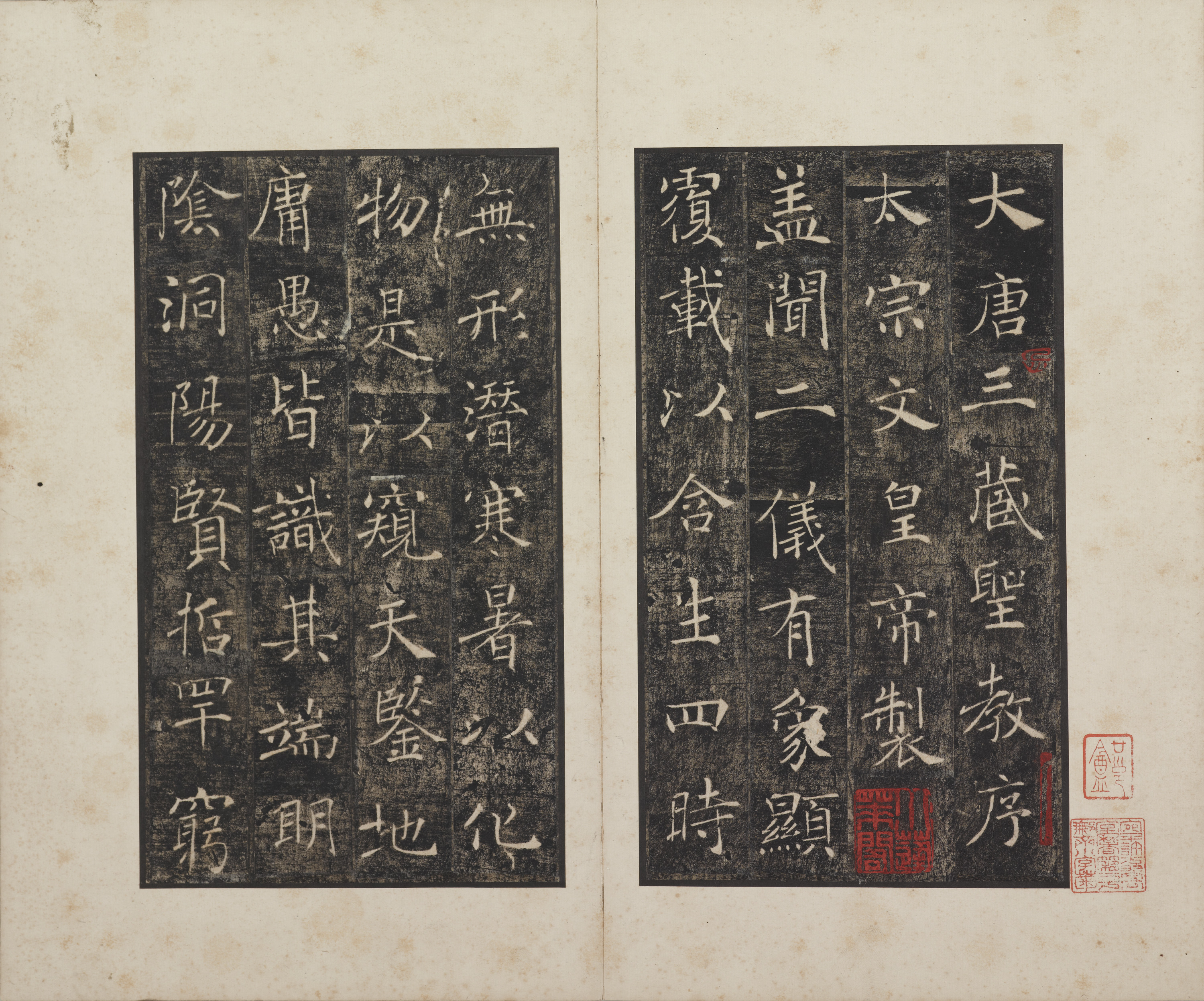
The character 大, “great,” at the beginning of 大唐三藏聖教序, “Preface to the Sacred Teachings of the Tripiṭaka of the Great Tang,” has an emphatic stroke at its lower right. Beginning thin, it gradually broadens and extends outward. The horizontal crossing its middle is much finer. In the adjacent attribution, 太宗文皇帝製, 太, part of the imperial title Taizong, likewise reserves greater weight for its lower right. Both characters occupy their places generously, although their pale lines cover relatively little area.
Now look at 二, “two,” in 蓋聞二儀有象. A broad dark interval separates its two horizontals. No other stroke fills it, yet the character feels complete. The opening already presents a rewarding question: why do characters with such fine strokes hold together?
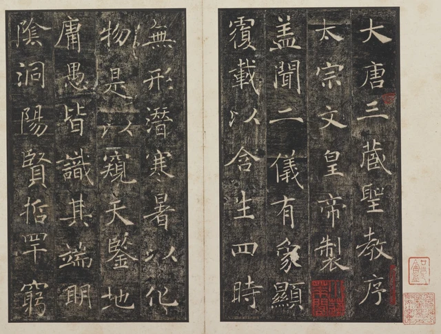
The direction of fine lines and a few heavier landing points together sustain this expansiveness. Horizontals, verticals, and diagonals leave considerable room between them, while their endings give each extension somewhere to stop. “Delicate” is consequently an insufficient description. We need to see where a fine line turns or broadens, and how much space those decisions leave within the whole character.
The Wild Goose Pagoda Preface commonly denotes two steles at the Great Wild Goose Pagoda: Emperor Taizong’s preface to the Buddhist scriptures translated by Xuanzang and the accompanying record by Li Zhi. Chu Suiliang wrote both inscriptions, carved in 653. This essay concentrates on Taizong’s Preface, from heading through text to final inscription, in Tokyo National Museum album TB-1363, donated by Takashima Kikujiro. The catalogue describes an ink-on-paper rubbing album, 33.7 × 24.2 centimeters. This paper object and the original stones surviving at the pagoda in Xi’an are distinct objects. Museum record
The weight of an ending reaches beyond the line
Looking only at the lower-right stroke of 大 in Figure 1 might suggest that the character depends on force applied there. Look upward: the fine horizontal and descending diagonal have already established the direction of expansion. The thicker ending provides a clear destination for a long, fine passage. Weight gathers in a few places rather than coating the entire character evenly.
文, “writing” or “culture,” midway down the second column of the right leaf, rewards the same approach. A separate mark sits above a crossing horizontal; the two lower strokes intersect and reach outward. Fine passages keep the middle transparent, while a broader lower-right ending prevents the form from seeming like disconnected floating lines. 宗 immediately above, here part of the imperial title Taizong, works differently: its upper part provides a covering, and several strokes divide below. 文 makes its central intersection the pivot for expansion.
This is a rubbing. Pale characters against a dark ground result from transferring a carved surface with ink and paper. What we call “empty space” is often black here: stone not recessed into a character receives ink, while recessed forms remain pale. The colors reverse those of a brush-written manuscript, but spatial relationships remain legible. There is dark ground beyond the two strokes of 二 and within the stacked compartments of 皇, “imperial”. Both are spaces, but their forms and functions differ.
The small spaces in 皇 are enclosed by comparatively dense horizontals and verticals, keeping the eye moving within. The space of 二 communicates almost directly with the exterior. Chu repeatedly places closed and open structures beside one another. Characters with many strokes need not become heavy blocks; those with few need not become thicker to acquire sufficient presence. The looseness of a column emerges from successive internal decisions about scale.
In calligraphic practice, “lifting and pressing” describes changes in brush pressure. The varying widths and endings visible in a rubbing help us discuss the forms such changes leave, but they are not a film of the moving brush. What can be checked directly is that pale lines vary in width, expansions occur in particular places, and the internal spaces answer those places. Establish that first, and inferences about writing have somewhere to stand.
A passage about visible form and the formless
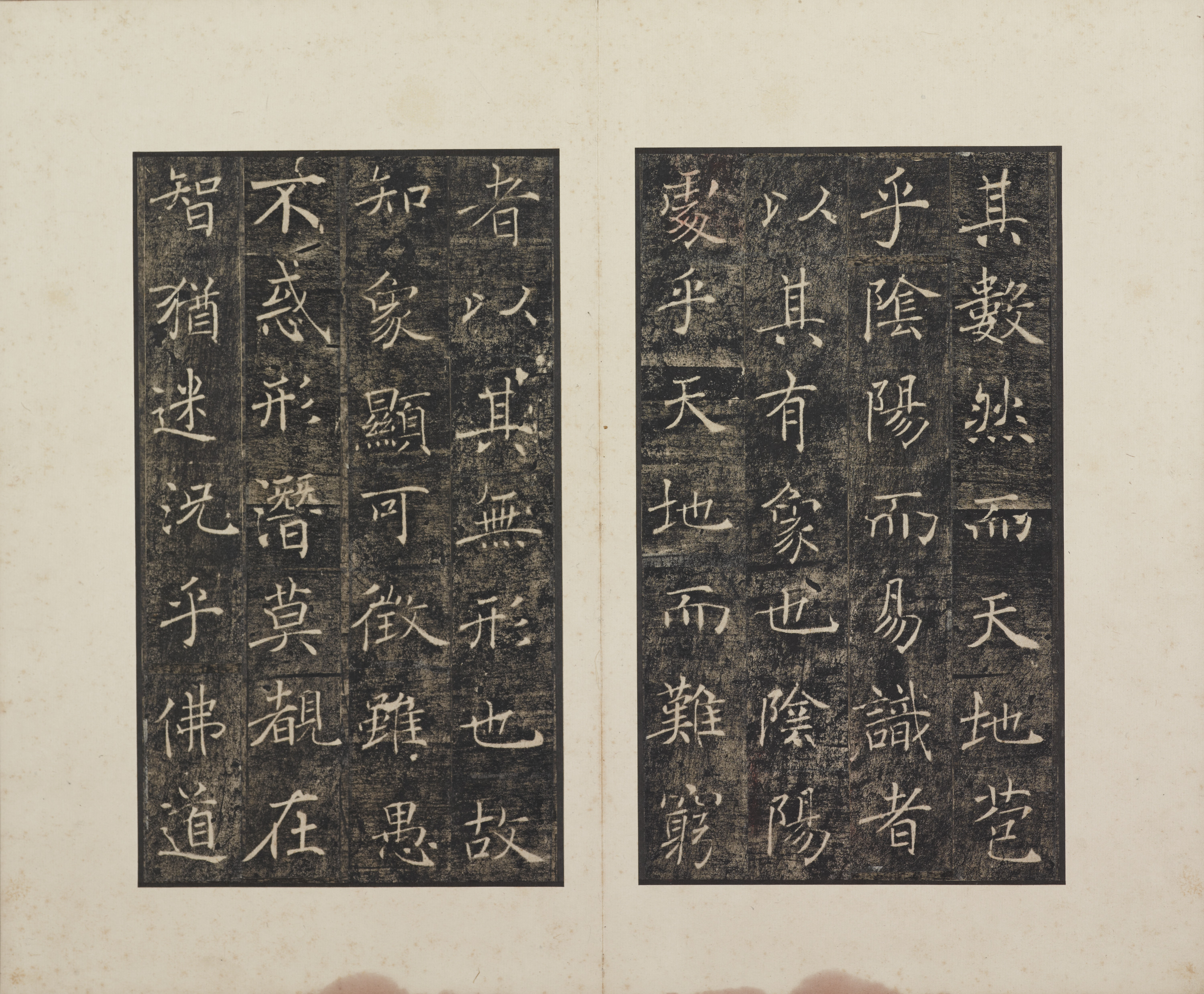
The opening reads 蓋聞二儀有象,覆載以含生;四時無形,潛寒暑以化物: “I have heard that Heaven and Earth have visible forms, covering and bearing all living things; the four seasons have no fixed form, yet through the hidden workings of cold and heat they transform the world.” It then compares how Heaven and Earth and yin and yang are known, before turning toward the profundity of Buddhist teaching.
This argument prepares the way for praise of Buddhism: some effects are visible; others remain perceptible without assuming a fixed shape. Taizong’s prose is more than a description of nature. It proceeds to Buddhism’s transmission, Xuanzang’s journey in search of teachings, and his translations, placing imperial recognition before those scriptures. The Preface was composed in 648; its inscription on stone in 653 was a subsequent stage. Li Danjie, “The Birth of the Wild Goose Pagoda Preface”
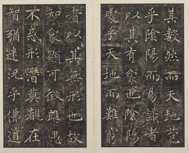
天地, “Heaven and Earth,” appears near the bottom of the rightmost column on the right leaf. 天 (“Heaven”) opens outward with few strokes; 地 (“Earth”) combines two parts, the bent stroke on the right reaching outward. Their spaces are relatively open. In the neighboring 陰 (“yin”) and 陽 (“yang”), more numerous strokes divide space into smaller portions. The prose pairs Heaven and Earth with yin and yang; the written forms supply different densities.
其無形也 on the left leaf is especially light. 無 (“without; not having”) expands horizontally, containing shorter upright lines and lower dots. The three slanting strokes on the right of 形 (“form”) remain individually separated. They do not merge into one thick diagonal occupying that side of the character. As the eye passes from one to the next, dark ground threads between them. That half-character acquires direction and intervals at once.
也 (“a sentence-final particle”) below has a long bending stroke that leaves an opening inside before its ending turns upward to the right. From the comparatively dense intersections of 無, through the separate short lines of 形, to the larger interior of 也, space changes successively. Lightness is a relational effect here. Strokes do not crush one another into a single mass, yet the characters retain distinct boundaries.
The prose says “formless,” while these characters offer very specific forms. That encounter is worth considering without identifying every dark space with the Buddhist concept of emptiness. Doctrine and calligraphy organize themselves differently. Understanding doctrine explains why the author uses these words; studying the writing shows how those words become a visible column. Their routes meet on one leaf, but neither route completes the other’s work.
Four instances of 無 let their neighbors determine the interval
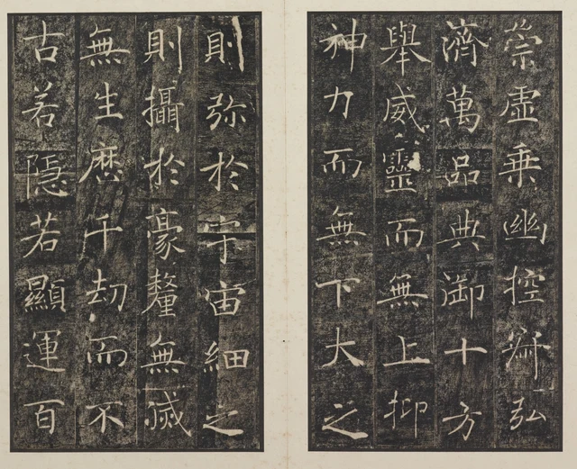
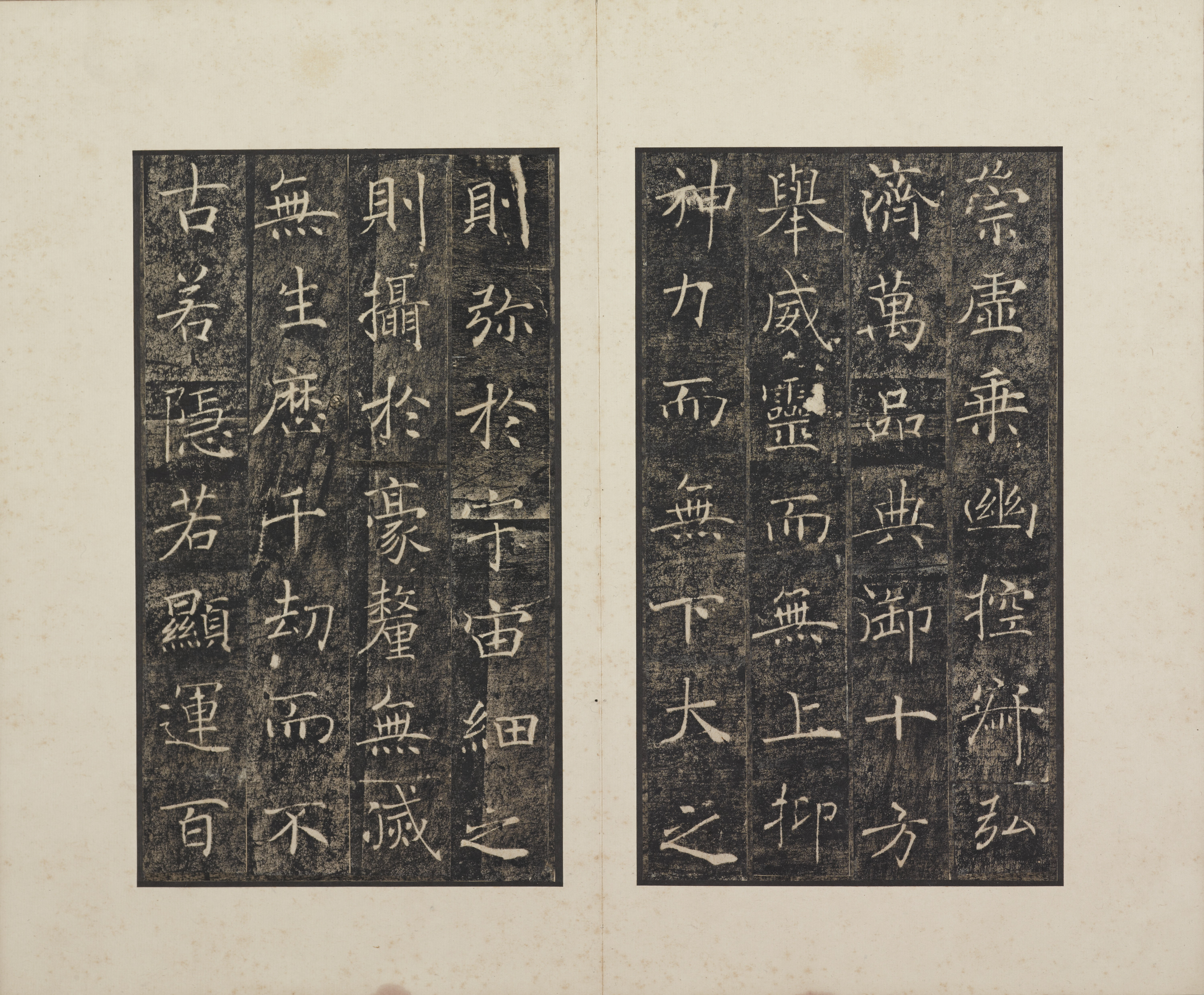
舉威靈而無上,抑神力而無下 means, approximately, “Raise its numinous majesty and there is no upper limit; extend its spiritual power downward and there is no lower boundary.” 無滅 and 無生, “without extinction” and “without birth,” continue toward Buddhist ideas of arising and ceasing. Parallel phrases bring 無 repeatedly into a small stretch of text.
In the leftmost column of the right leaf, 無 lies between 而 and 下 (“below”). Its neighbor to the right has another 無 followed by 上 (“above”). Both 無 forms expand laterally, but their surroundings differ. 下 sends a long vertical downward with conspicuous dark space beside it; 上 ends on a longer baseline, concentrating the form lower down. The same 無 joins two different endings.
Now consider 無 at the top of the third column on the left leaf. It is followed by 生 (“birth; arising”), whose central vertical runs through several horizontals and directs the structure downward. Farther right, 滅 (“extinction”) after 無 has intricate, densely divided left and right parts. The four instances of 無 neither turn into wholly different signs nor become inert through repetition. Each following character leads it into a new spatial relationship.
This opening also allows comparison among 神 (“spirit; divinity”), 力 (“strength”), 十 (“ten”), and 方 (“direction”). The bend and long diagonal of 力 occupy little area; a slant immediately exposes the space on its right. 十 has two intersecting strokes with open surroundings. 神 contains more vertical supports and small internal spaces. Their stroke counts differ greatly, yet the columns descend through comparable widths. Airiness therefore means more than having few characters or placing them far apart. Even a complicated character can preserve routes through its interior.
This matters in practice. A student may copy an extremely fine horizontal but crowd the internal intervals: fineness remains, expansiveness changes. Simply increasing the intervals without definite starts and stops will instead weaken the character’s cohesion. Line and space must be arranged together. That is among the hardest things this work asks a student to learn.
At the final inscription, fine lines can still bring the text to rest
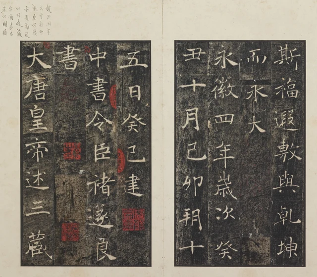
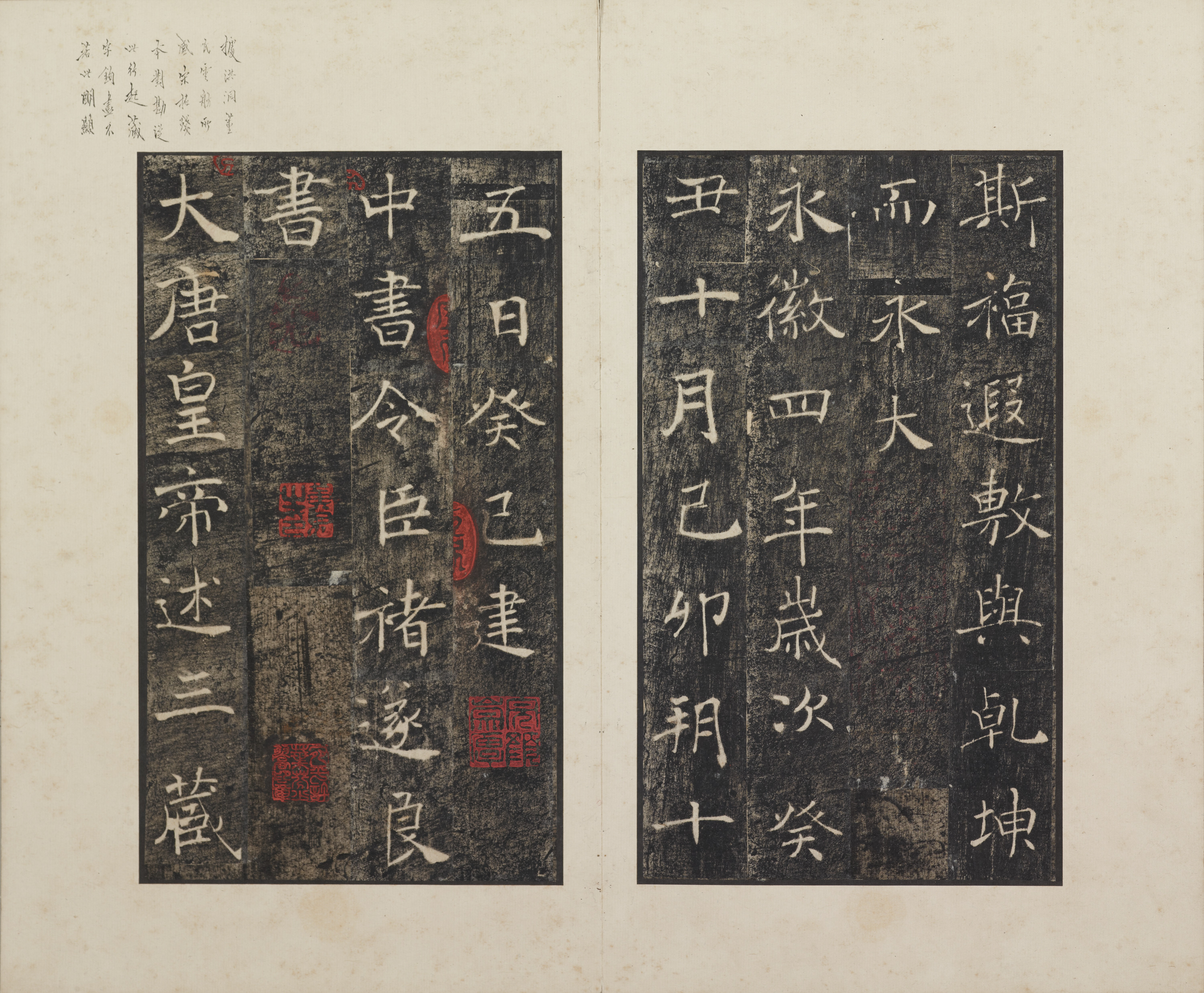
The final inscription dates the stele to the fifteenth day of the tenth month in Yonghui 4 and names “your servant Chu Suiliang, Director of the Secretariat, who wrote this.” The office, the word “servant,” and the name situate the writing within the relationship between court and Buddhist enterprise. The work had a public function and a specified writing identity. Its later use as a model of regular script developed through its transmission.
In 中 (“center”), the vertical passes through a small central enclosure, with substantial open space around it. 書 stacks horizontals without filling every interval. The lower part of 良 at the end of the name extends rightward, returning us to the pairing of fine line and weightier endpoint seen in the initial 大 and 太. From title to signature, expansiveness is an ongoing method of construction rather than an occasional embellishment.
Below 書 in this album is a dark stretch without main text, with red seals scattered through it. The next title has already begun on the left. We can distinguish a textual ending, an inscriptional signature, and later collecting traces. But these leaves are assembled from cut sections of a rubbing, so every paper seam cannot be attributed to Chu’s original spacing. Retaining the full image preserves these layers and helps orient our reading.
Return to the opening. 二 still has just two horizontals; 皇 remains more complex; 大 remains heavier at the lower right. A character’s presence is not distributed evenly according to its number of strokes. Fine lines establish direction, broader parts settle positions, and remaining space lets those relations unfold. The Preface’s clarity emerges from this measured distribution.
Optional further reading | Returning scale to the eye
In “As the Light Fades, the Garden Appears Differently”, I considered how conditions of perception participate in the way things appear. Figure 2 suggests a small experiment: first fit the whole opening on screen, then enlarge the columns around 形 or 無. At reduced size, pale lines gather into an ordered rhythm of density; enlarged, thickened endpoints, turning fine lines, and the textures of paper and rubbing ink become easier to distinguish.
One view is not true and the other false. Each discloses some relationships within the same image. SAE’s “beauty of perception” invites us to include viewing scale in our judgment. “Fine” and “clear” should refer to details we can point out in an adequately legible image. A thumbnail introduces arrangement, a detail introduces lines, while the original’s actual dimensions and material still require separate understanding.
The general SAE essay on judgment and aesthetics distinguishes beauty from mere pleasure. Here that does not require everyone to prefer fine regular script. More concretely, even someone drawn to heavy writing can compare the opening of 二, the enclosures of 皇, and the ending of 大, and explain how they sustain one another. Judgment gains an object that can be examined together.
Edition, images, and textual notes
This essay uses Tokyo National Museum’s public ColBase images of TB-1363; it is not a record of examining the stele or album in person. All four pictures come from the same album and photographic series. They are rectangular crops reduced proportionally, without reconstructed strokes, removed seals, recoloring, or generated writing.
653 dates the original stone inscription; 648 dates Taizong’s text. Earlier album labels say “Song rubbing” and “Northern Song rubbing.” These are recorded as judgments made on the labels, not independent proof of when the rubbing was produced. The museum’s 33.7 × 24.2 cm describes the album rather than the stone. The Preface and Record are distinguished from Huairen’s 672 inscription assembled from Wang Xizhi’s characters.
Quotations follow the visible writing, with modern punctuation supplied. Translations appear in the main essay. The three diagonals of 形 discussed here lie in the middle-to-lower portion of the rightmost column on the left leaf in Figure 2.
Images come from ColBase. Its official FAQ permits free reuse with attribution and requires edits to be disclosed. This package names the Tokyo National Museum, links the object, and identifies cropping and reduction. It does not imply museum endorsement. Source images and crop coordinates are documented in IMAGE_NOTES.md and IMAGE_MANIFEST.json.